How to design wrist tattoos that interact elegantly with watches and bracelets in everyday wear.
Designers and enthusiasts share thoughtful approaches to ink that harmonizes with timepieces and bracelets, creating cohesive daily wear. Explore planning, placement, line weight, and color choices that enhance both skin art and accessories while maintaining legible readability and a polished silhouette in any routine.
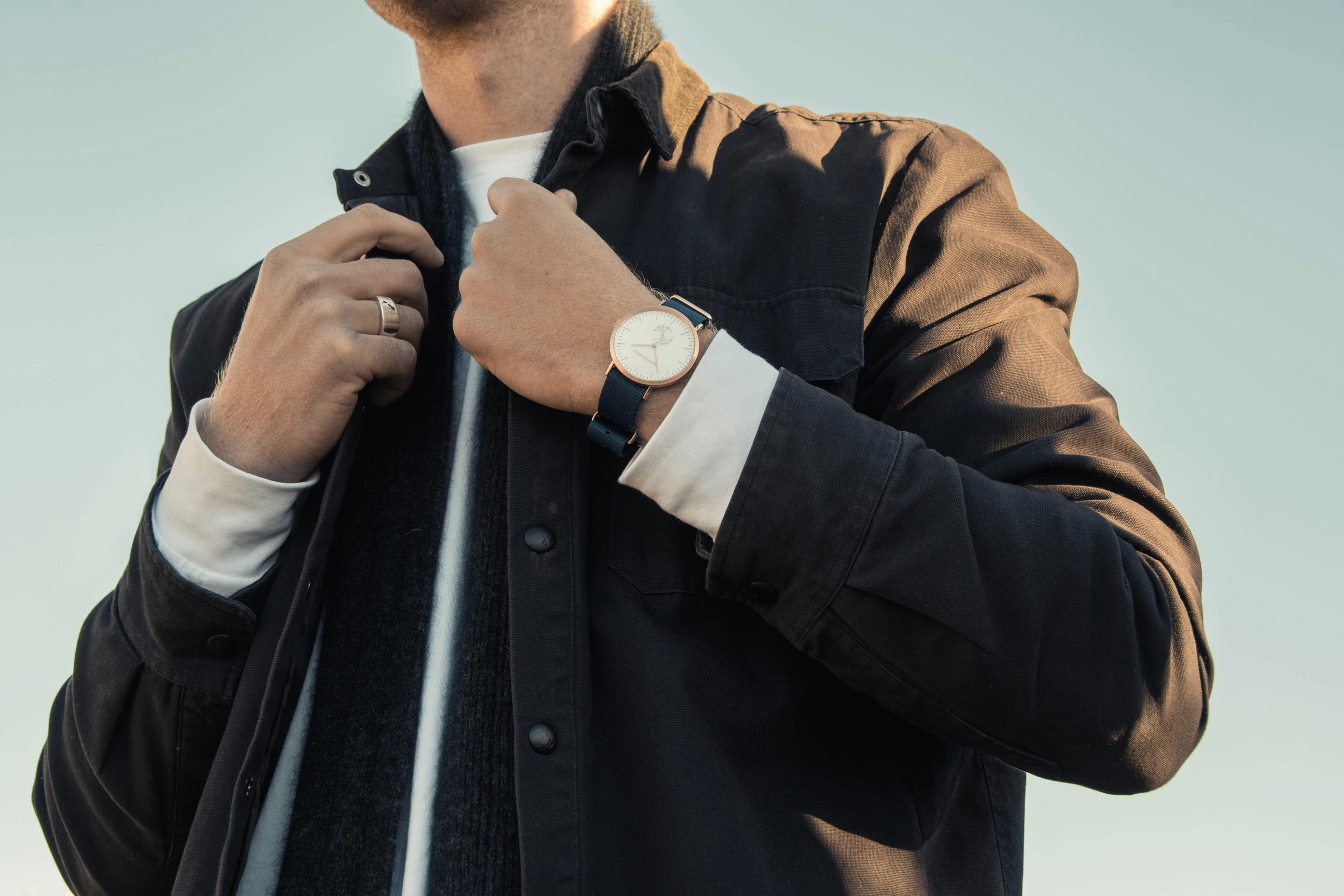
A wrist tattoo design that talks to a watch requires a mindset that treats both skin and metal as a single canvas. Start by considering how a timepiece’s dial, case, and crown will align with the tattoo’s lines. Visualize the arc of a bracelet or the curve of your wrist when you move your hand, noting where the ink will sit relative to hardware. The aim is balance rather than competition: the tattoo should accent the watch without overpowering it. Choose a focal point where ink interacts with the watch’s silhouette, ensuring neither element undermines the other’s presence.
To achieve harmony, you can plan the tattoo’s geometry around common watch features such as lugs, bezels, and the crown. A bold line following the wrist’s natural curvature can guide the eye toward the timepiece rather than away from it. Consider the ink’s scale: too large can overwhelm a small watch, too delicate can vanish against busy metallic surfaces. A subtle negative space near the watch enables light to bounce off the metal while the ink remains legible. Trial sketches on skin-safe transfer paper help you anticipate how the final piece will breathe with your daily accessories.
Balanced ink and hardware require thoughtful planning and restraint.
When selecting line weight, think about legibility in daily life. A watch face demands clear, clean lines so the time remains easy to read at a glance; your tattoo should mirror that clarity. Moderate line work tends to pair best with metallic surfaces, providing definition without competing for attention. Avoid overly intricate bundles that risk fading visibility after sun exposure or oil buildup from frequent wear. Instead, favor continuous curves or simple geometric motifs that hug the wrist’s contour. This approach creates a quiet backdrop that enhances both the tattoo and the watch, rather than creating a visual tug-of-war between ink and dial.
Color considerations matter as well. Black ink offers timeless contrast with most watch metals and dial colors, remaining legible across lighting conditions. If you want color, choose restrained, muted tones that echo the watch’s metal hue—gunmetal, rose gold, or champagne tones—and keep saturation modest. This restrained palette prevents clashes and maintains a refined, cohesive look. Additionally, consider how skin aging and sun exposure will alter color over time. Subtle shading can preserve depth without dominating the accessory layout, ensuring the tattoo’s presence remains elegant as you age and as your watch evolves.
Technical details help craft durable, tasteful wearable art.
Bracelets introduce another layer of complexity and opportunity. A bracelet’s spacing, texture, and clasp line can guide where a tattoo should begin or end. If the bracelet sits above the wrist bone, let the ink trail slightly beyond human movement to maintain curvature when the arm bends. Alternatively, if a bracelet sits close to the inner wrist, you might design a tattoo that terminates just short of the jewelry’s edge, leaving a small, clean margin. The key is previewing how the jewelry translates into functional art: the tattoo should enhance the accessory’s silhouette rather than interrupt its form.
Practical tests can prevent disappointment. Wear a bracelet for several hours in a controlled environment, then observe how the ink holds up around the hardware’s pressure points. If you notice chafing or friction, adjust the design’s placement outward or inward to reduce rubbing. Consult a professional tattoo artist who specializes in fine-line work and has experience with wearables. They can provide recommendations on needle configuration, ink density, and shading techniques that ensure longevity on the dynamic surface of the wrist. Remember, the goal is a seamless conversation between skin, ink, and jewelry.
Consistent style choices ease the launch of a wrist tattoo.
Longevity hinges on careful aftercare and strategic touch-ups. Aftercare routines protect the tattoo’s crisp lines where it meets metal, sweat, and lotion. Cleanse gently, pat dry, and apply a thin layer of fragrance-free moisturizer to maintain skin suppleness without creating a slippery surface that could hinder the watch’s grip. If you frequently expose your wrist to water or sun, plan a maintenance schedule with your artist to restore any fading. Regular touch-ups can preserve the line integrity around the watch’s edges and along bracelet contact points, ensuring the piece remains legible and harmonious for years.
A mindful approach to subject matter makes the tattoo age gracefully. Favor motifs with enduring appeal and timeless aesthetics, such as continuous bands, minimalist symbols, or abstract geometric shapes. Avoid trendy characters that may look dated or clash with versatile timepieces. Consider seasonal wardrobe changes as well; ink that aligns with different fabrics and color palettes will feel at home whether you’re wearing a steel chronograph or a leather strap with a colorful dial. By prioritizing enduring simplicity, your tattoo will complement a wide range of accessory styles across different occasions.
Final checks ensure a polished, lasting collaboration with accessories.
The decision to align tattoo style with watch type should reflect your daily routines. Sports watches with bold numerals and busy dials invite a cleaner, more restrained tattoo approach, while a dress watch with a slim profile invites a slightly more elaborate motif. When in doubt, choose designs that emphasize negative space and gentle curves, allowing the watch to remain the star. The ink should weave a story without overpowering the timepiece, creating a balanced scene that translates well from desk to dinner. A cohesive concept makes rotating between accessories feel intentional, not accidental.
Consider how lighting influences perception. In bright daylight, high-contrast black lines on the skin can pop against metal; in dim environments, softer shading helps the tattoo retain its elegance beside a watch’s polished surface. A muted grayscale palette can achieve this versatility, while a single accent color may highlight a shared motif. By imagining how light hits both the skin and the jewelry, you can craft a design that remains aesthetically compelling across settings. This awareness keeps the wrist tattoo relevant in everyday wear, regardless of mood or occasion.
Before committing to ink, model the design on your skin using a temporary transfer. Then wear different watches and bracelets to observe interactions across angles. Note where the inscription or motif aligns with clasp openings and watch crowns, adjusting as needed for space and symmetry. It’s beneficial to photograph these trials to compare progress and confirm the balance between ink and hardware from multiple viewpoints. A thoughtful test phase saves time in healing and reduces post-tewing adjustments. The objective is a fluid integration where each element enhances the other without crowding its space.
Finally, partner with a skilled tattoo artist who communicates clearly about wearable dynamics. Bring references of watches, bracelets, and wrists you admire, and ask for a clean, scalable plan that respects contour and motion. Ensure the artist understands how the piece should look with common wrist shapes and in professional environments. Discuss aftercare in depth, including how to protect the ink during activities that involve wrist motion and contact with metal surfaces. With deliberate planning, your wrist tattoo becomes an elegant extension of your daily wear, a subtle signature that endures.