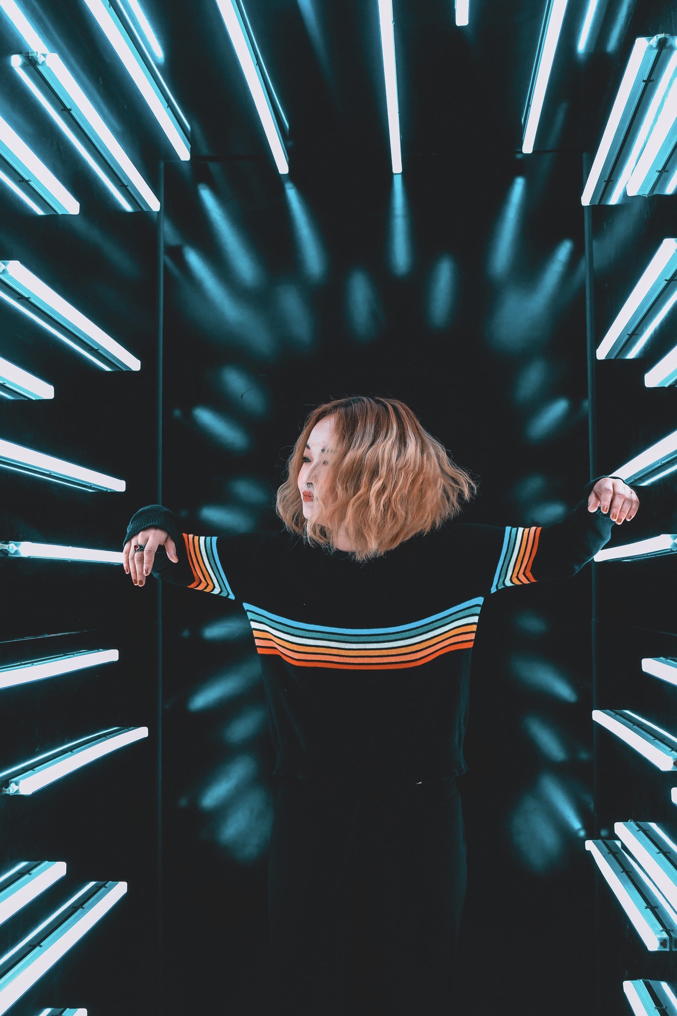
The first step toward a well-balanced look is to map the natural lines of your body and consider how ink and metal interact as you move. Begin by noting the largest expanses—shoulders, forearms, calves, or the spine—and decide which zone should act as the focal point. The goal is to create a visual flow, not a jumble of symbols scattered at random. Think in terms of rhythm: a bold tattoo here, subtle piercings there, and then a quieter middle ground that unifies the entire composition. Visual harmony comes from deliberate spacing, consistent style cues, and an awareness of how light hits your skin.
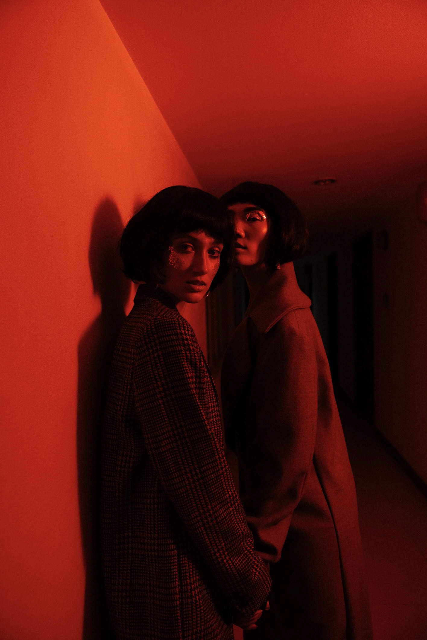
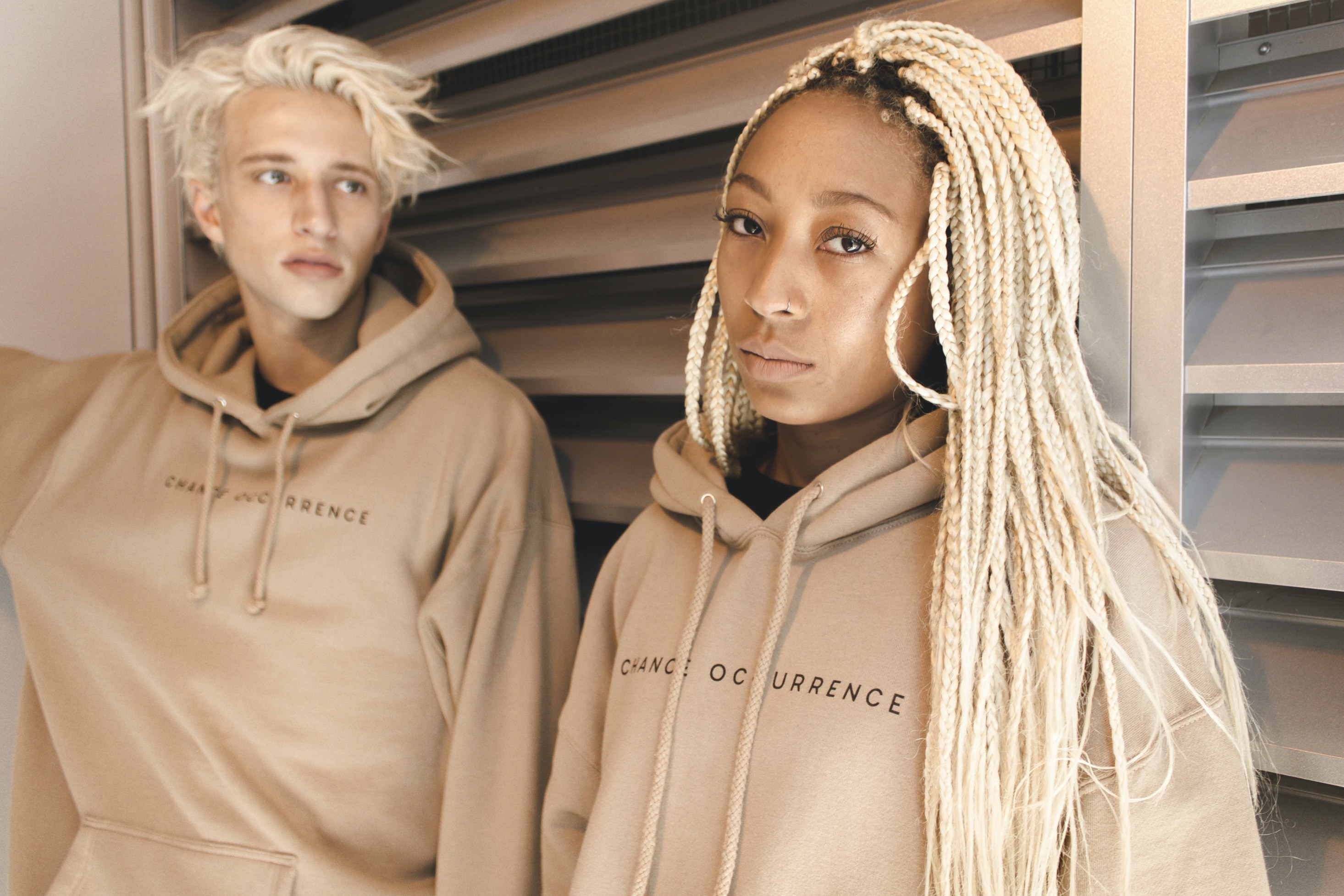
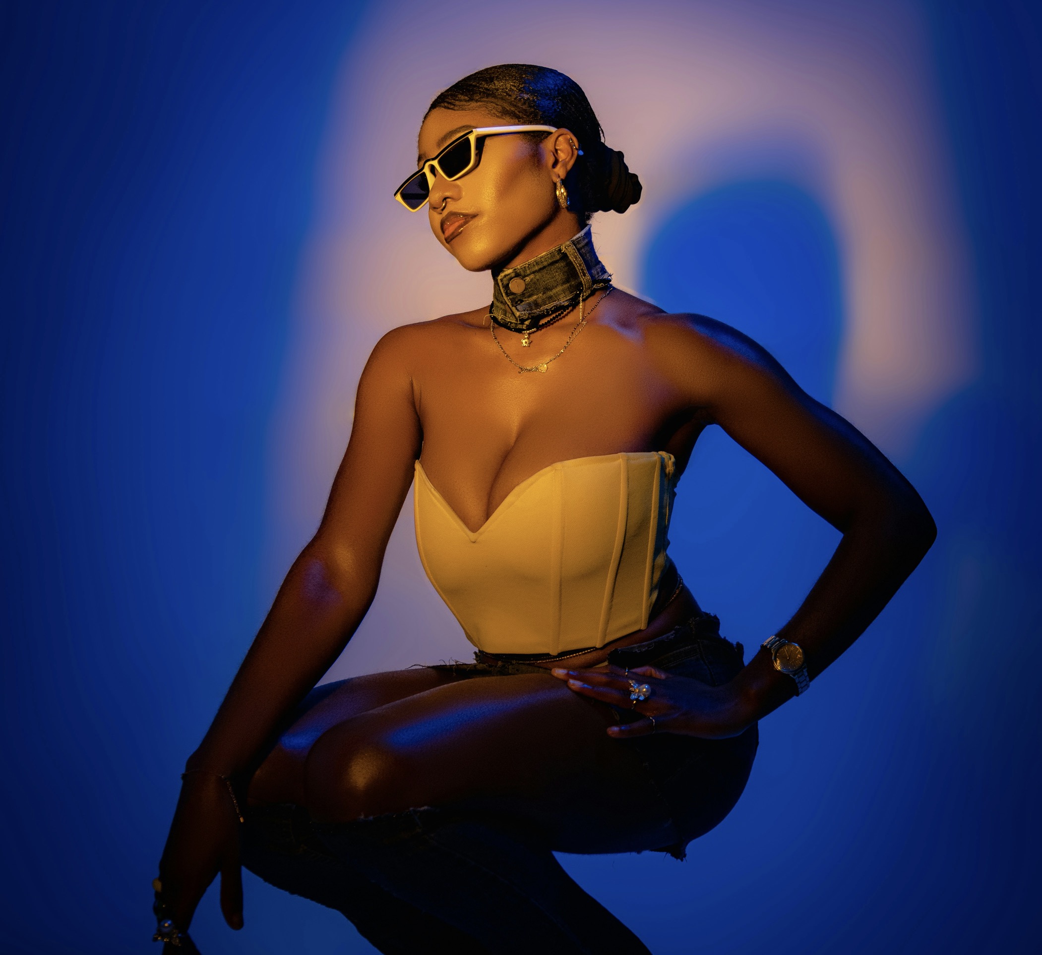
Next, choose a unifying theme for both tattoos and piercings so the elements feel connected rather than competing. This might be a shared motif, such as geometric shapes, botanical lines, or a mythic narrative that threads through multiple placements. When selecting piercing types, favor locations that mirror tattoo lines to reinforce continuity. If your tattoo has sharp angles, consider barbell or stud piercings with similarly crisp lines. For rounded motifs, opt for curved jewelry or soft-lobed placements. Consistency in line weight, color palette, and symbolism helps the zone feel intentional and stylish.
Create flow by linking zones with recurring motifs and spacing.
Establish a primary focal area where the eye lands first, then let secondary areas support and extend the story without stealing attention away. A single, striking tattoo on the upper arm can anchor the look, while a handful of well-placed piercings along the ear, collarbone, or wrists adds texture without crowding. The key is to avoid duplicating heavy details across nearby zones. Instead, distribute bolder elements with lighter ones to create contrast. This approach allows the body’s natural shape to guide the design, ensuring that each addition enhances the overall silhouette rather than competing for attention.
Pay close attention to the scale and negative space around each chosen area. Tattoos should breathe; piercings should punctuate, not overcrowd. If you opt for a large backpiece, keep the surrounding areas simpler—perhaps minimal line work along the arms and small, discreet piercings at the ears or nape. Conversely, a sparser tattoo layout can support more visible, statement jewelry in a coordinated zone. Negative space acts as a visual pause, giving the viewer’s eye room to rest and appreciating the artistry without overwhelm. Balance grows from restraint as much as from bold choices.
Rhythm and repetition unify tattoos with piercings across the frame.
Color strategy matters as much as linework and metal choice. Coordinating ink colors with jewelry tones—blackwork with gunmetal, vibrant blues with silver, or warm earth palettes with rose gold—unifies disparate pieces. If your tattoos rely on a limited palette, mirror that restraint in piercings by selecting a single metal finish and one color gem to maintain cohesion. Alternatively, a monochrome tattoo suite can pair elegantly with bi-metal or mixed-metal jewelry to introduce subtle variety without breaking the harmony. Remember, color consistency across the zones helps the viewer read the design as a single, intentional story.
Consider lighting and how your body displays art at different times of day. Natural daylight reveals true ink tones and metallic reflections, while indoor lighting can alter perceived contrast. When scheduling touchups or new pieces, test how the chosen zones appear under various lights. A location that looks balanced in daylight might gain or lose impact under evening lighting. By visualizing these shifts, you can place new work where it remains legible and striking whether you’re outdoors, at an event, or in a dim room. Practical planning ensures lasting visual impact.
Story, symmetry, and proportion guide your aesthetic decisions.
Work with a designer or artist who understands your goals and can translate them into a mapped plan. A seasoned professional can sketch a layout showing how each element relates to others, helping you imagine line weights, placements, and scale. Ask for a staged approach: first a central piece with surrounding accents, then additional details added in a logical sequence. Collaboration reduces risk and increases satisfaction, especially when you’re balancing multiple disciplines. A clear plan demonstrates commitment to an artful, enduring look rather than an impulsive mood board of random choices.
Build a personal narrative into the arrangement so the zone tells a story you can revisit. Your tattoo motifs could symbolize milestones, values, or a favorite myth. Piercings can act as punctuation marks—tiny, deliberate commas or bold exclamations that emphasize moments in the tale. When your look circulates through different social contexts, the narrative remains consistent, giving people a reason to notice the interplay without feeling overwhelmed. Your visual identity becomes more memorable when each element echoes a larger theme rather than existing as a scattered collection.
Careful upkeep sustains a cohesive, enduring zone design.
Consider symmetry as a powerful organizing principle, especially for locations visible in front-facing situations. A mirrored approach—tattoo lines or shapes on both forearms, paired with corresponding piercings on each ear or across the collarbone—creates a balanced frame that feels deliberate and grown-up. If you prefer asymmetry, maintain a controlled cadence by offsetting one zone while keeping another paired. The crucial point is to avoid a chaotic mix across the torso, legs, or neck. Symmetry or intentional asymmetry should serve the same aim: a cohesive, well-thought-out presentation.
Practical maintenance supports long-term balance. Regular aftercare matters for tattoos, ensuring colors stay vibrant and lines heal cleanly, which preserves their legibility alongside jewelry. For piercings, follow hygiene schedules, check for migration or irritation, and adjust jewelry as needed to avoid pulling on delicate ink lines. If a piercing forces a temporary change in hair or clothing, choose pieces that won’t clash with your evolving look. Consistent care preserves the visual relationship between ink and metal, letting the zone continue to read clearly over time.
When planning a future addition, revisit your baseline map and measure the impact of new placements against your existing work. Additions should feel like natural extensions of the storyline, not quick experiments. If your initial layout centers on a bold piece, consider smaller supportive accents that reference the same motif. Conversely, a new feature should introduce a fresh but complementary element that doesn’t overshadow established anchors. A thoughtful update preserves the sense of progression and helps your overall look grow with you, rather than requiring a complete rework.
Finally, embrace personal style as the ultimate guide. What resonates emotionally becomes visible in how you curate details, from the angle of a tattoo to the kind of jewelry you choose. Use your everyday behaviors—where you stand, how you move, the outfits you favor—as a testing ground for balance. When you tune into what feels authentic, the zone translates into a tasteful, enduring statement. Your body becomes an evolving gallery where ink and metal communicate a shared message, and every new piece feels like a natural chapter rather than a disruption.