Choosing the right studio lighting and photography for accurate tattoo portfolio shots and client previews.
Lighting in tattoo photography is not just about brightness; it defines color fidelity, texture, and mood. A thoughtful approach blends equipment, technique, and studio workflow to produce consistently honest results that clients trust and artists celebrate.
In tattoo photography, lighting is the backbone of truth in imagery. Start with a clear goal: accurate color reproduction and visible skin texture that conveys ink depth without distortion. A controlled space helps you avoid mixed spectra that shift hues. Invest in a reliable lighting kit with soft, diffuse sources to minimize harsh shadows while preserving details. Position lights to sculpt the design, highlighting line work and shading even in small areas. Beyond tools, establish a standard shooting protocol—white balance presets, calibrated exposure, and a consistent backdrop—to ensure repeatable results across sessions and clients, every time.
A well-planned light plan considers skin tone diversity and ink saturation. Use a key light that distributes gentle illumination over the tattoo, paired with a fill light to reduce hard shadows. For larger pieces, add a backlight or hair light to separate the client from the background and reveal subtle ink layering. White or neutral-gray backdrops enhance color accuracy by providing a stable reference. Avoid high-gamma screens or gels that artificially warm or cool tones. Calibrate your camera with a color target, then test on a few volunteers with different skin tones. The goal is a faithful image library that represents real-world appearances without edits masquerading as truth.
Managing color fidelity and tonal range across diverse tattoos.
The first pillar of dependable portraits is a consistent white balance routine. Begin by placing a neutral target in the frame and lock it into your camera profile. Shoot a gray card before each session and adjust the exposure in manual mode to ensure skin tones stay natural. When capturing tattoos, keep the white balance steady even as the subject changes position. A small shift in color temperature can alter ink appearance dramatically. Document your settings at the start of the session so future shoots can reproduce the exact lighting conditions. Consistency reduces post-processing time while preserving authenticity across your portfolio.
Exposure control matters as much as color accuracy. Use a moderate contrast setting to preserve fine lines and subtle gradients without clipping highlights. Tattoos often have sharp blacks and soft shading; your histogram should reflect a balanced distribution. If you rely on automatic exposure, you risk creeping shadows or blown highlights as the tattoo stretches or tilts. Manually meter around the central motif to protect detail in the core design, then fine-tune with a touch of fill to reveal surrounding skin texture. Consistent exposure aligns images from different sessions, which strengthens the portfolio’s credibility for clients checking consistency.
Consistency in equipment and technique across sessions.
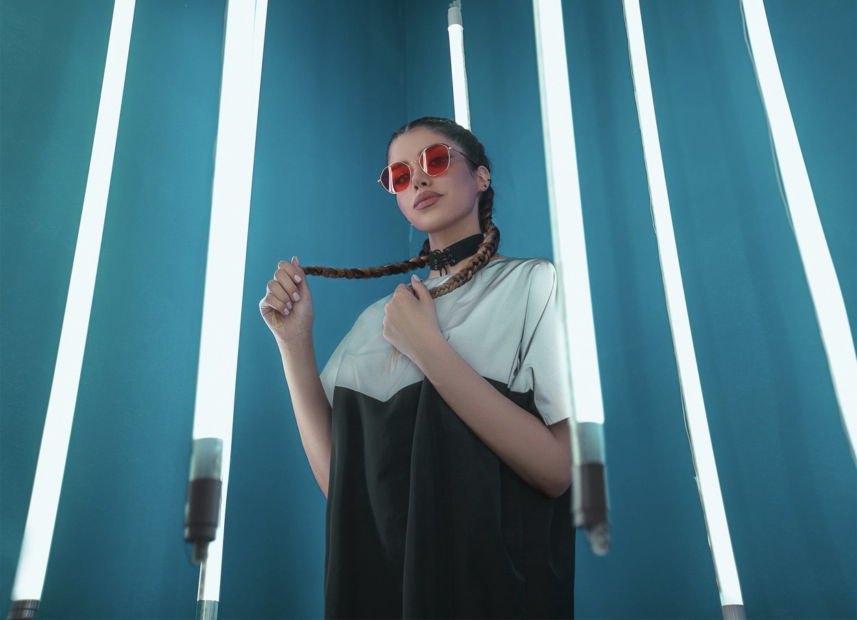
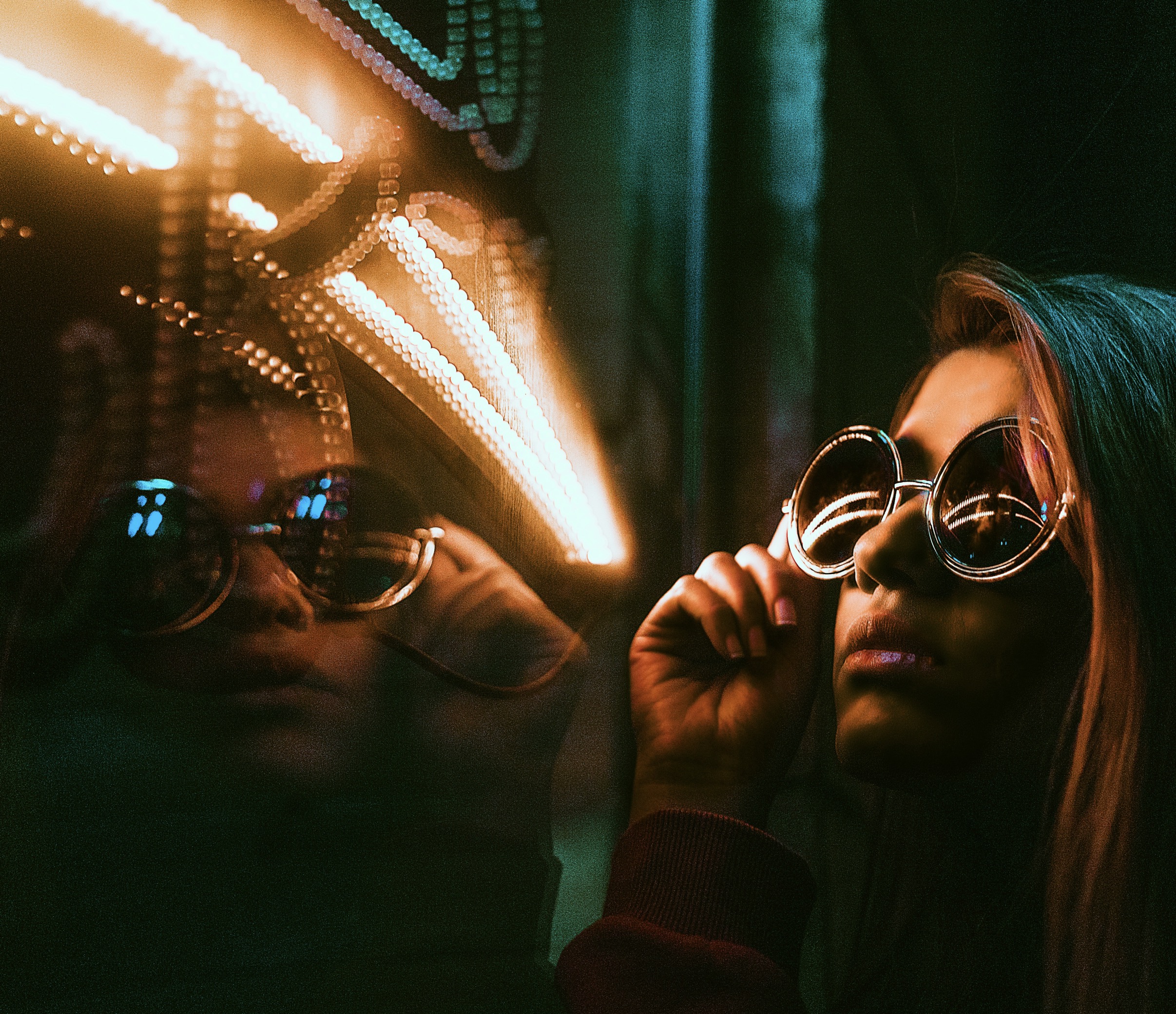
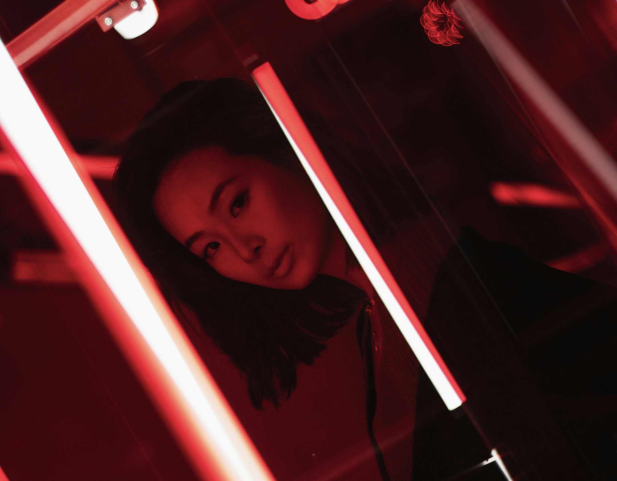
Lighting placement influences perception of texture and depth. A common setup uses a key light at about 45 degrees to the tattoo, with a secondary fill on the opposite side to soften shadows. Consider a gentle rim light behind the subject to create separation from the backdrop, especially with busy backgrounds or dark garments. If your studio has colored walls, neutralize them with a white bounce board to keep the ink colors true. Avoid window light unless you can control it with blackout curtains. Consistency in light direction prevents odd reflections on gloss finishes and maintains uniform texture visibility across multiple angles and sessions.
Practical studio practices reinforce lighting reliability. Keep cords tucked away and maintain a clutter-free shooting area so reflections don’t creep into the frame. Use a standardized lens choice for all tattoos in your portfolio—often a moderate telephoto or macro for detail—and set a fixed focal length to preserve perspective. Implement a behind-the-scenes checklist that includes camera settings, lighting ratios, white balance, and background choice. Regular equipment maintenance, such as cleaning the lens optical path and refreshing batteries, minimizes interruptions. These habits help you deliver clean, consistent results that clients can trust as a true representation of their artwork.
Techniques for clean detail and true color in tattoos.
Posture and camera distance dramatically affect perceived ink size and detail. Maintain a predictable shooting distance for every piece to preserve proportional accuracy. Use a stable tripod and a level head to avoid perspective shifts when clients move or adjust positions. For flat tattoos, fill the frame with a comfortable margin; for sleeves or chest panels, compose with negative space to avoid crowding the image edges. Communicate clearly with the client about how their pose will influence lighting and shadow. A comfortable, well-informed subject results in steadier, more natural expressions, which in turn enhances the reliability of the final photographs.
Composition should prioritize legibility of the artwork. Include contextual cues that help a viewer gauge scale—like a portion of the client’s arm or torso in frame—without distracting from the design. Avoid busy backgrounds; instead, use a neutral backdrop and minimal props that don’t intrude on color or line work. When cropping, keep ink lines crisp and consistent across images. Build a reference library organized by body area, ink color family, and shading style so future projects can quickly match lighting and tonal expectations. Strong composition supports accurate client previews and portfolio credibility.
Ethical transparency and client previews after shooting.
Detail capture hinges on close focusing and micro-contrast control. Use a lens with shallow-to-medium depth to separate tattoo from skin while maintaining edge definition. Shoot at a slightly smaller aperture to increase depth of field around the design, then test if a wider aperture preserves essential textures. Preserve skin microtexture, such as pores or fine lines, to convey realism without exaggeration. Color grading should be minimal and reversible, relying on planned white balance adjustments rather than heavy post-processing. The aim is to preserve the tactile feel of the ink, allowing prospective clients to understand how a tattoo will look in real life.
When portraits accompany tattoos, skin tones deserve the same degree of care as ink. Maintain even illumination to minimize color shifts across exposed areas. If the tattoo spans multiple tones, adjust light intensity to keep each hue faithful without flattening texture. Polite retouching can address minor shine or uniformity, but avoid drastic alterations that misrepresent the piece. Document any edits for client transparency. The most ethical approach is to publish images that reflect the true appearance, ensuring artists and clients share the same expectations about the final result.
Client previews rely on clear communication and accessible proofs. Provide unedited proofs in a dimmed preview environment to prevent glare creating false impressions. Show multiple angles and close-ups to convey contour, shading, and line weight. Include brief notes on lighting setup and color accuracy so clients understand the conditions under which the images were captured. Offer a selection of final images with consistent color and exposure, while maintaining a simple, honest disclaimer about possible minor variations in real life. Transparent previews build trust, encourage informed decisions, and set the foundation for confident commissions.
Finally, document and refine your studio workflow. Create a standardized checklist covering space layout, lighting configuration, camera settings, and post-processing steps. Regularly review your portfolio for consistency in color, contrast, and composition across tattoos of different sizes and placements. Seek feedback from other photographers or tattoo artists to identify subtle biases in lighting or retouching that might misrepresent work. Embrace continuous learning: tweak placements, test new lights, and update your color profiles to keep your shoots reliable, ethical, and evergreen for years to come.