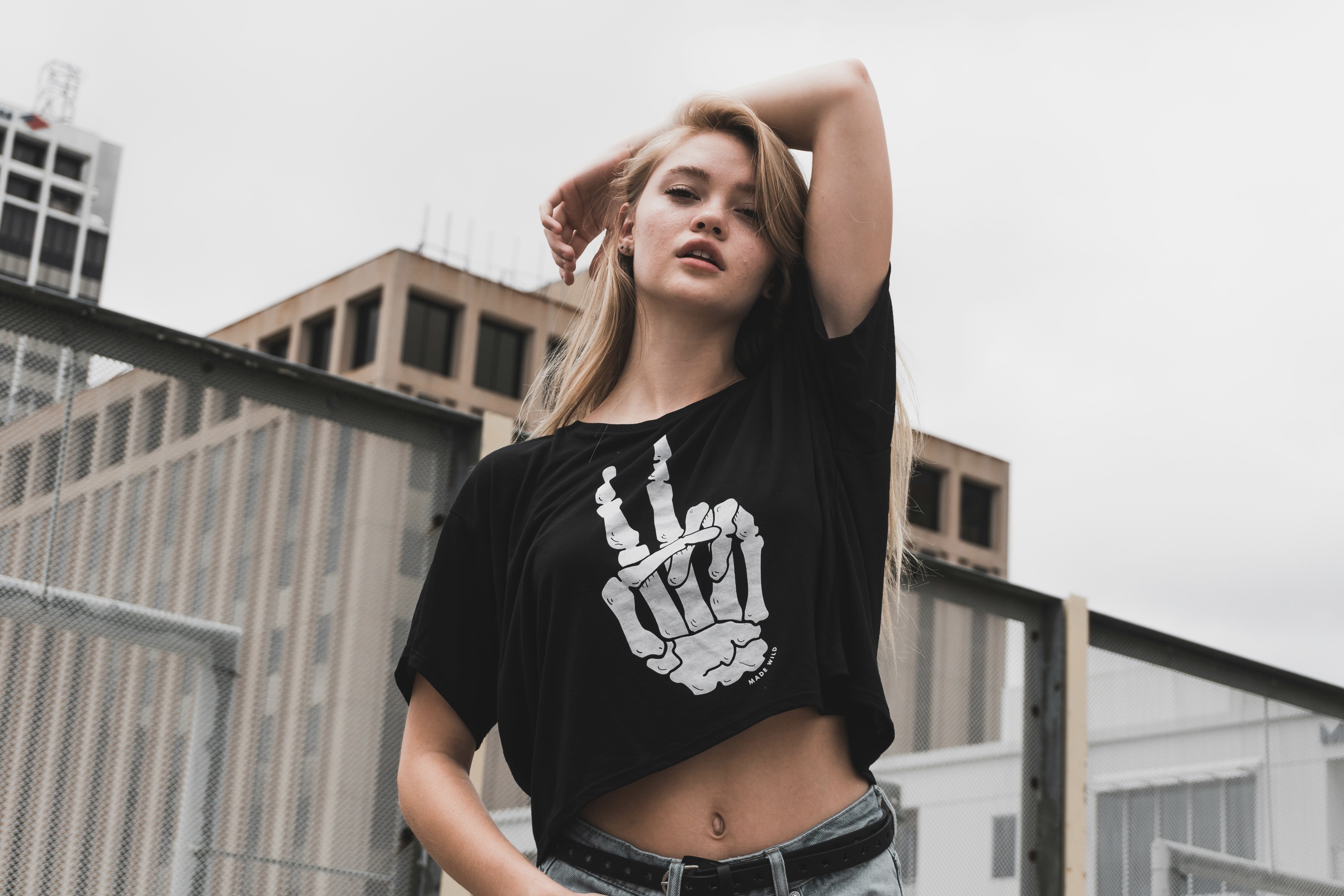
Colorful tattoos and blackwork form a visual dialogue, where light, saturated hues demand attention while dense black lines provide gravity and structure. The key is balance: let color breathe against black as you would sunlight against a midnight skyline. Designers and clients should map out a narrative that assigns color to focal moments and blackwork to framing shapes, negative space, and texture. Consider line weight, shading, and color saturation to ensure the piece remains legible as the skin ages. A well-planned contrast helps both the piece and the person evolve over time, maintaining clarity through evolving skin tone and aging ink.
Before needle meets skin, study reference images that show how color behaves beside solid black. Observe how color blocks interact with thick outlines and how small, densely shaded areas can anchor a larger field of color. Discuss preferred temperature ranges—cool versus warm hues—and how they render against black outlines. Skin undertone matters; people with cooler undertones often find brighter, jewel tones pop against black, while warmer complexions can hold richer oranges and greens without saturating. A thoughtful palette and an aware technique ensure longevity and readability across ages and sun exposure.
Color placement and line work must harmonize with body form and motion.
The practical process starts with an integrated design brief shared by artist and client, detailing where color accents will land and where blackwork will frame edges and create textures. Creating rhythm through repetition of black motifs—dots, crosshatching, or geometric bands—helps the eye travel smoothly across the composition while color punctuates critical moments. Carvers of ink should consider skin curvature, muscle movement, and action lines that might distort straight edges over time. By forecasting these dynamics, the tattoo remains legible in motion, and the contrast remains intentional rather than accidental, preserving the piece’s clarity during daily activities and aging.
A crucial technique is staggered layering: apply clean black lines first, then introduce color in transparent, buildable layers rather than solid fills. This method reduces color bleed into outlines and preserves the stark edge that blackwork demands. For larger color fields, use gradients and selective shading to mimic natural depth without overwhelming the black framework. Aftercare guides should emphasize hydration and sun protection, since UV exposure can fade color unevenly, while black ink tends to retain its density. Regular touch-ups may be necessary to realign the balance as the body changes.
Storytelling through motif, mood, and material yields lasting contrast.
Mastering contrast requires thoughtful color sequencing across panels or limbs, ensuring that hot and cool tones appear where they will age gracefully. For instance, reserve high-saturation colors for areas that won’t stretch or fold excessively, while blackwork anchors movement-rich regions with consistent lines. Consider the energy of the piece: a high-contrast sleeve should feel cohesive rather than disparate, so connect panels with shared motifs and recurring motifs in the blackwork. By respecting anatomy and biomechanics, the tattoo remains legible during flexion, contraction, and long-term skin changes.
When choosing subjects, select motifs that translate well into both color and black. Floral petals, geometric lattices, and illustrative silhouettes adapt cleanly to black outlines and get enhanced by vivid fills. Avoid overly detailed scenes in dense color blocks that might blur as ink settles; instead, favor crisp silhouettes and restrained shading that allow the blackwork to define form. The best outcomes unify narrative content with a visual rhythm, so observers read the story clearly from distance and up close, with color leading the way and blackwork offering gravity.
Technique, maintenance, and personal meaning shape timeless contrast.
Lighting considerations are often overlooked in planning. Tattoos read differently under daylight, flash, and indoor lighting, so test how color and black on the same area shift with illumination. Under natural light, some colors appear brighter, while black lines dominate structure; indoors, color can lose tensile strength without enough saturation. A skilled artist calibrates pigment density and line continuity to minimize performance gaps across environments. The wearer should also be mindful of how cosmetics, skincare products, and sweat can temporarily alter appearance. Long-term maintenance includes periodic cleaning and mindful sun exposure to preserve the intended contrast.
The social and personal meanings behind color choices deserve equal attention. Color carries emotion and symbolism—blue for calm, red for energy, green for renewal—while blackwork often conveys resilience and formality. Aligning both aspects creates tattoos that tell a coherent story across sessions and decades. Clients should feel empowered to re-evaluate symbolism as their life evolves, adjusting expectations for future additions or modifications. Thoughtful conversations with the artist about preferred symbolism help the final piece stay relevant and visually potent over time, ensuring the contrast remains a deliberate stylistic signature.
Collaboration, care, and curiosity sustain striking, lasting contrast.
Maintenance plans should factor in skin type, climate, and activity level. Abrasion, friction, and frequent shaving can wear down color faster, yet proper sunscreen and moisturizers help maintain vibrancy. Artists often recommend a gentle cleansing routine and avoiding harsh exfoliants on the tattoo for the first weeks post-ink. Afterward, regular hydration supports both color and line integrity, while sun protection minimizes fading and glare that can dull the blackwork’s crisp edges. When color begins to dim, a carefully timed refresh can restore the intended balance, preserving the original contrast without over-saturation.
The role of professional expertise cannot be overstated in ensuring durable results. A capable artist knows how to pre-calc color layering, stabilize inks, and choose pigments with superior lightfastness. Blackwork demands precision in needle control, consistent depth, and reliable line consistency to maintain sharp boundaries around color fields. Clients should review portfolios for examples of compatible color sets and edge precision before committing. Ongoing communication about expectations, healing progress, and any changes in lifestyle helps refine timing for touch-ups, ensuring the piece remains harmonious and readable for years to come.
A successful project hinges on clear communication about pain tolerance, session length, and healing milestones. Setting realistic goals reduces the tendency to rush corners or cram too much detail into a single sitting, which can blur contrasts. Photographs from multiple angles during the design phase support accuracy in line weight and color balance, serving as references for later work. Equally important is listening to the wearer's feedback after each session; adjustments in future sessions can optimize line clarity, spacing, and color saturation to preserve the intended visual impact.
Finally, embrace the evolving conversation between color and blackwork as a personal evolution. People change, tastes shift, and skin changes with time, yet a well-planned, consciously executed tattoo can grow with you. The strongest pieces retain their legibility and mood while adapting to life’s stages, weathering trends without losing meaning. A mindful approach to color selection, blackwork density, and surrounding negative space creates a living artwork that remains striking, legible, and deeply personal across decades.