How to select muted tattoo palettes for understated elegance without losing visual impact
When choosing muted tattoo palettes, balance is key; explore tonal ranges, skin undertones, and evolving trends to achieve a timeless look that remains expressive, refined, and eye-catching without shouting for attention.
Muted tattoo palettes are a study in restraint, requiring a careful blend of color theory and personal resonance. Begin by surveying the core tones that define your aesthetic: earthy beiges, soft taupes, dusty olives, and muted blues can all serve as foundations without overpowering the skin. The goal is to create depth with subtle contrast rather than loud saturation. Consider how each shade interacts with your natural undertones—cool, warm, or neutral—and test small swatches on the area to gauge how light exposure will alter perception over weeks. A restrained approach often yields longevity, as color stability tends to outlast trends while maintaining a quiet sophistication.
To translate muted palettes into lasting visual impact, think in layers rather than single hues. Start with a base that matches or gently undercuts skin tone, then introduce one or two secondary shades to carve gentle dimension. Fine line work or stippling can yield texture without heavy color, allowing the design to breathe against the skin. The line weight should be deliberate but subtle, avoiding stark delineations that disrupt harmony. Remember that the choice of needle configuration and shading technique can dramatically affect the perception of tone, so discuss these details with your artist to ensure the palette remains cohesive as it ages.
Balanced tones create enduring charm while preserving modern thrift.
When selecting muted inks, it helps to borrow from nature’s own palette, where color exists in nuanced gradations rather than bold bursts. Consider minerals and plant-derived tones such as clay browns, moss greens, granite grays, and clouded blues—colors that age gracefully and fade with elegance rather than clashing with evolving personal style. A well-chosen muted palette respects the skin’s texture, allowing the tattoo to merge with the contour of the body rather than fight it. Discuss permanence and fading with your artist, as some pigments shift subtly over time, influencing both contrast and readability. This foresight prevents surprises down the line.
Preparing the skin and choosing placement are integral to how muted colors perform. Areas with even surface and consistent sun exposure respond more predictably to subtle inks than highly textured or highly tanned zones. Consider placements that allow gradients to travel along natural lines—wrists, collarbones, shoulders—where the eye can trace soft transitions rather than abrupt changes. Before committing, observe how the piece looks under different lighting, including cool daylight and warm indoor bulbs. The aim is a design that remains legible and refined without relying on high saturation. When in doubt, opt for a smaller, cleaner composition that functions as a quiet signature.
Quiet, refined color choices withstand changing fashion cycles.
The psychology of muted palettes hinges on restraint and storytelling. Rather than announcing a statement, a quiet tattoo invites conversation through suggestion. Tell a personal story with a minimal motif: a line or a delicate motif that represents a memory, a place, or a sentiment. The color choices should echo that narrative, reinforcing mood rather than color-blocking attention. If your artist offers a monochrome or near-monochrome option with minimal color shift, lean into it. A palette rooted in tonal harmony often ages with grace, allowing the wearer to reinterpret the piece as style evolves. This approach keeps the tattoo relevant across decades.
Practical care complements the aesthetic, preserving the integrity of muted hues. Aftercare should emphasize gentle cleansing, moisturization, and sun protection, because UV exposure accelerates pigment change in cooler tones. Use mineral-based sunscreen and lightweight moisturizers that won’t clog pores or disrupt delicate color transitions. Avoid exfoliants that abrade pigment unevenly, which can make lines blur or tones appear patchy over time. Schedule periodic touch-ups with your artist to restore clarity without inflating saturation. A small refresh keeps the original intent intact and maintains the softness that defines understated elegance.
Technique and patience shape timeless understated outcomes.
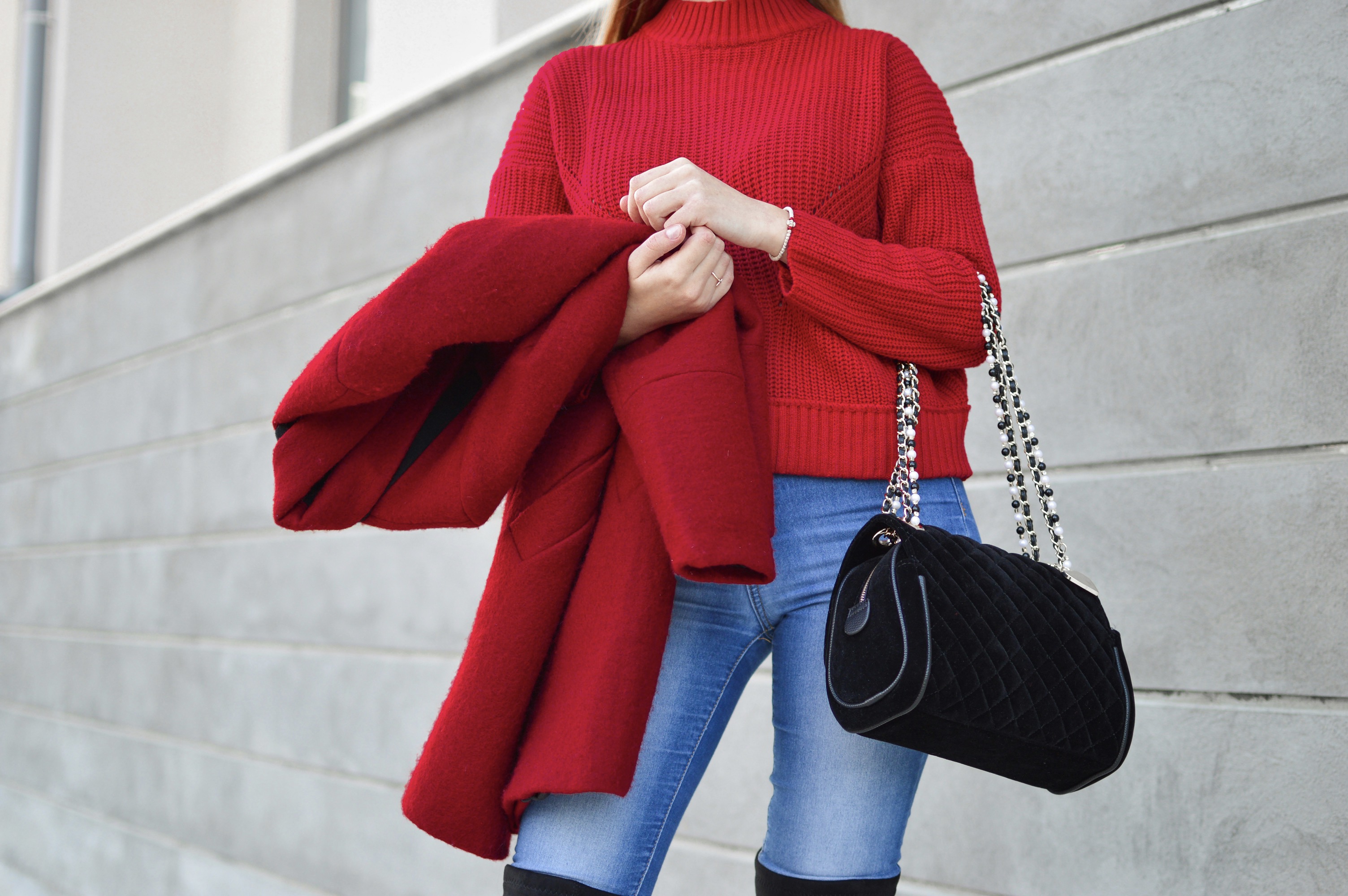
The decision to pursue muted pigments also involves considering your wardrobe and lifestyle. A palette that harmonizes with your everyday outfits enhances the tattoo’s presence without demanding attention. If your wardrobe leans toward earth tones, blues, and soft neutrals, your ink should mirror that aesthetic to maintain cohesion. Conversely, if you frequently wear bold prints, a subtler tattoo can provide balance, preventing clash while still offering a point of visual interest. The aim is synergy between body art and personal expression, where neither overwhelms the other but rather informs a unified style narrative.
Another practical lever is the artist’s expertise with shade transition. Subtle shading should feel like natural shading of the skin rather than an artificial fill. Techniques such as feathering, stippling, or micro-blending can create a soft gradient that reads as a whisper of color rather than a loud proclamation. The safest muted palettes rely on a narrow spectrum of pigments that cooperate under the artist’s stroke, producing a cohesive field of color and negative space. Ask to see examples of faded works to understand how the palette matures over time, and simulate finish options to visualize aging.
Intentional choices forge a lasting, elegant impression.
For those who crave structure, a modular approach to muted tattoos can be transformative. Break the design into interconnected elements—thin lines, tiny shapes, and small negative spaces—that collectively tell a larger story. Each module can use a slightly different shade within the muted spectrum, ensuring depth without increasing saturation. The layout should guide the eye with rhythm, so the composition feels intentional rather than incidental. In practice, this means collaborating with the artist on a grid-like plan that respects contour, motion, and asymmetry. The result is a sophisticated tattoo that remains legible and refined, even as body dynamics shift with aging.
The cultural and personal dimension of muted palettes adds another layer of value. Many communities value tattoos that convey meaning through subtlety, honoring traditions that favor restraint over flamboyance. If your inspiration draws from heritage motifs, translate them through refined lines and soft tones that honor the past while speaking to contemporary tastes. Tattoos with a quiet voice can become heirlooms, passed down and reinterpreted by future wearers. By choosing palette and line work with intention, you invest in a visual artifact that transcends fad and speaks to a refined sensibility.
When in doubt, start with a consult that centers on visuals, not just technique. Bring reference images that illustrate your preferred mood, scale, and color balance, along with notes about where the piece will be worn most often. A good artist will translate those cues into a preliminary stencil that demonstrates how muted tones perform on your skin. Evaluate the draft in daylight and under indoor lighting, and request adjustments if lines appear too stark or tones too aggressive. This collaborative process reduces surprises after healing and helps ensure the final piece remains aligned with your vision.
In the end, choosing muted tattoo palettes is an exercise in felt sense as much as color science. It requires patience, honest self-reflection, and a willingness to let the ink evolve with you. By prioritizing skin-friendly hues, delicate line work, and thoughtful placement, you craft a work of art that feels personal yet universally elegant. Whether you’re a longtime collector or a first-timer, the aim is a timeless expression that endures across seasons. With careful planning and a trusted artist, your understated tattoo can be both subtle and striking, a quiet signature of refined taste.