To begin, identify the core symbol you want linked with a jewelry piece. Small tattoos often carry personal meaning, so translating that meaning into a mockup requires clarity about scale, orientation, and context. Start by choosing a simple glyph or motif that prints clearly on metal or gemstone surfaces. Consider how the line weight and negative space will behave when transferred to a ring, pendant, or bracelet charm. A symbol with clean geometry tends to translate more faithfully than intricate artwork. Create several sketches that experiment with size, alignment, and edging. This foundation helps you compare aesthetics across different jewelry formats.
Next, digitally render the symbol onto a 3D model of the intended piece. Use texture maps to mimic skin tone or material color at the exact location where the tattoo would appear. This step helps you foresee how the tattoo will age with wear and whether the ink’s contrast will withstand lighting conditions. Pay attention to the silhouette of the jewelry and how the tattoo interacts with curves and flat planes. If a wearer plans multiple pieces, ensure the symbol reads consistently on each item. Consistent branding across pieces fosters a cohesive collection and a harmonious look when worn together.
Visual consistency across multiple pieces and angles
When the symbol sits near a clasp, setting, or chain, consider how jewelry mechanisms alter visibility. A tattoo placed near a hinge or pivot might obscure detail or blur edges over time. To counter this, adapt the symbol’s composition so key lines stay clear, even when the piece moves. You can slightly exaggerate line thickness or elongate curves to maintain legibility. Additionally, test the tattoo’s position on different sizes of rings or pendants. A compact mark on a petite ring may demand bolder strokes, while a larger pendant invites a refined approach. The goal is legibility without sacrificing elegance.
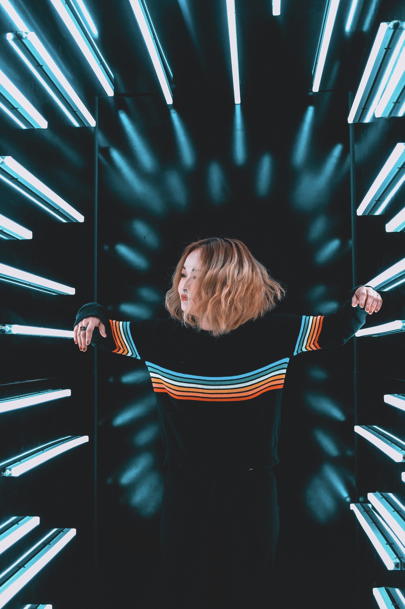
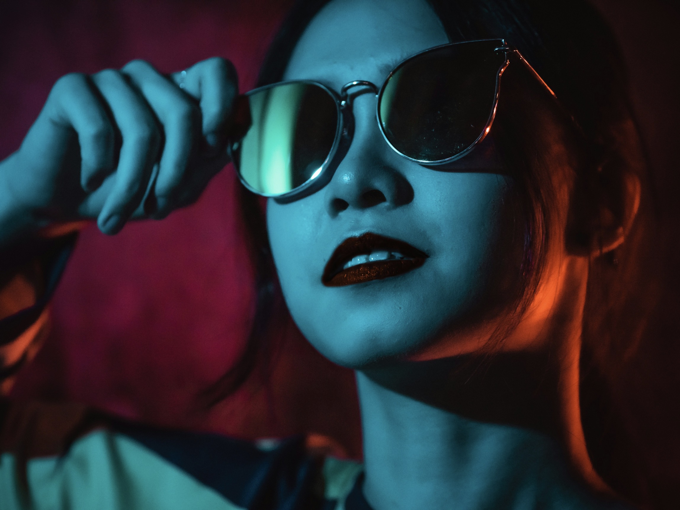
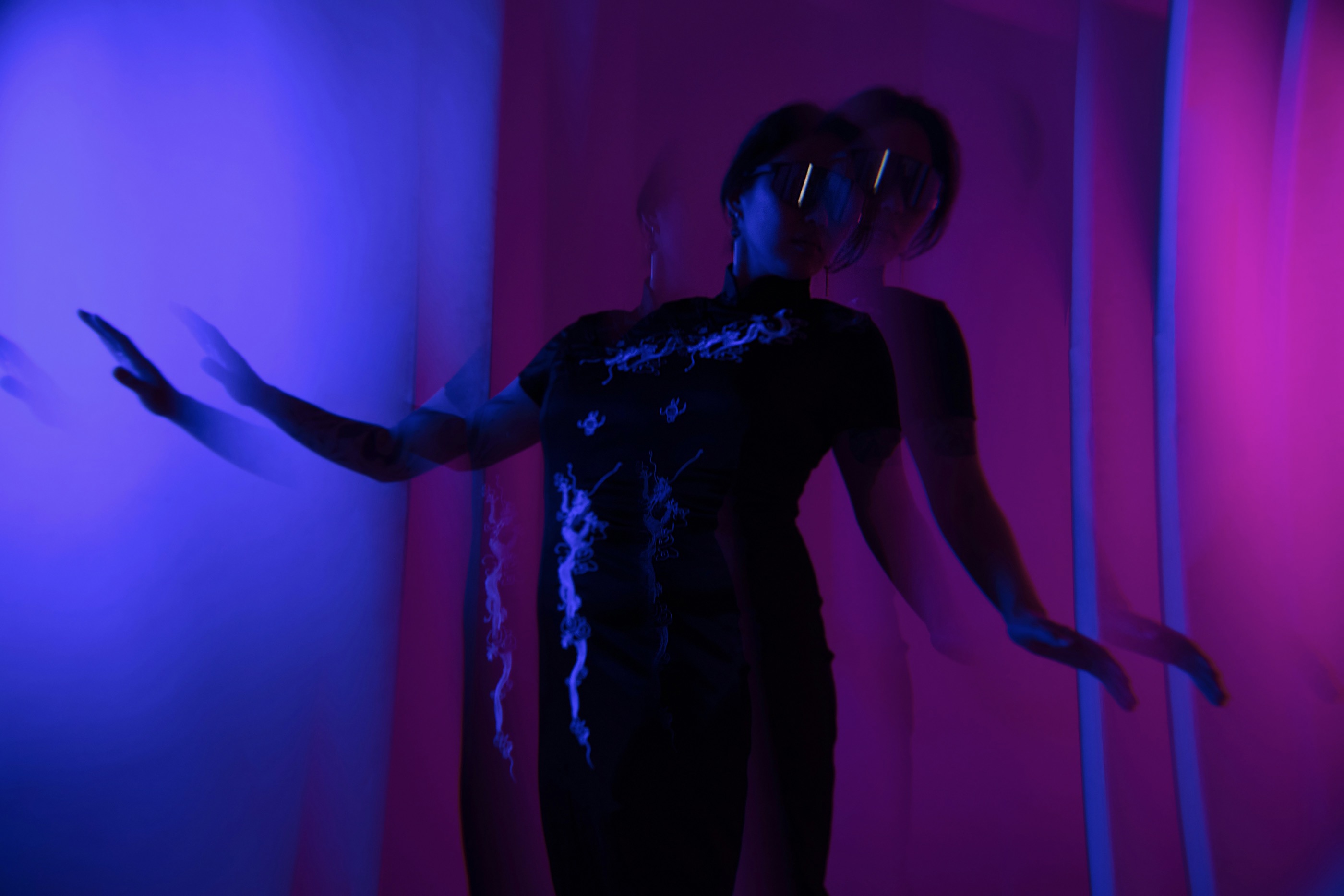
Lighting and reflection dramatically affect how a tattoo mockup reads. Use multiple lighting scenarios, including soft ambient, direct highlight, and low-light ambiance, to observe readability. Shadows should enhance, not obscure, the symbol’s form. If the wearer prefers a subtle approach, implement a subdued version with thinner lines and softer contrast. For a bolder aesthetic, opt for darker fills and sharper edges. In all cases, keep the symbol visually balanced with the jewelry’s proportions. Start with a neutral baseline, then add variations that show how the piece would appear alone and when worn on different skin tones or materials.
Techniques for accurate transfer and preview fidelity
Expanding the concept to a multi-piece set requires consistent anchoring elements. Choose a unifying feature—such as a specific line style, motif geometry, or a recurring flourish—that appears on every item. This harmony ensures that, when worn together, the tattoos lend a sense of continuity rather than competing with the jewelry. Create a style guide for the symbol’s usage: preferred ink density, stroke direction, and edge treatment. The guide helps manufacturers reproduce the look faithfully across production runs. When designers and clients review the mockups, they can quickly assess whether the collection feels cohesive and intentional.
Another essential consideration is the wearer’s comfort and skin interaction. Tattoos are inherently about personal skin experiences, but jewelry introduces mechanical interaction. Ensure the symbol’s placement avoids zones prone to friction or irritation. Test for readability in typical daily activities: typing, gripping objects, or resting a hand on a table. If necessary, reposition elements to minimize wear on the tattoo while preserving visibility. Additionally, consider how different metals react with skin chemistry. A gold-tone surface can subtly alter ink appearance compared to cooler silver tones, influencing perceived contrast.
Engaging clients with interactive preview experiences
To simulate real-world wear, combine 3D rendering with tactile mockups. Create physical samples using resin or silicone with printed decals that mimic tattoo ink. These tangible previews let clients interact with the scale and texture more intuitively than screens alone. Pay attention to depth cues: raised or recessed ink can suggest permanence versus impermanence, guiding aesthetic choices. Include measurements for the tattoo’s width, height, and edge radius so that the designer can faithfully replicate the look in metal or gemstone in production. A well-calibrated mockup accelerates decision-making and reduces revision cycles later.
Lighting a mockup to resemble real skin is challenging but crucial. Use light sources that mimic daylight, tungsten, and studio LEDs to observe how color shifts affect legibility. Skin undertones influence ink perception, so incorporate a few skin-tone gradients in your renders. If the symbol includes fine lines, consider a micro-etch technique on metal to imitate tattoo texture without sacrificing durability. Document your rendering parameters clearly so artisans can reproduce consistent results. When buyers see a convincing preview, they gain confidence in the final jewelry’s personality and symbolism.
Practical steps to finalize tattoo-inspired jewelry concepts
Interactive previews invite clients to experiment with placement, scale, and combinations. A digital gallery that lets users drag the symbol along different parts of a jewelry piece fosters personalized exploration. Provide presets for common placements, such as close to the clasp, at the center of a pendant, or along a curved edge of a bracelet. Include quick comparisons of variations, so clients can assess how subtle adjustments alter mood. The best experiences blend aesthetics with storytelling, letting clients feel how the symbol aligns with their life narrative. A successful preview invites emotional connection and informed choices.
Beyond static previews, offer dynamic simulations showing movement and wear over time. Animate the jewelry on a rotating pose to reveal how the tattoo appears from multiple angles during daily activities. Simulated wear patterns can illustrate how the ink might fade or sharpen with movement, helping clients decide on ink density and line weight. Provide a simple checklist for final approval: placement, size, contrast, and overall balance with the piece. When everything aligns, the proof of concept becomes a persuasive argument for production.
Compile everything into a concise presentation that pairs visuals with narrative context. Explain why a specific symbol was chosen and how it complements the jewelry’s form. Include notes on maintenance, potential aging effects, and care instructions that protect both ink-inspired aesthetics and metal integrity. A transparent briefing helps clients understand trade-offs between detail and durability. Also, outline customization options, such as adjustable placements or alternative symbols for future collections. Clarity in the briefing fosters trust and keeps the project on schedule while preserving creative intent.
Finally, prepare production-ready assets that translate the mockups into manufacturing instructions. Deliver vector outlines for engraving or stamping, texture maps for surface finishes, and tolerances for fit and wear. Provide color and contrast references so jewelers can reproduce the tattoo-inspired look accurately across batches. Include variation guides for different metals and stone settings, ensuring the symbol remains legible under varied conditions. With these tools, the collaboration between designer, client, and craftspeople becomes efficient, reliable, and capable of sustaining a cohesive brand story.