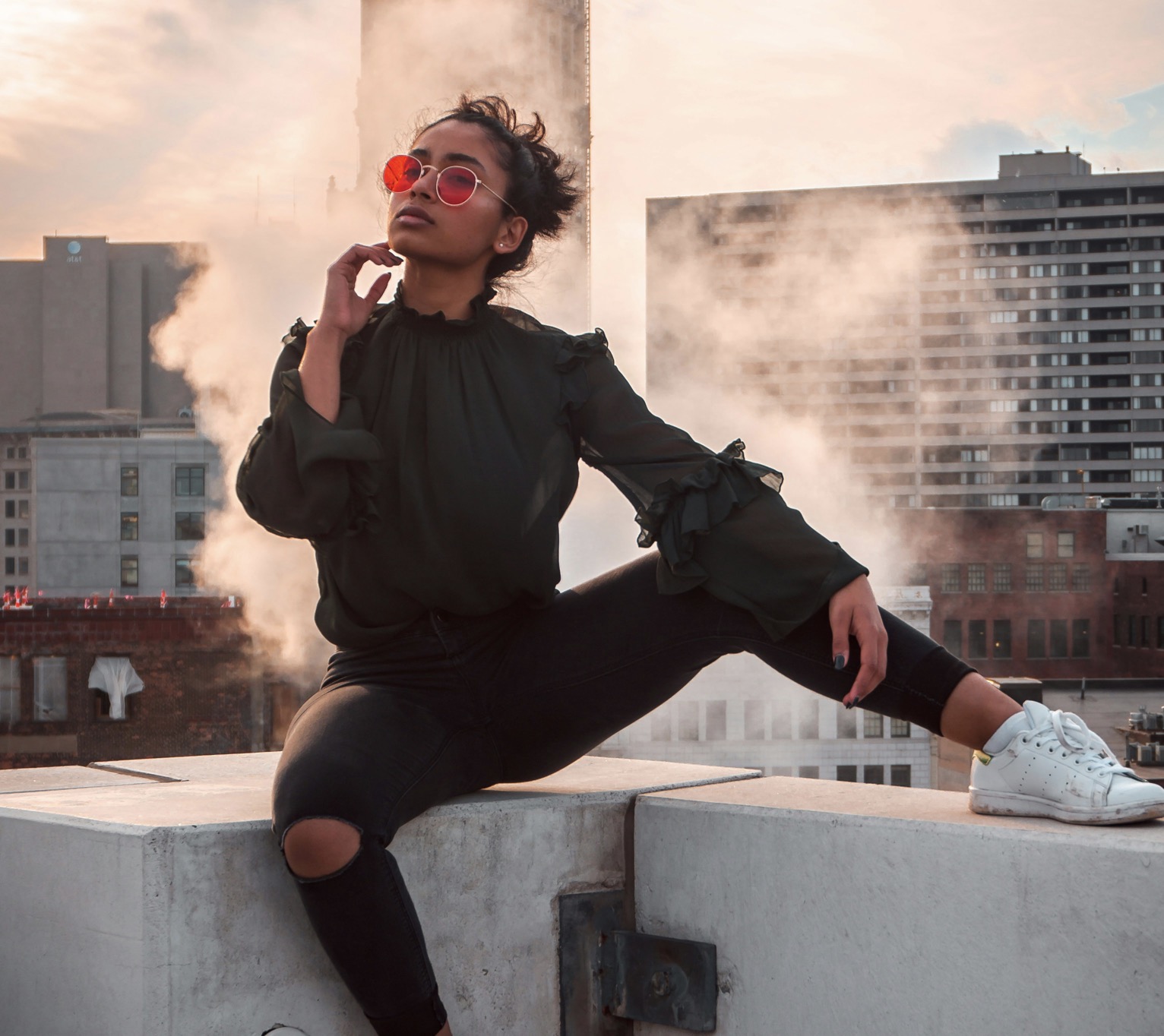
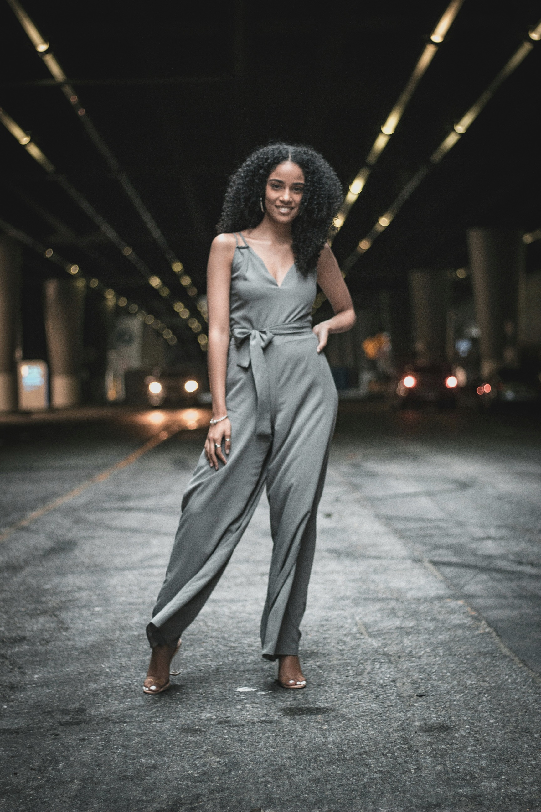
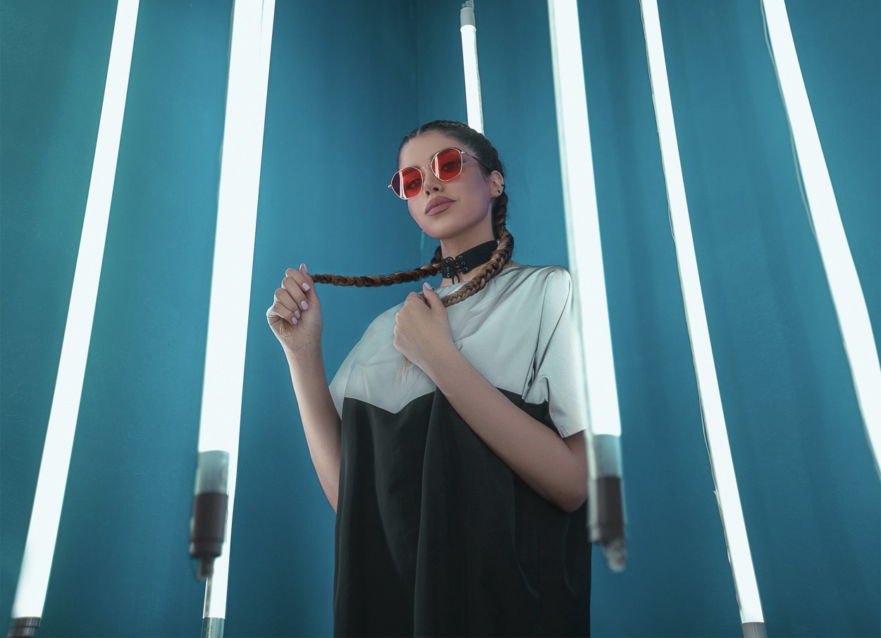
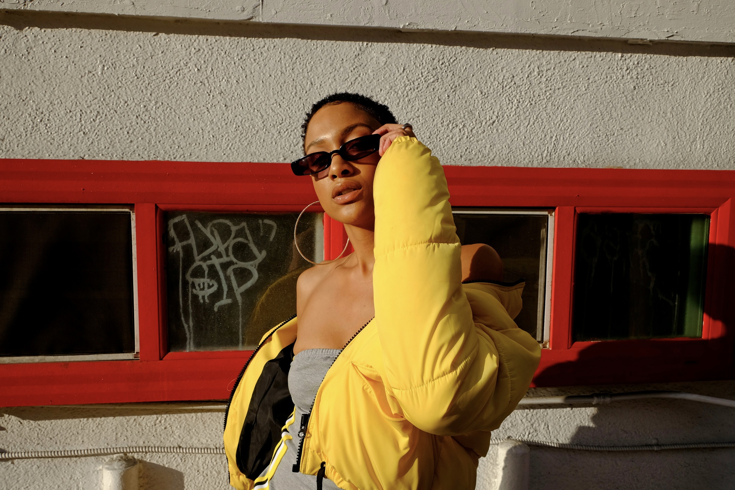
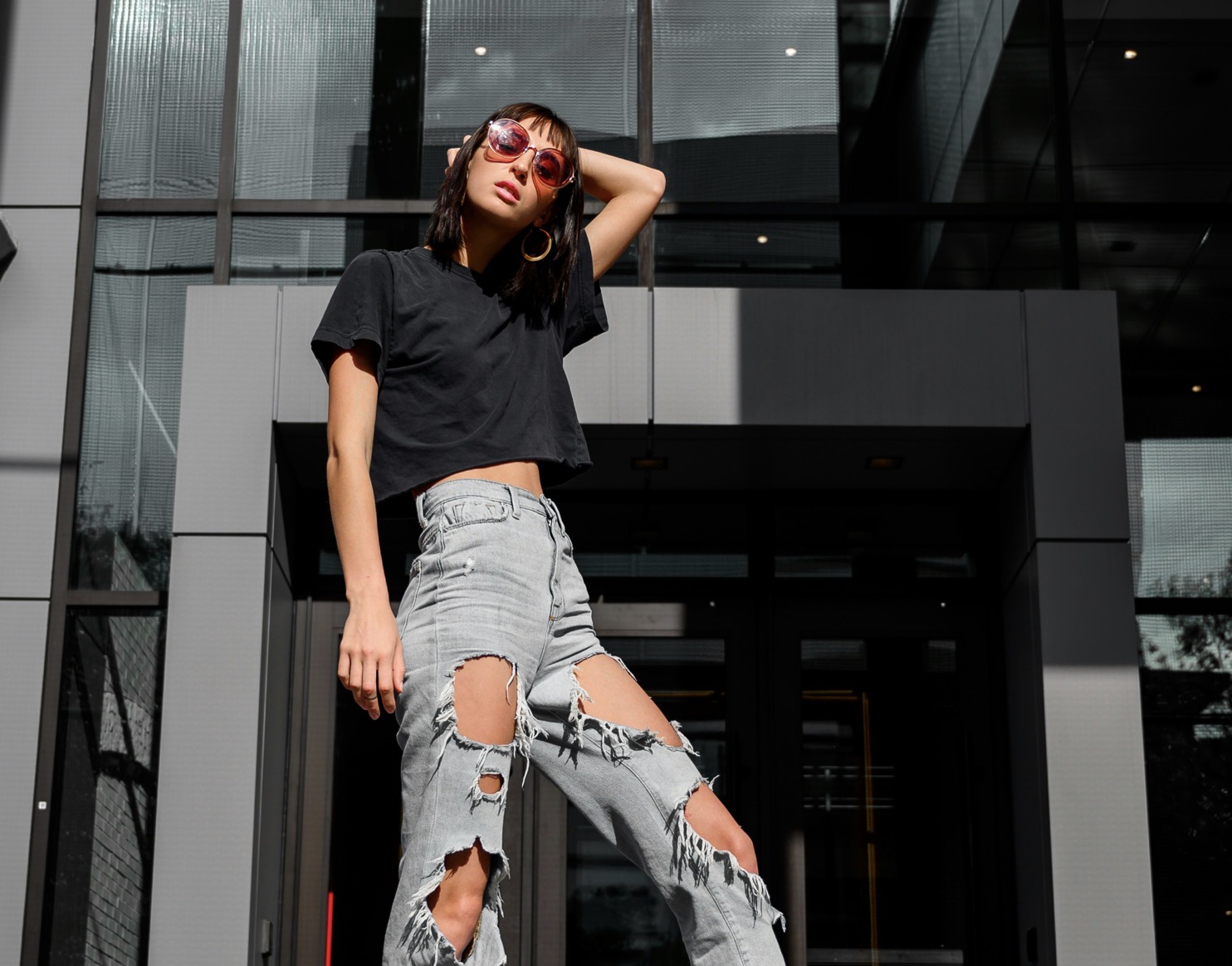
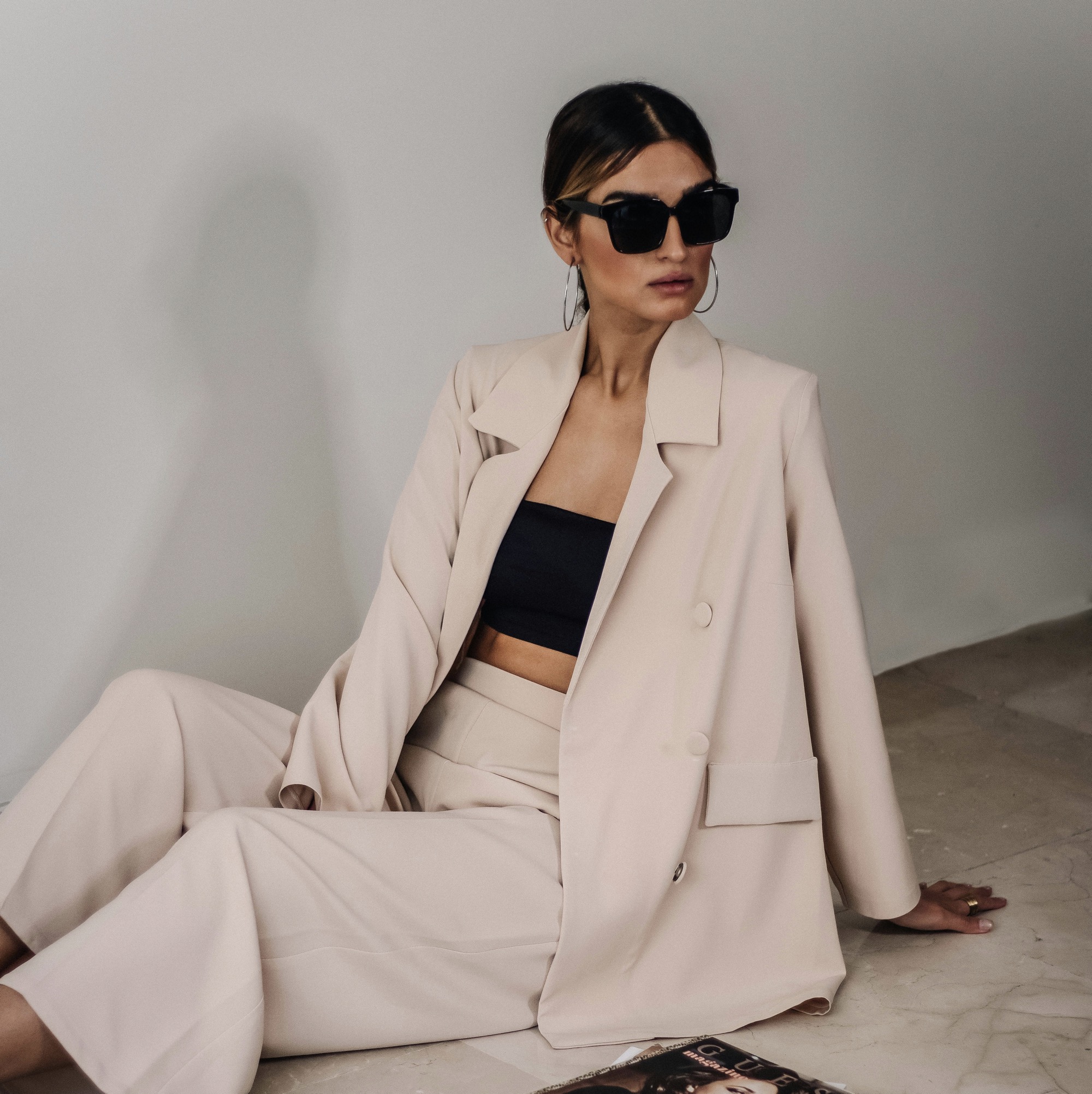
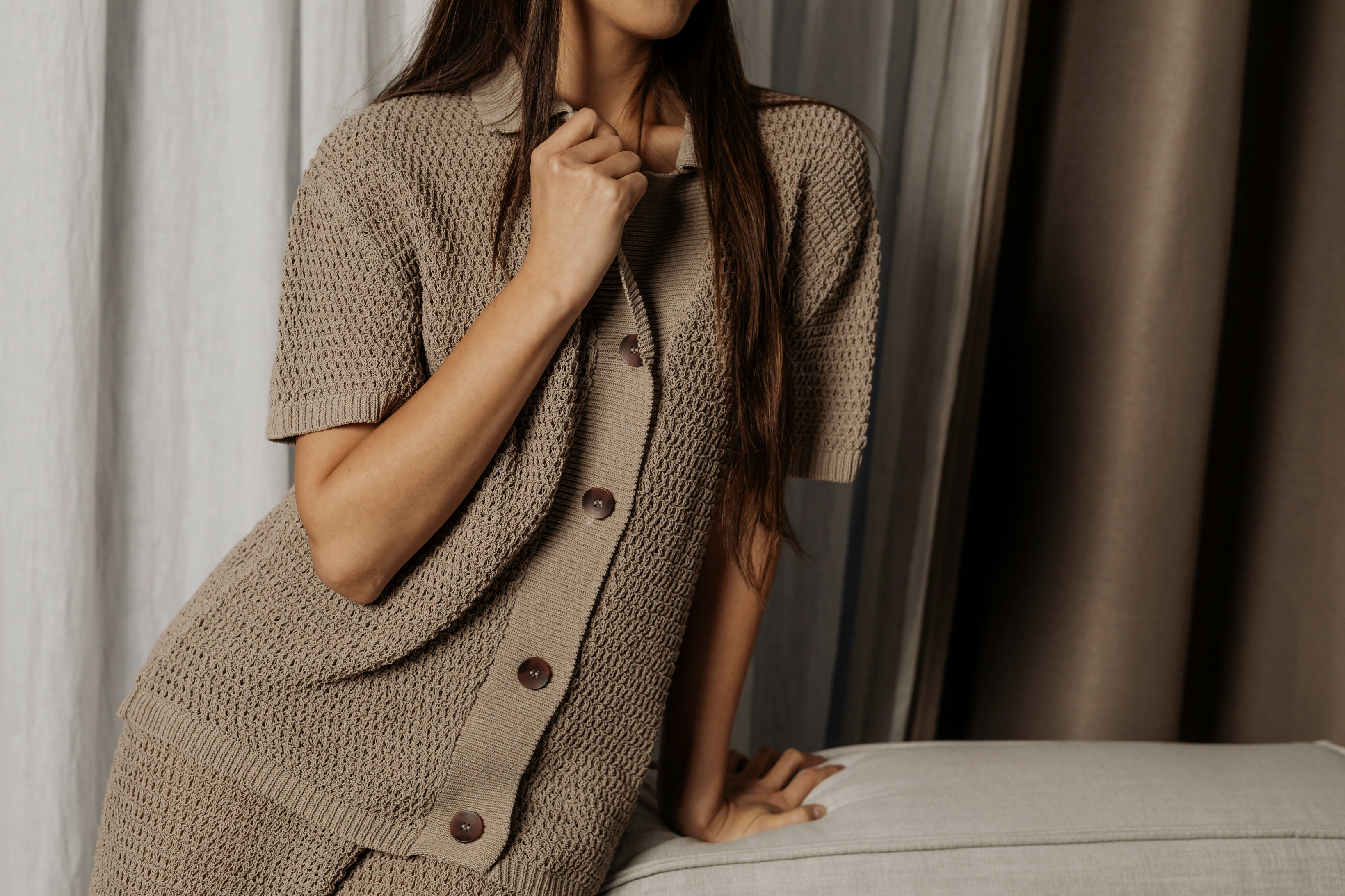
Neutral wardrobes provide a versatile canvas for color, but adding accents requires care. Start by identifying your base tone—warm beige, cool gray, or earthy taupe—and choose an accent that sits near it on the color wheel. Subtle contrasts, rather than loud statements, keep the look cohesive. Consider how the accent works with your skin undertones and hair color, since the right shade can brighten features without stealing attention from your clothes. For daytime wear, lighter hues like soft blush, powdered blue, or olive gray offer gentle lift. Save bolder choices for structured parts of the outfit, like a jacket or bag, to anchor the ensemble without overwhelming it.
The most effective accents enhance, not overpower. Instead of applying multiple bright tones, select a single color and vary its intensity across accessories. A muted scarf, a small belt, and coordinated earrings can harmonize through shared undertones. If you want a tactile nuance, lean on textures that reflect light differently in the same hue—silk, wool, leather, or matte fabric all play with color in distinct ways. Remember that neutrals themselves can be shades of color; a warm gray, for example, carries a touch of beige that can interact nicely with a pale amber or muted sage. Aim for balance, not bold shock.
Build a color story with one main accent and mindful repetition across items.
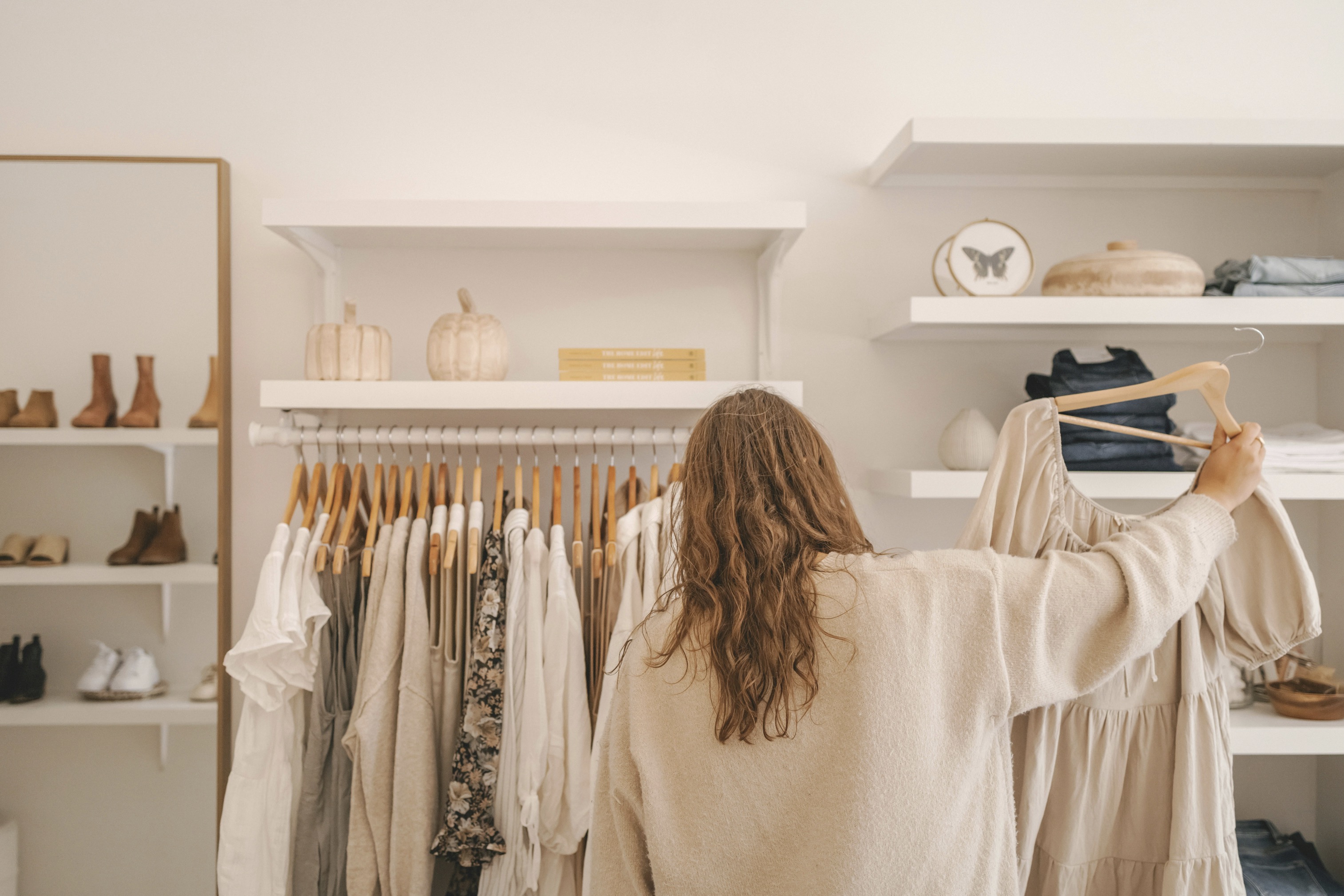
When selecting a single accent color, start with what exists in your closet already. A scarf, belt, or pair of shoes in a hue you consistently wear will feel natural rather than forced. Test color proximity by holding items near your face and around your waist to observe how light reflects and whether any undertone clashes appear. If you notice warmth in your skin, lean toward warm accents like terracotta, rose, or sage. If your undertones skew cooler, try slate, dusty blue, or plum. These choices create cohesion across garments and accessories, letting your neutral base shine with quiet confidence.
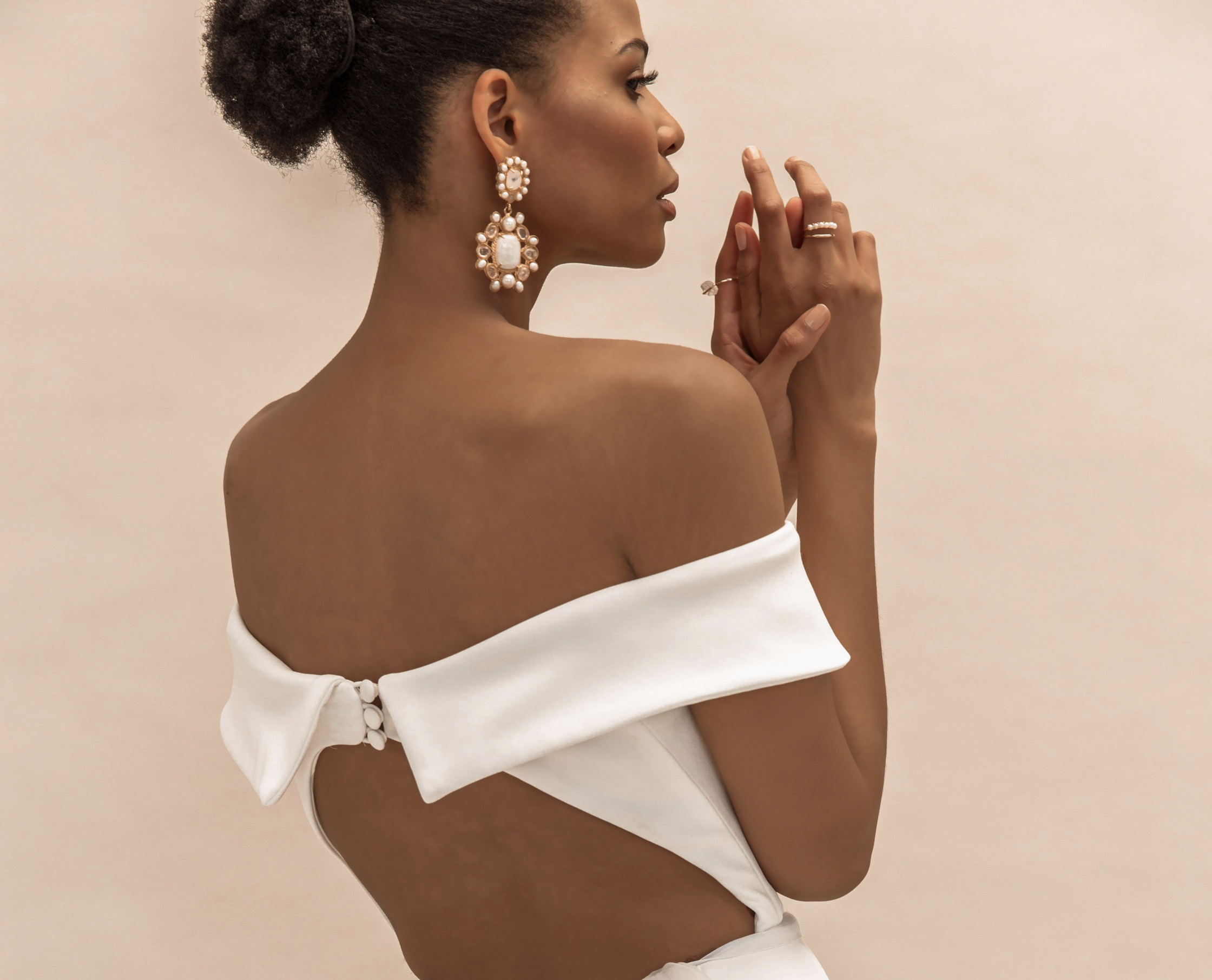
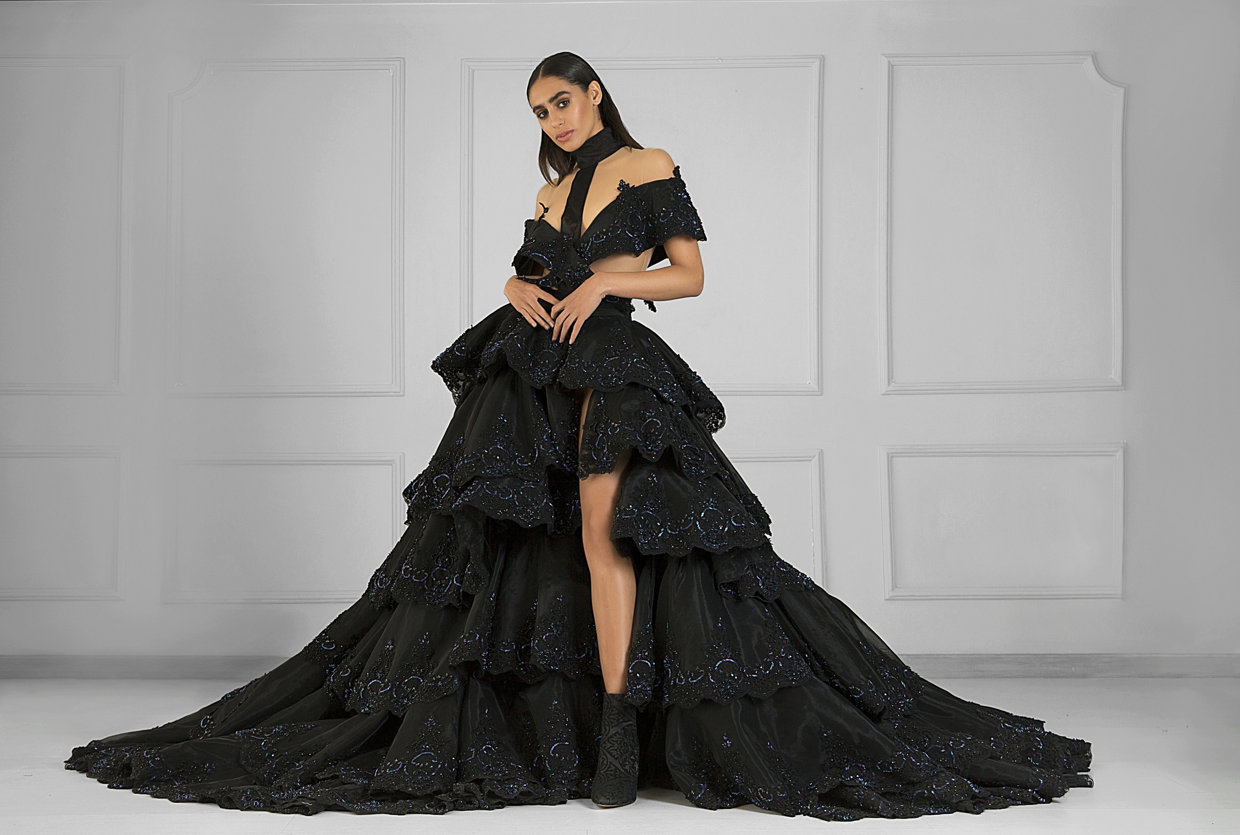
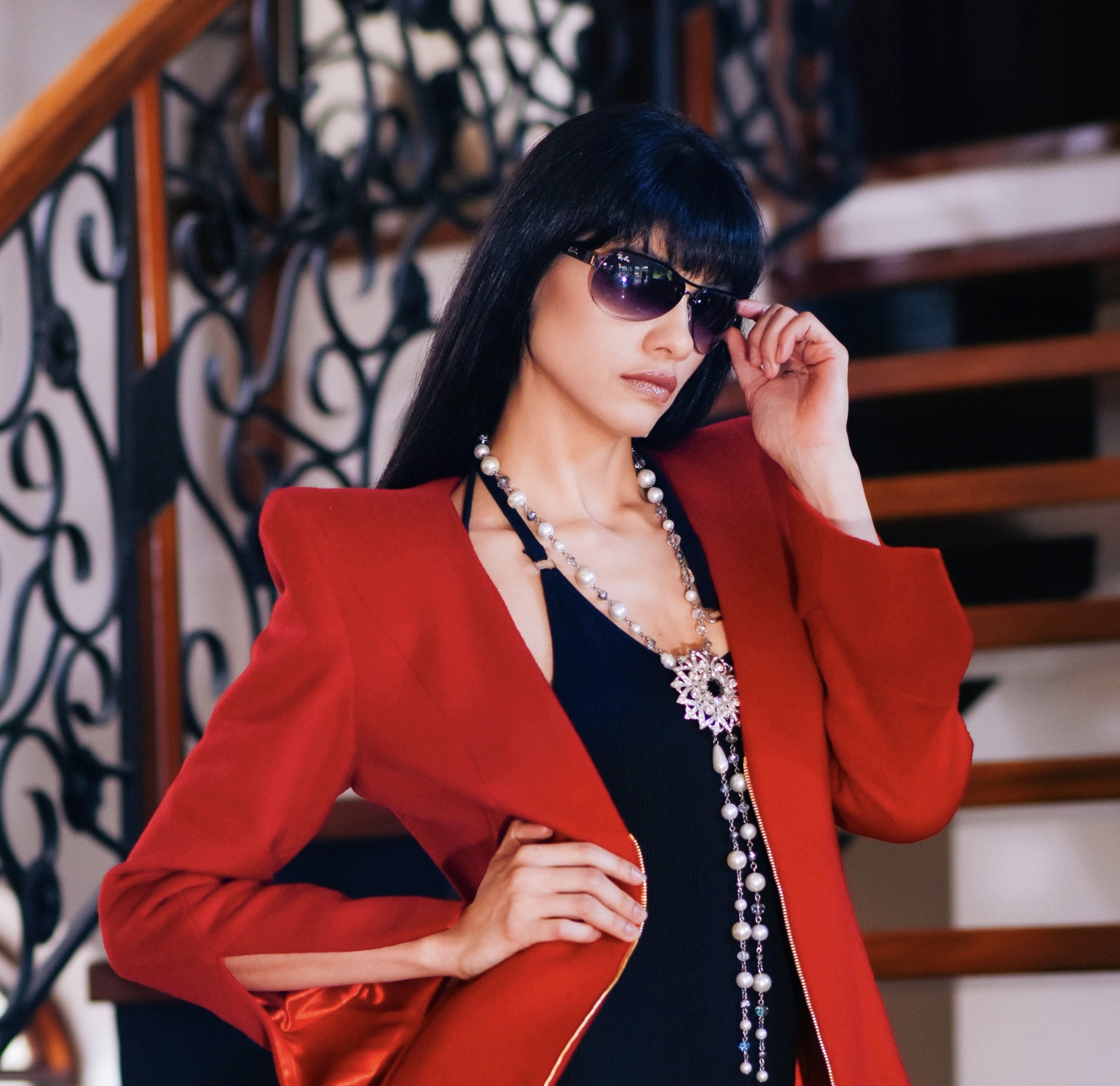
Beyond color alone, consider the scale and placement of accents. Small touches near the face—earrings, a pendant, or a scarf—offer immediate impact without overwhelming the overall silhouette. Medium-sized accents, such as a belt or handbag, anchor the outfit and establish a visual anchor. Large accents risk dominating neutral tones, so reserve them for outerwear or statement pieces that still harmonize with the rest. Fabrics contribute texture as well as tone; a satin ribbon will glimmer differently than a matte leather strap, altering perception without changing color. The goal is a cohesive story where each element speaks in the same language.
Color accents should enhance natural features, not obscure them.
A single accent color becomes more versatile when echoed in several accessories with varying textures. For example, a muted aubergine scarf paired with suede shoes and a leather bag in the same family creates depth without saturation. Repetition strengthens a theme, so limit the palette to two or three related hues across your entire look. When the base is a cool gray, inject soft lilac or dusty teal rather than neon hues. The result is a refined balance that reads as intentional design rather than accidental coincidence. Experiment with conversions between warm and cool tones to discover which harmonies flatter you most.
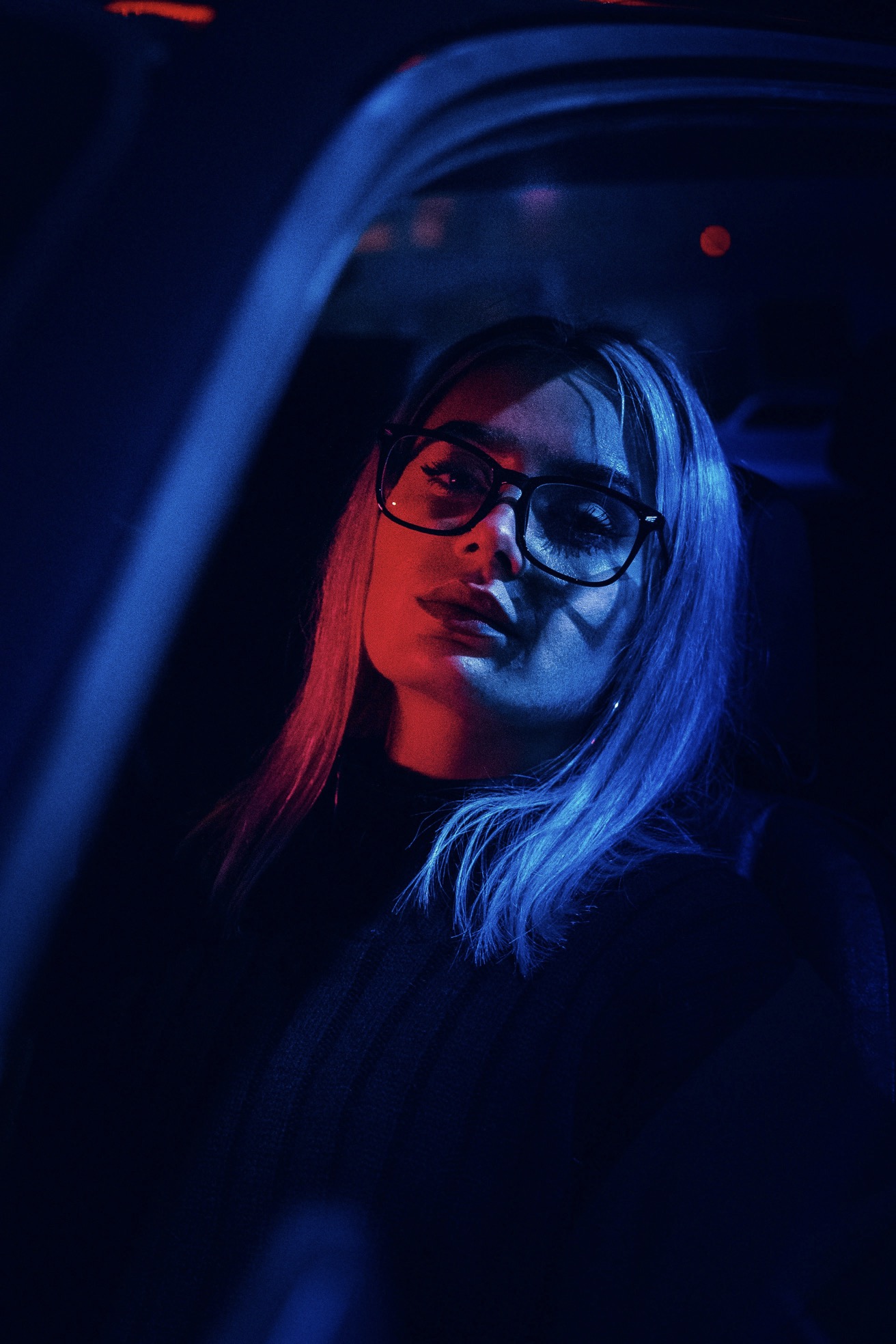
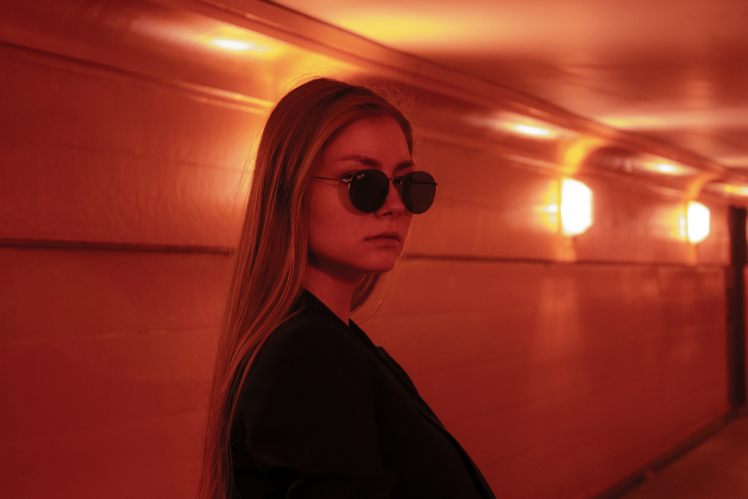
Pay attention to lighting and occasion, because these influence how color communicates. In daylight, colors appear brighter and can amplify contrast; indoors, artificial light can dull or distort shades. If you’re unsure about a choice, test under the lighting you’ll most often encounter. A color that feels tame in a store might look loud once worn at work or during evening events. Accessories with metallic threads or subtle sheen can catch light differently, altering perceived intensity. Confidence matters more than color precision, so choose options that you feel comfortable wearing repeatedly.
Thoughtful placement creates a calm, considered finish.
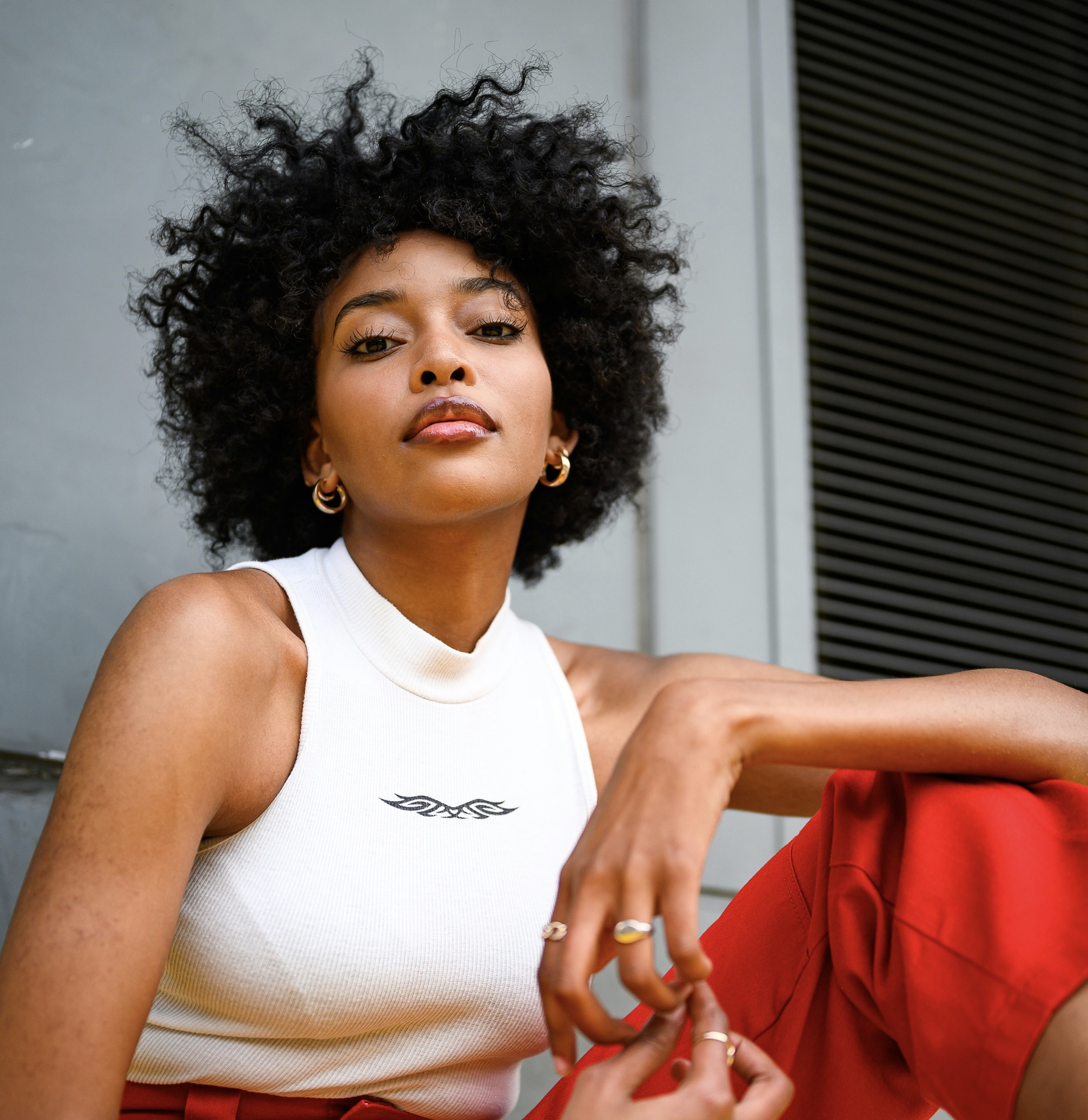
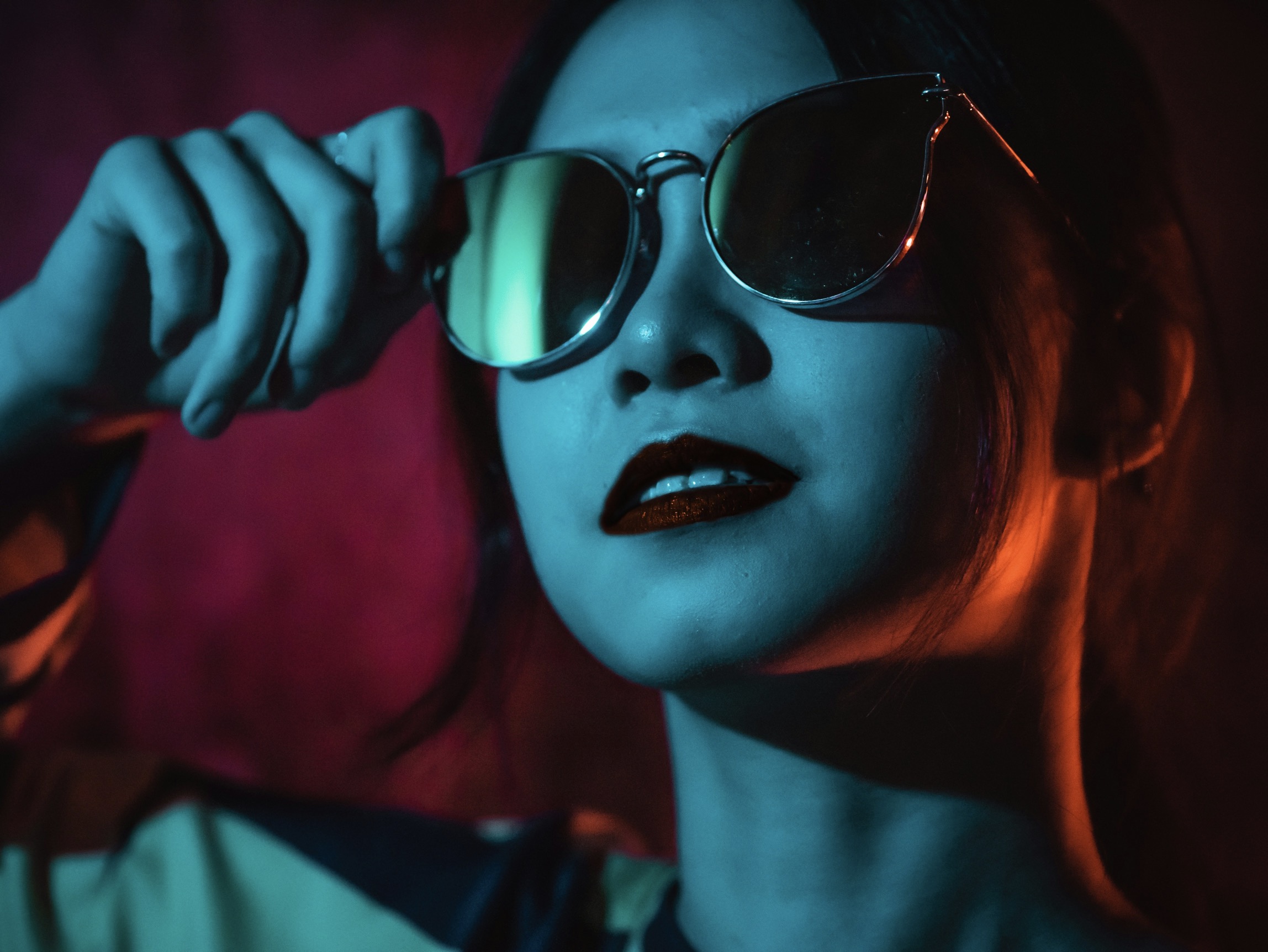
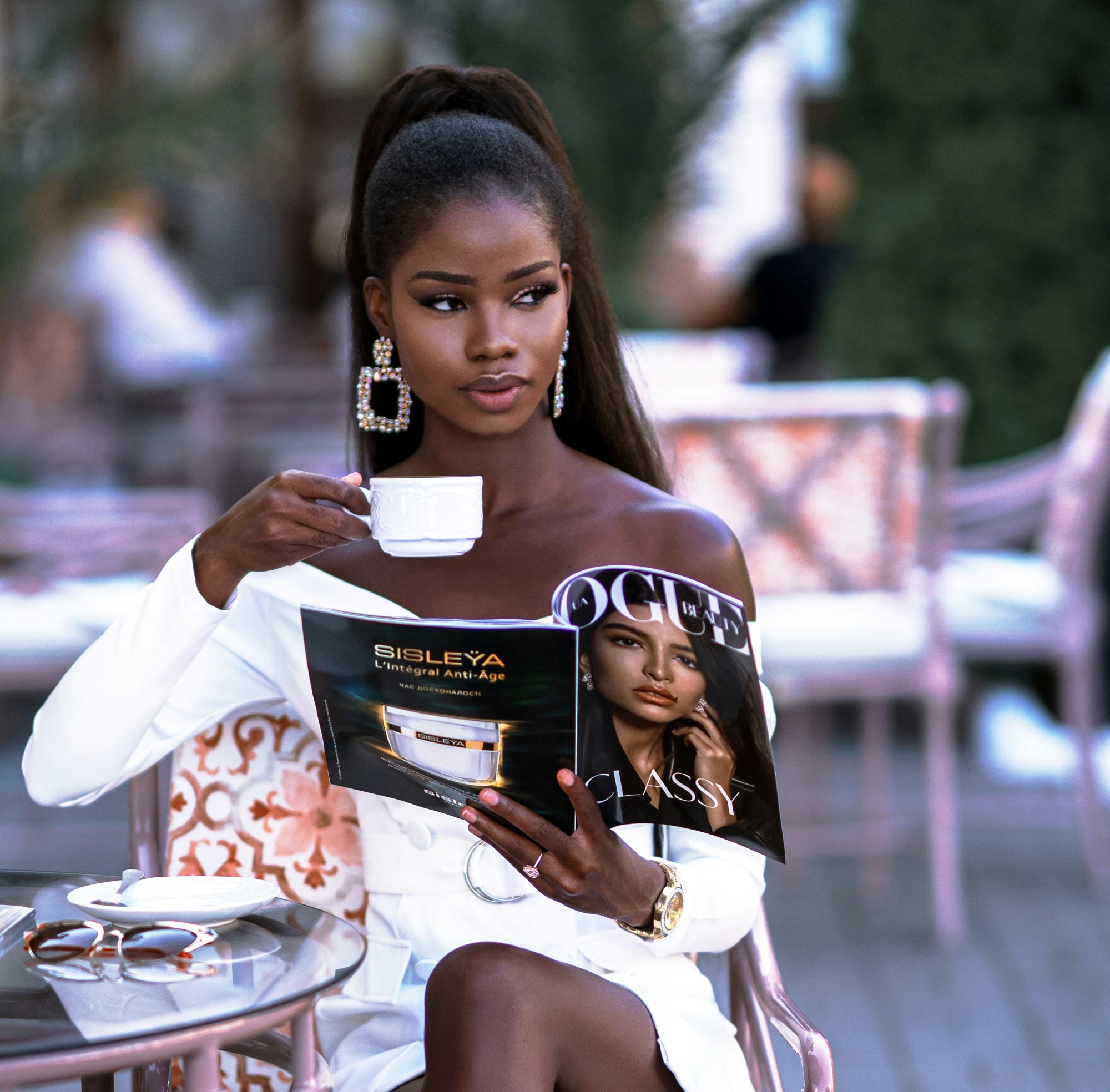
The relationship between hair, skin, and eye color affects accent choice. For brunettes, deeper, earthy accents like olive, burgundy, or eggplant can complement rich tones; for blondes, softer pastels or peachy hues often brighten complexions; for those with darker skin, jewel tones such as emerald or sapphire can provide striking contrast while maintaining elegance. Undertones matter: cool skin tones harmonize with blue-leaning hues, while warm skin harmonizes with amber or olive tones. Testing swatches near your face helps determine if the undertone aligns with your natural coloring. Once you identify a flattering mood, you can replicate it across multiple accessories.
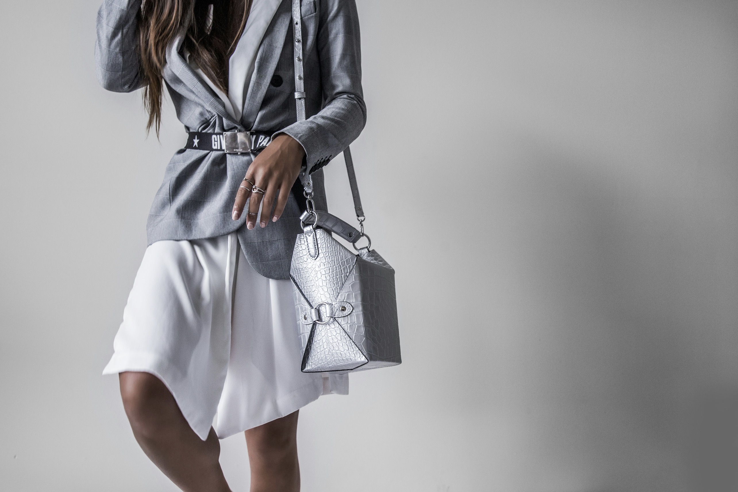
Aligning color with fabric weight helps preserve balance. A delicate silk scarf looks refined with a light tint, while a heavy wool belt may require a richer, deeper shade to avoid fading into the garment. When outfits rely on a lot of texture, keep the accent color consistent but introduce variation through sheen and finish. A matte bag against a glossy shoe, for instance, can create a nuanced contrast that remains cohesive. The key is to select hues that complement the garment construction and drape, ensuring that color acts as a unifier rather than a disruptor.
Create a practical color plan anchored in your routine.
Accessorizing with color is most successful when each piece serves a function and contributes to the overall silhouette. You might begin with a base outfit in neutral tones, then choose a single accent to appear in at least two items, such as a belt and shoes. This repetition helps the eye travel smoothly across the ensemble. Avoid competing patterns and overlapping prints in the same color family, which can create visual noise. Instead, let color be the quiet conductor that guides attention to the lines of your clothing. A precise, restrained approach often yields the most timeless results.
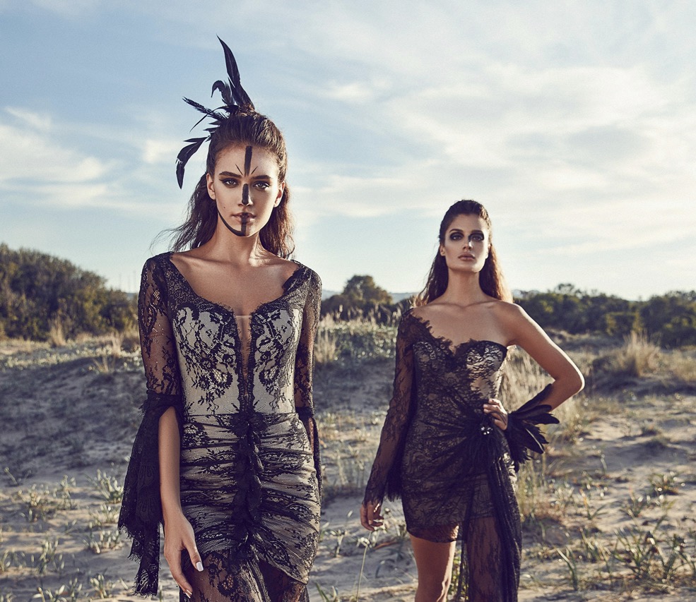
Consider cultural and contextual cues when selecting vibrant accents. Certain colors carry symbolic meanings or seasonal associations that may influence the message of your outfit. For formal settings, restrained versions of classic accents—dusty blue, muted burgundy, or warm taupe—read as polished and professional. In creative environments, you can experiment with slightly brighter tones, provided they connect with the rest of the wardrobe. The aim remains to craft a composed impression that feels effortless, not loud or manufactured. Subtlety often reads as confidence.
Build a color framework you can reuse across days and events. Start by cataloging your neutrals and noting which accent colors pair naturally with each. Then map your weekly outfits to a couple of dependable accents so you don’t rethink color every morning. A practical rule is to keep one cool accent and one warm accent in rotation, depending on the base garment you wear most. This system supports consistency and fosters quicker decision making, which is especially valuable on busy days. When you have a reliable palette, it becomes easier to mix and match without fear of clashing.
Finally, trust your instincts and refine with experience. If a combination feels off, step back and reassess the shade, texture, or placement before proceeding. The most durable style habits emerge from trial and observation, not from rigid rules. Take notes on what works for your complexion, garment weight, and lighting conditions for future reference. With time, choosing accent colors becomes second nature, enabling you to elevate basic outfits into thoughtfully curated looks. The result is a wardrobe that travels well through seasons while staying true to your personal taste.