Practical tips for choosing accessory colorblocking to create visual interest without appearing disjointed or clashing dramatically
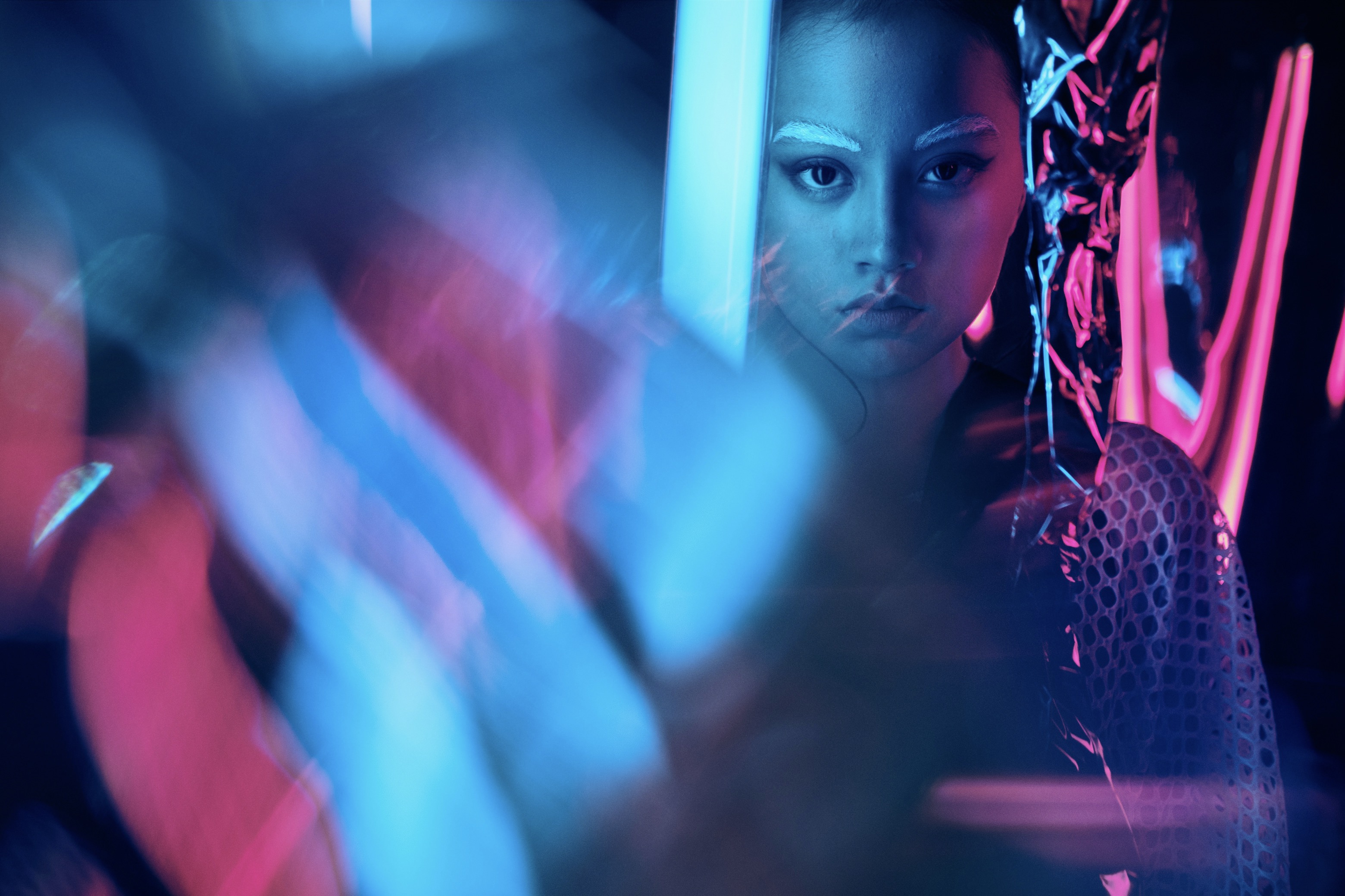
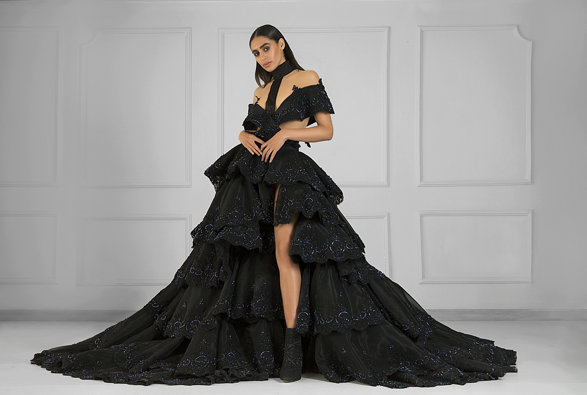
Thoughtful colorblocking in accessories can elevate outfits, guiding the eye with harmony, contrast, and careful balance; here are practical strategies to avoid dissonance while showcasing creativity across shoes, bags, and jewelry.
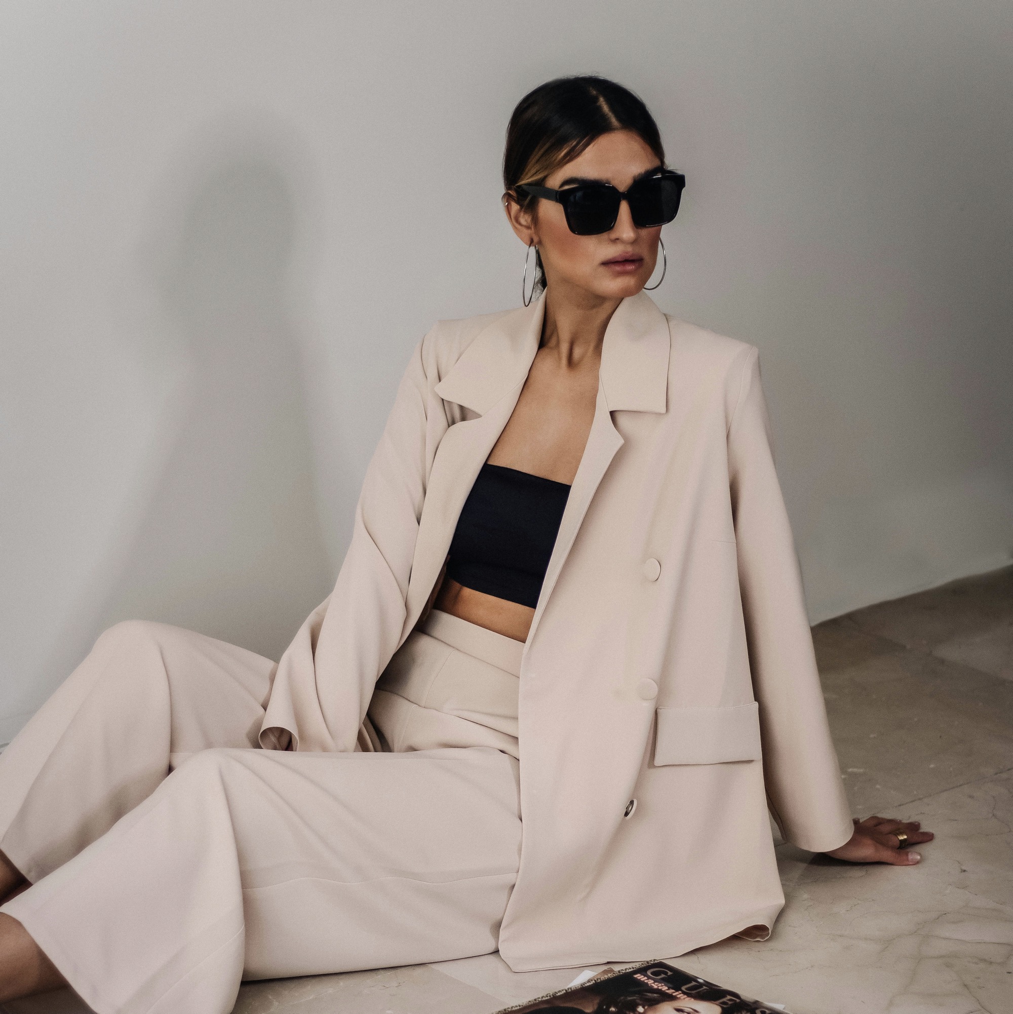
Colorblocking in accessories works best when you anchor the palette to a single base tone and use supporting hues to highlight shapes and textures. Start by selecting a dominant color that resonates with your skin tone or the mood you want to convey, such as a warm caramel or a cool navy. Then introduce one or two accent colors that echo elements from your clothing, like a belt, scarf, or hat, so the look remains cohesive. The goal is to create a visual story rather than a chaotic collage. When the palette feels intentional, even bold combinations can feel deliberate and polished, inviting admiration rather than confusion from onlookers.
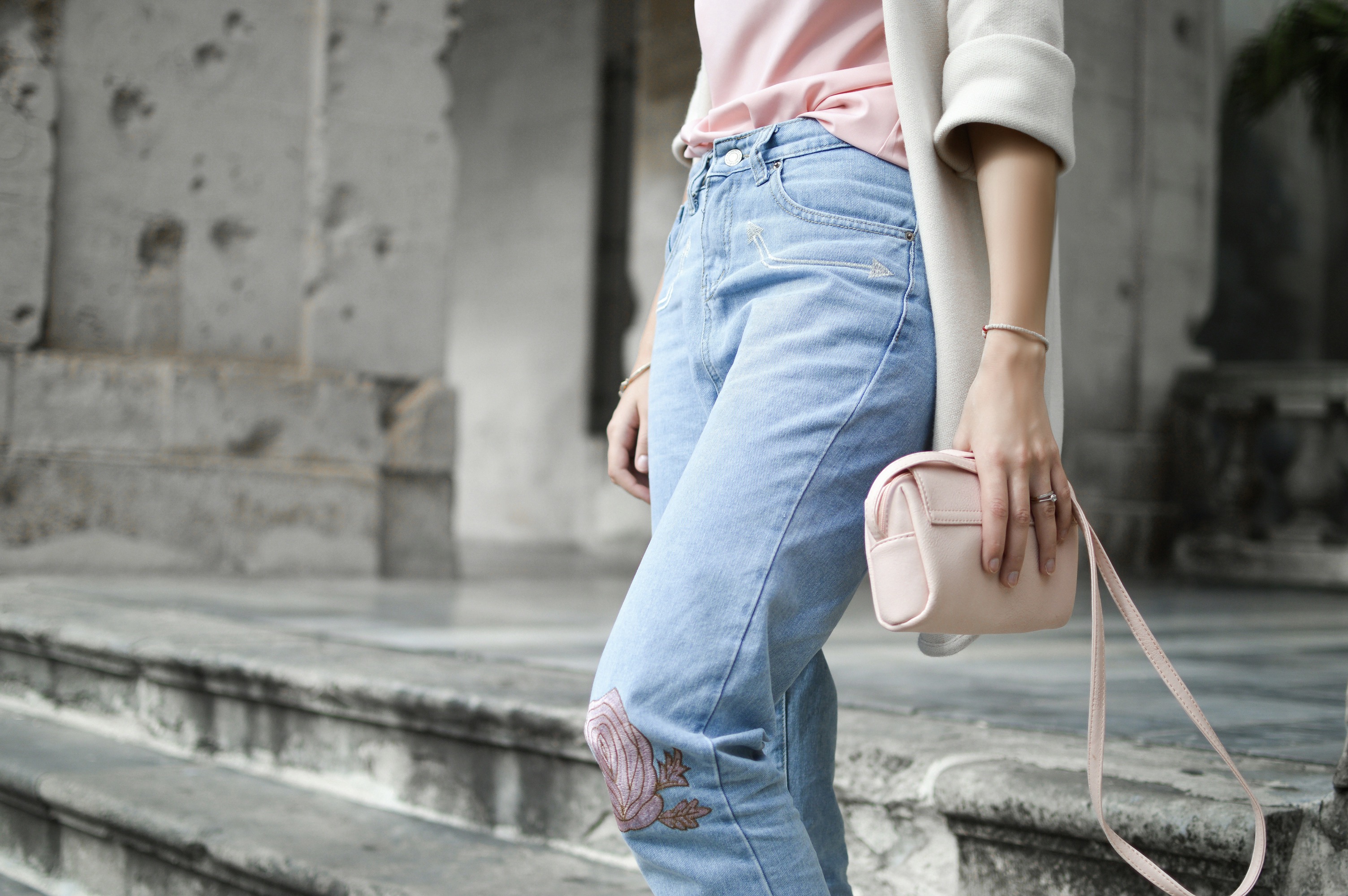
Consider the proportion of colors across your ensemble. A practical rule is to allocate about 60 percent to the main color, 30 percent to a secondary hue, and 10 percent to a pop of contrast. This helps prevent any single shade from dominating or clashing with another. In footwear and bag pairings, mirror one of the accent colors to create a subtle thread that ties everything together. If your outfit includes large blocks of color, choose accessories that sit in the same family rather than the exact shade, which smooths transitions. Subtle texture differences can also help separate colors without creating visual noise.
Rhythm and repetition help colorblocking feel intentional
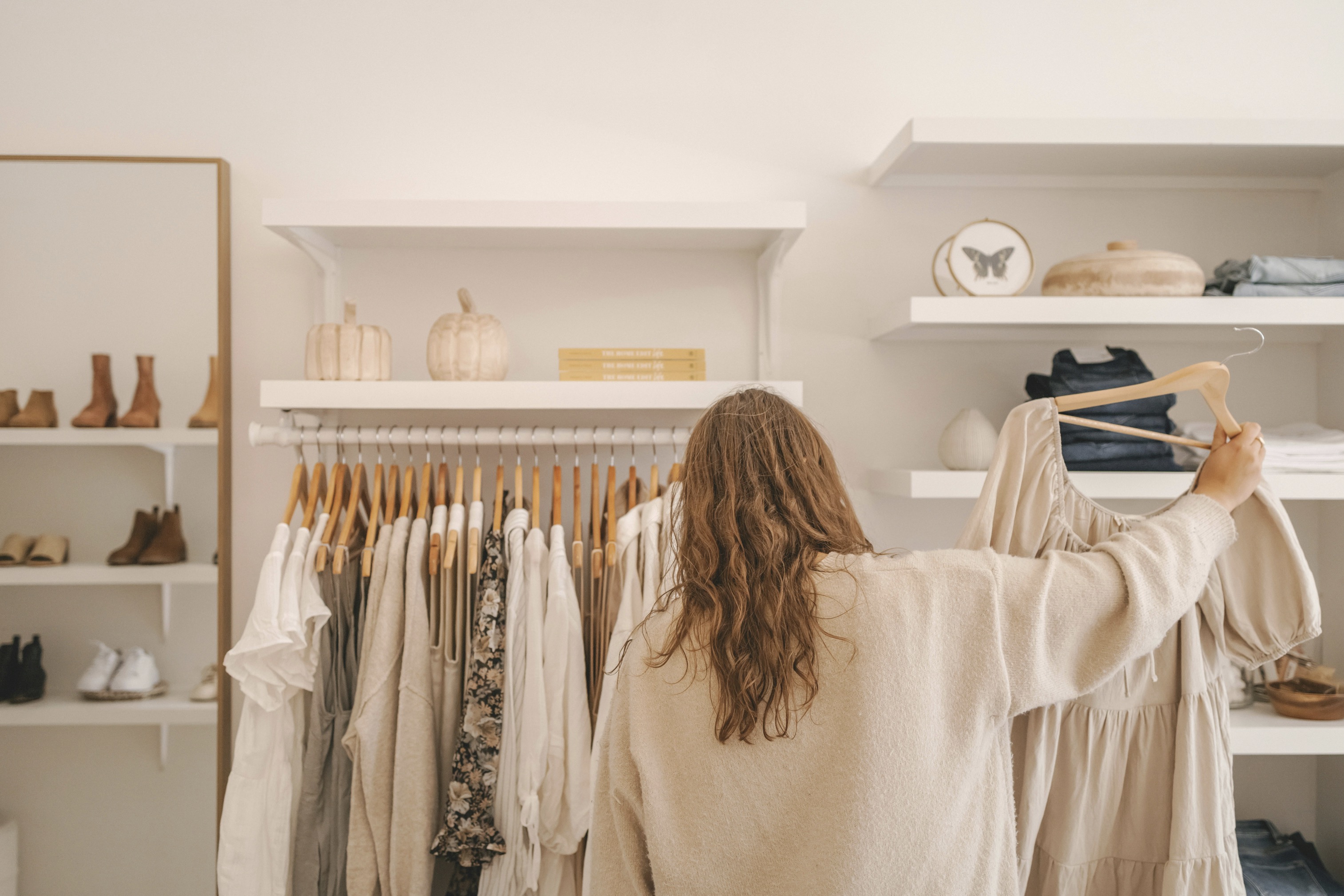
When you introduce pattern or color blocks, start with a neutral base in your outfit and let accessories carry the color story. A leather bag in taupe, for example, can act as a calm stage for brighter shoes or jewelry. The trick is to avoid competing lines and shapes; instead, align silhouettes and finishes across items so the eye travels smoothly. If you wear a bold dress, choose muted metallics or earth-toned straps to temper the look. Conversely, pairing a muted dress with strong accessories can inject personality without overwhelming the wearer. The balance lies in restraint and mindful repetition.
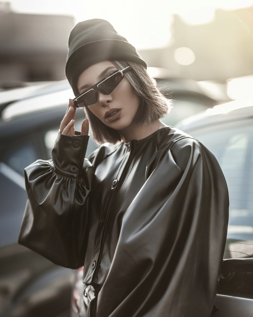
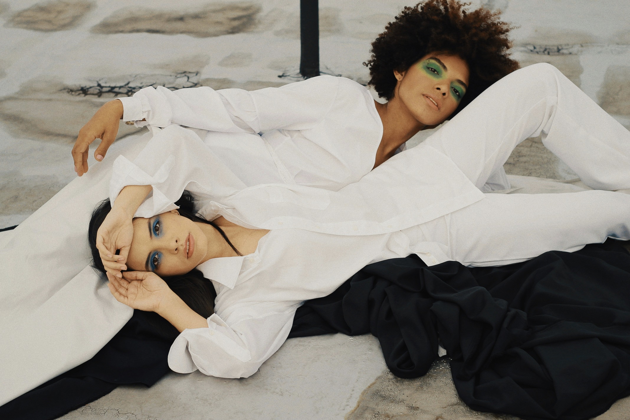
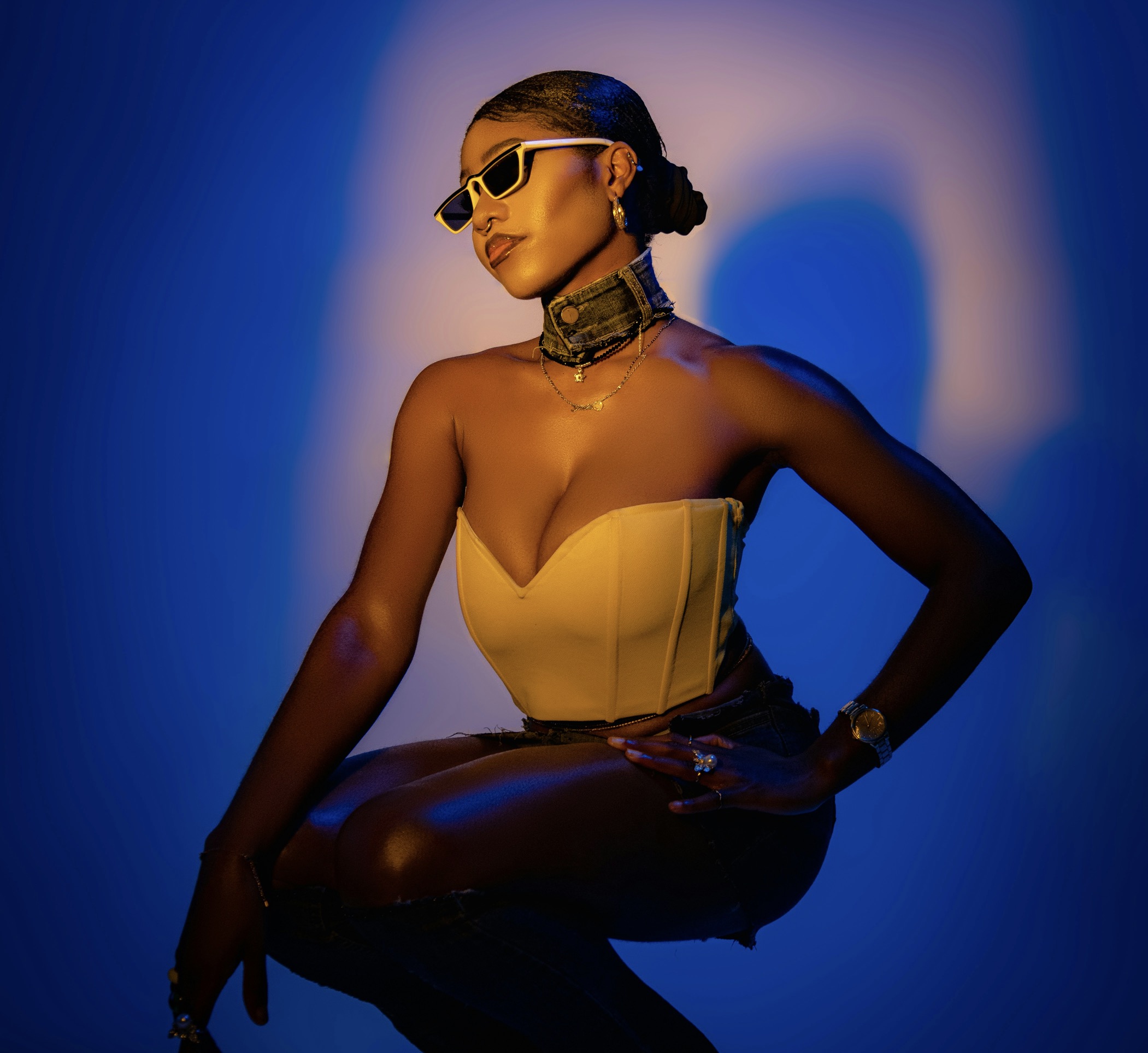
Texture matters as much as hue. A glossy patent bag will reflect light differently than a matte fabric clutch, and that variance can either unify or disrupt color blocking. Use texture as a unifier by repeating a finish in another accessory or in the shoes. For instance, a satin scarf paired with a satin belt and coordinating patent heels creates a cohesive sheen that reads as intentional rather than accidental. If your outfit already includes a texture-heavy surface, select accessories with simpler color blocks to avoid visual overload. Subtle rhythm between surfaces keeps the ensemble anchored.
Let context guide color choices and balance
To keep colorblocked accessories from appearing arbitrary, introduce repeating color cues across items. Repeat the same hue in two or more places—perhaps a handbag clasp and a pair of shoes—so the eye follows a deliberate path. Repetition can be as subtle as a shade in a print that reappears in an enamel charm or a metal accent. If you’re wearing a predominantly monochrome base, a single color pop in a belt or earrings can act as a punctuation mark that energizes the outfit without shouting. The aim is to create a narrative that the observer can follow naturally.
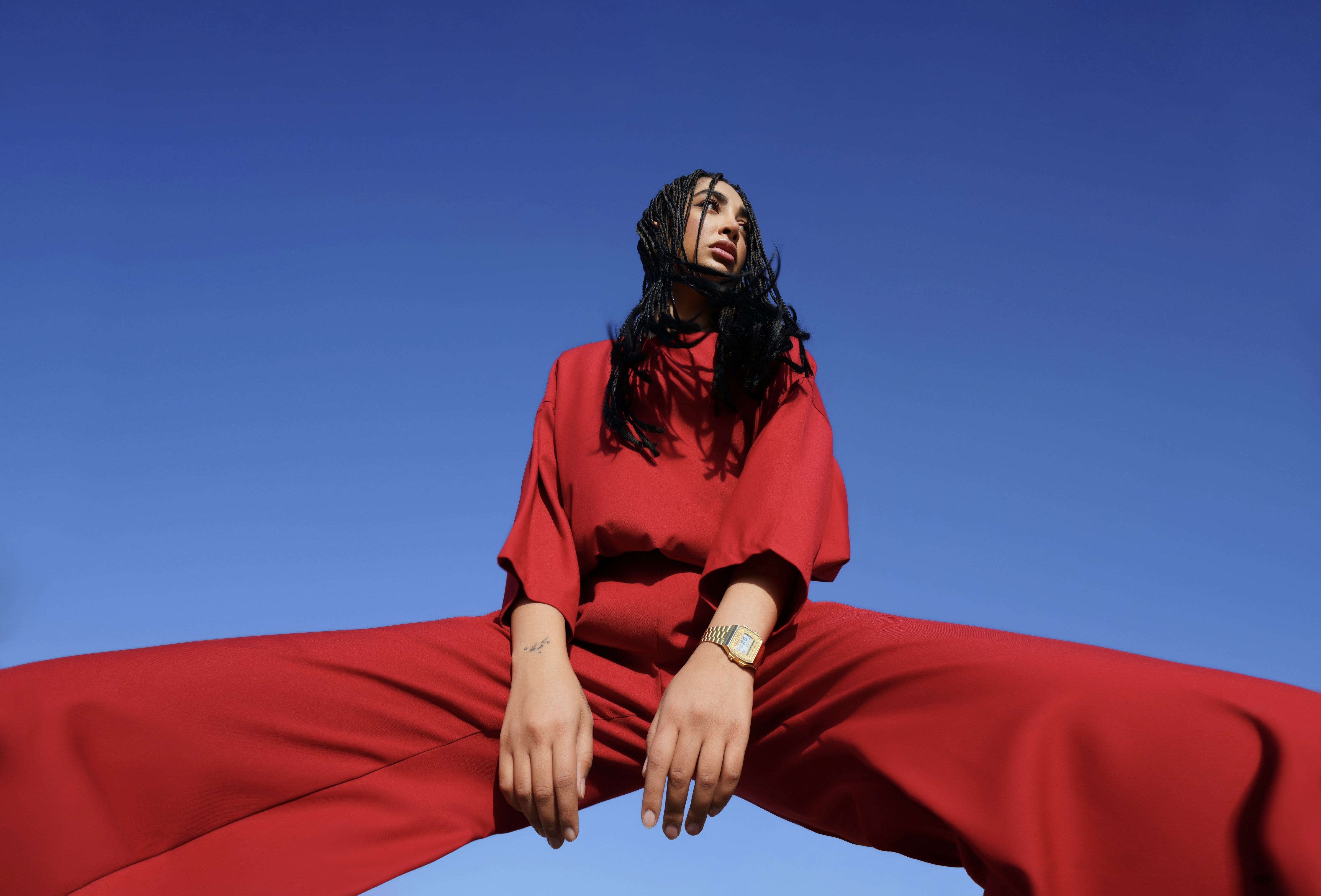
Consider the setting and occasion when choosing color combinations. A daytime brunch invites lighter combinations with airy fabrics and soft contrasts, such as cream, blush, and muted olive. Evening events, however, permit richer pairings like burgundy with charcoal and a touch of metallic. Always test your look in neutral light before stepping out; colors can shift in artificial lighting and alter perceived harmony. If you’re unsure, start with a low-contrast pairing and gradually introduce a second hue that mirrors a textile in your clothing. Small, calculated steps prevent dramatic mismatches.
Use decisive color anchors to stabilize your palette
The same colorblocking rule can be adapted for different body types by emphasizing or downplaying certain features. If you want to draw attention upward, pair a vivid accessory with a simpler outfit at the neckline or shoulder line. This directs gaze without overwhelming the frame. For broader figures, anchor with a dark, grounding piece like a deep bag or belt, and introduce lighter accents to create vertical elongation. The key is to avoid high-contrast junctions at critical points; instead, let color shifts occur along extended lines, such as sleeves or hems, to smooth the silhouette while adding interest.
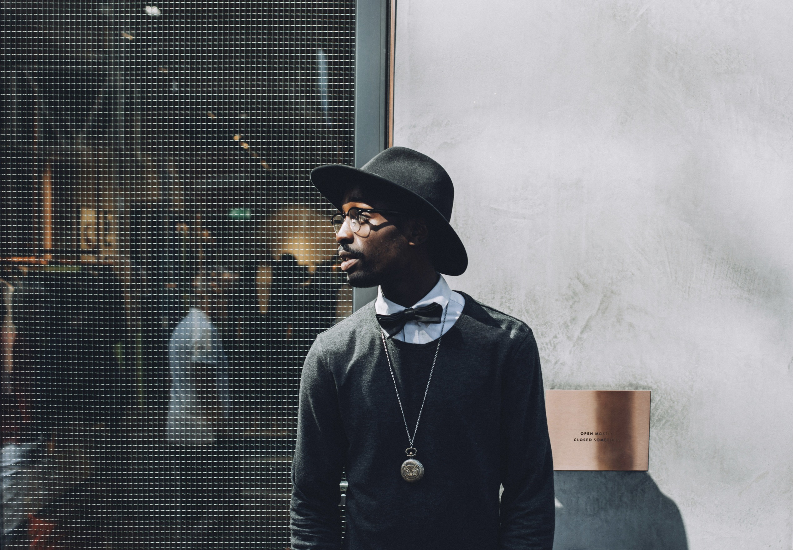
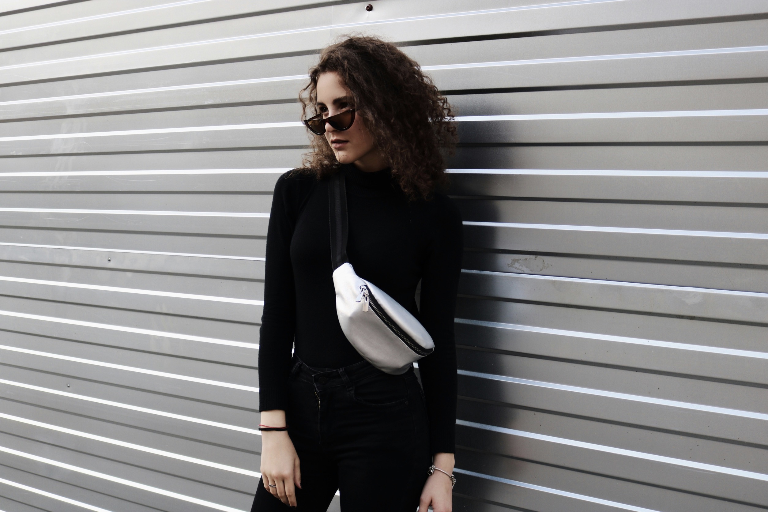
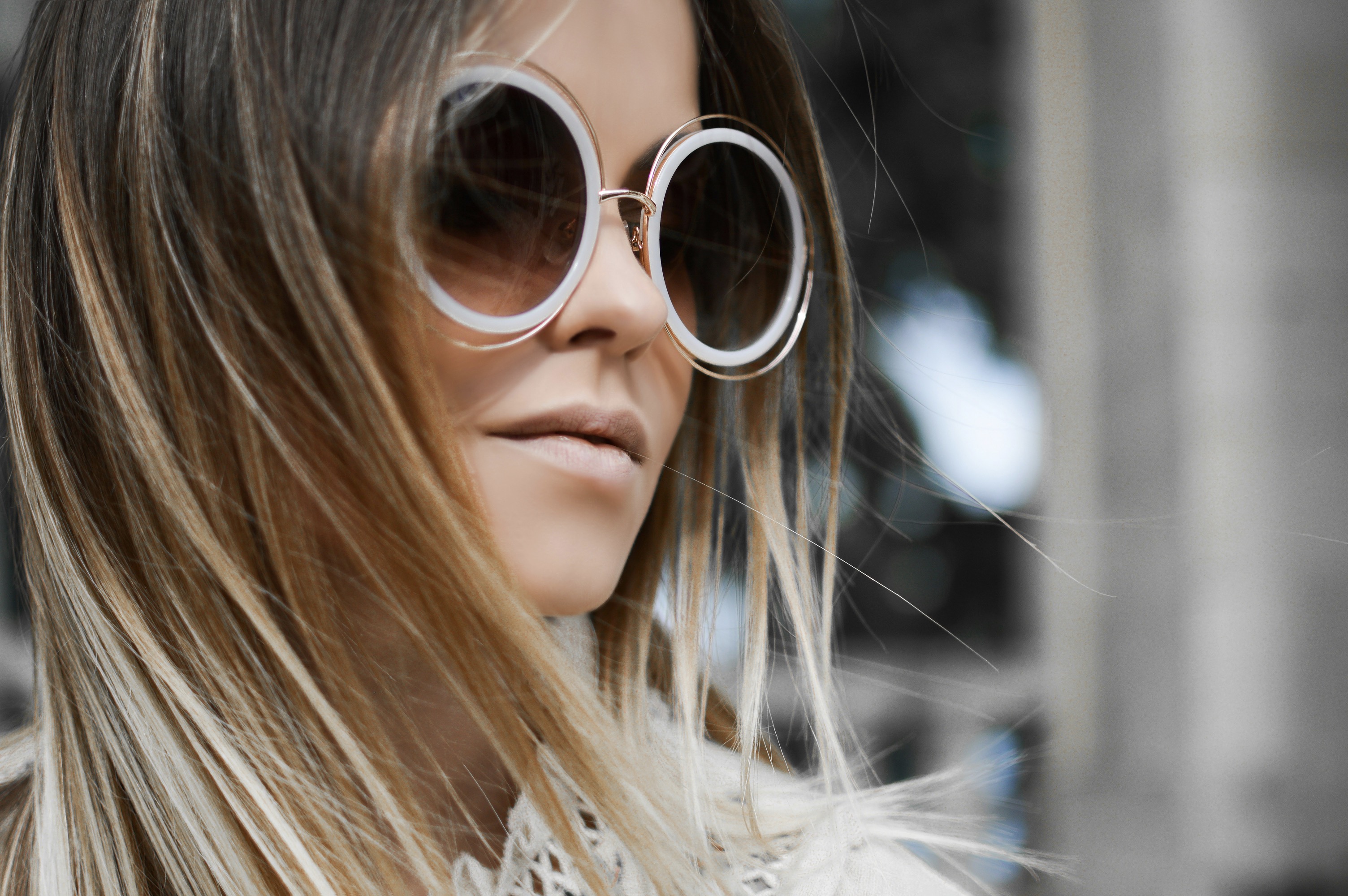
Jewelry plays a crucial supporting role in colorblocked looks. Choose pieces that echo the smallest accent color in your outfit so the ensemble reads as a single composition rather than a mix of disparate parts. If your shoes carry a bold shade, bring that hue into a compact pendant or cuff but in a different intensity or finish to maintain balance. Metals can also help harmonize disparate colors; rose gold may bridge warm and pink tones, while silver can unite cool blues and greens. Remember, the value of a color—light versus dark—often matters more than the exact shade.
Practical steps for testing color harmony before wearing
Shoes set the tone for a colorblocked look and should harmonize with or gently contrast the bag and belt. If you’re wearing multiple colors, choose one that will serve as the anchor and allow the others to orbit it. For instance, a navy shoe can pair well with a tan bag and a burgundy accessory, keeping the palette anchored while still appearing vibrant. Evaluate each item as part of a three-point system: base, support, and accent. If all three compete for attention, scale back the brightness of one to regain equilibrium. Small adjustments can rescue a disjointed color story.
Seasonal palettes can guide sensible colorblocking decisions. In spring, soft pastels with a single stronger accent feel fresh and approachable. In autumn, earthy tones with a crisp star color—like teal or cobalt—injects vitality without overwhelming the senses. Summer leans toward bright, saturated hues that can be balanced with neutrals, while winter benefits from deeper contrast and metallic highlights. Before committing to a color mix, imagine the journey of the eye across your accessories and clothing, ensuring the route remains smooth from first glance to final detail.
Try a dry-run by laying out each accessory against your outfit, then observe from a distance to assess proportion and cohesion. Photograph yourself in natural light to catch subtle shifts that could signal clashing tones. If a color feels off, swap it with a neighboring hue or adjust the intensity through shade or finish. A quick trick is to choose one recurring undertone—warm, cool, or neutral—and ensure all pieces echo that undertone. This approach reduces the risk of jarring contrasts while maintaining the expressive potential of colorblocking in everyday style.
Finally, develop a personal color-blocking library, a mental catalog of dependable pairings you can trust. Track what works with which fabrics, footwear, and accessories, noting when certain colors flatter you or clash. Build a few go-to combos that align with your lifestyle, from casual to formal, so you can assemble outfits quickly without sacrificing harmony. Over time, your eye will recognize harmonious color-blocking patterns instinctively, enabling you to experiment with bolder pairings while staying elegantly cohesive. The result is a wardrobe that looks intentional, polished, and uniquely yours.