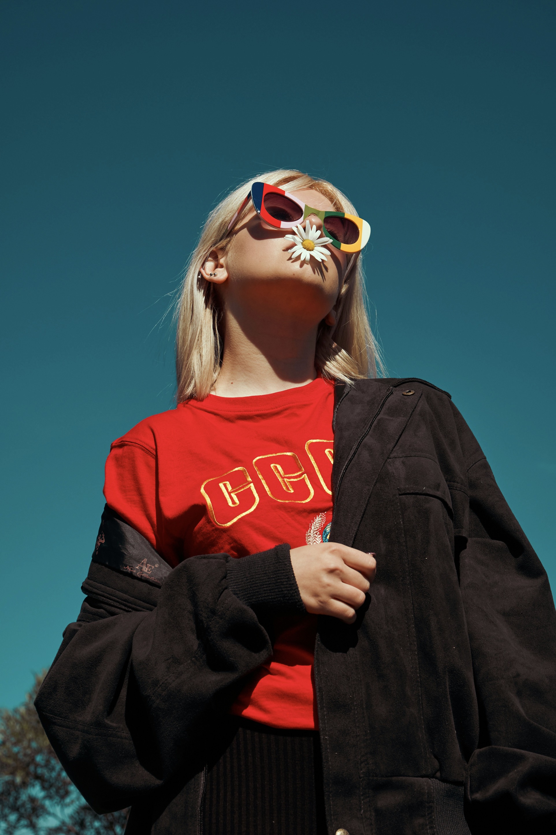
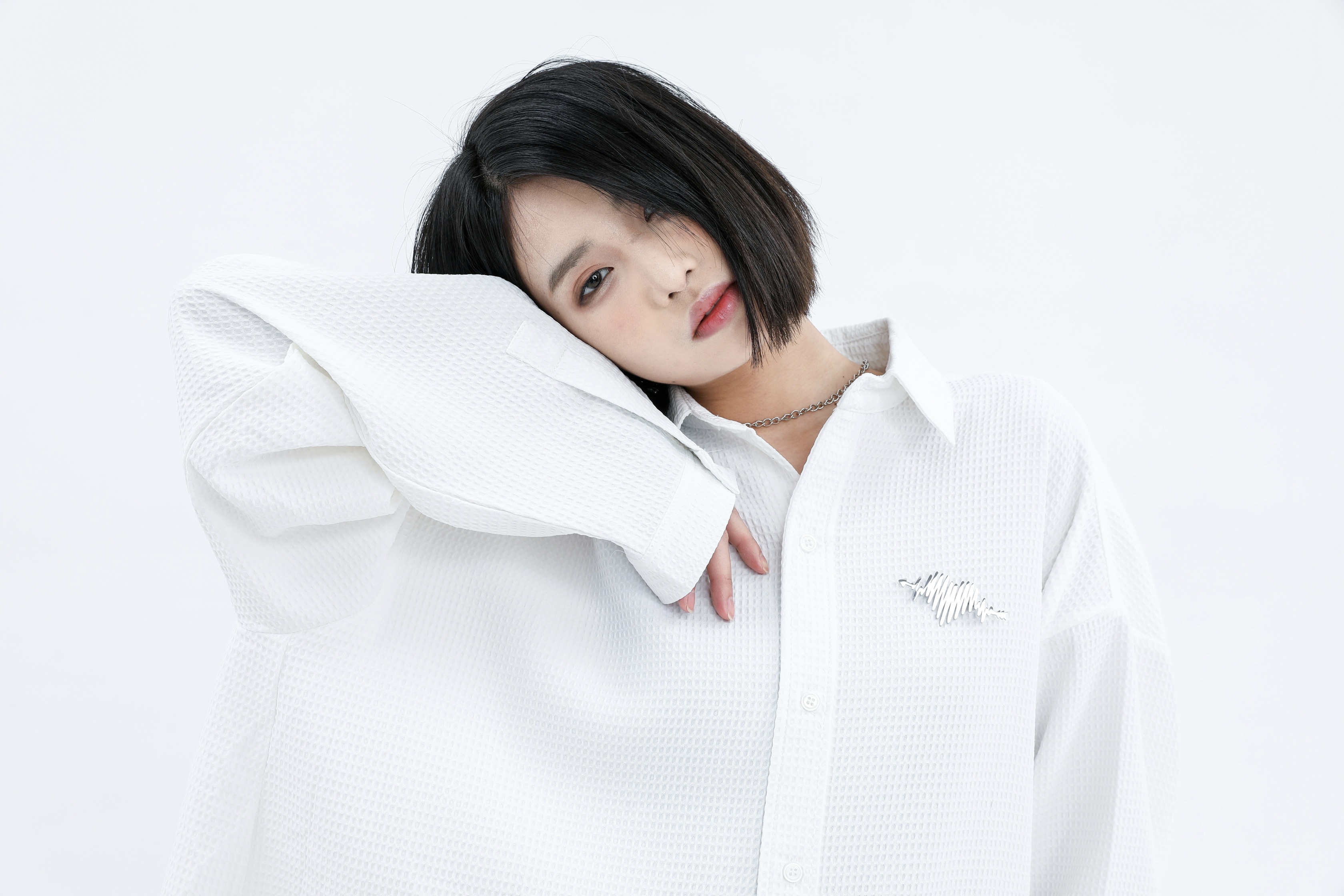
Color is one of the most practical tools in an athlete’s wardrobe. It can affect how you perceive your own movement, how you feel during a workout, and how easily your gear can be mixed and matched. Start by assessing the dominant tones in your existing closet: neutrals such as black, gray, navy, and beige, or warmer hues like olive and rust. Then consider your skin undertone and how it responds to different hues under gym lighting. The goal is to choose shades that flatter you while not contradicting your day-to-day outfits. Functional color decisions also help you spot when you need a fresh set of basics versus statement pieces.
Patterns can energize a workout outfit when used thoughtfully. A bold print might be uplifting in a long run, but it can also overwhelm a small frame if overused. Aim to pair patterned items with solid colors drawn from the same palette to preserve balance. If you love geometric shapes, keep the top simple and let the leggings carry the visual interest, or vice versa. Consider rotation: a patterned top with a solid bottom creates a clean line that elongates the silhouette. Remember that prints affect apparent dimensions; vertical lines can stretch your frame, while large, horizontal motifs may broaden it.
Use neutral bases to anchor brighter accents for flexible coordination.
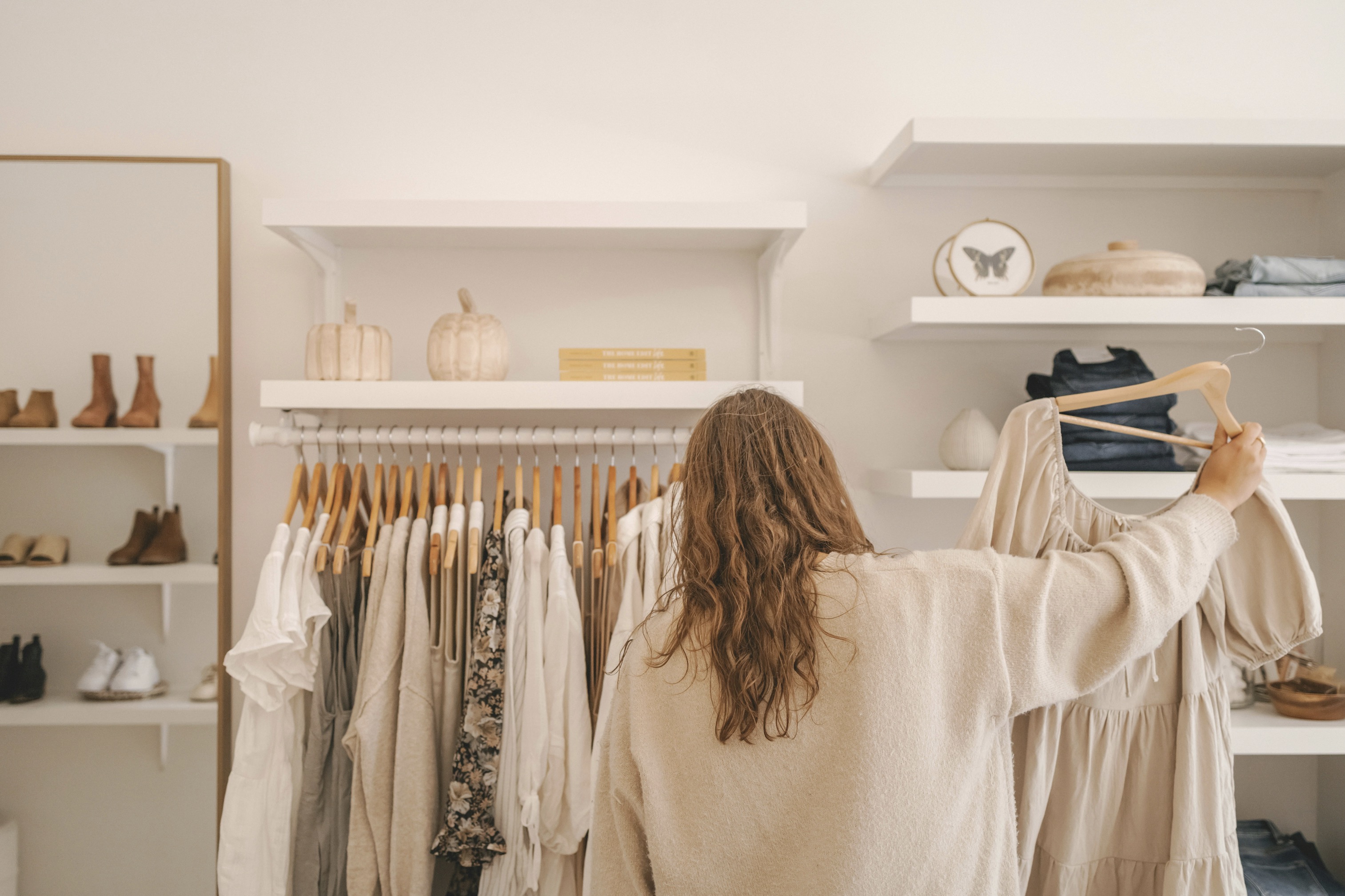
Before you shop, do a quick audit of the items you already own. Note the primary colors, the fabrics, and the heaviest patterns in your collection. You may discover that your closet leans toward cool blues and balanced grays, or toward earthy greens and warm tans. Write down two or three color families you’d like to emphasize this season, and another two that you’d prefer to limit. This exercise helps you shop with intention, avoiding clashes and unnecessary duplicates. With a clear framework, you’ll be ready to select activewear that visually coordinates with everything else you own, from outerwear to sneakers.
When considering patterns, think about the intent of your workouts. For high-intensity training, a simple color scheme with minimal visual noise can reduce distraction and help you stay focused. For yoga or mobility work, you might want softer, tonal shading that reads as calm and approachable. If you run outdoors, reflectivity is not strictly about color; incorporate reflective piping or panels that glow under streetlights. Patterns can also serve functional roles: a chevron or color block can mark the correct orientation of the top and bottom, aiding form during complex movements. The right combination blends aesthetics with performance.
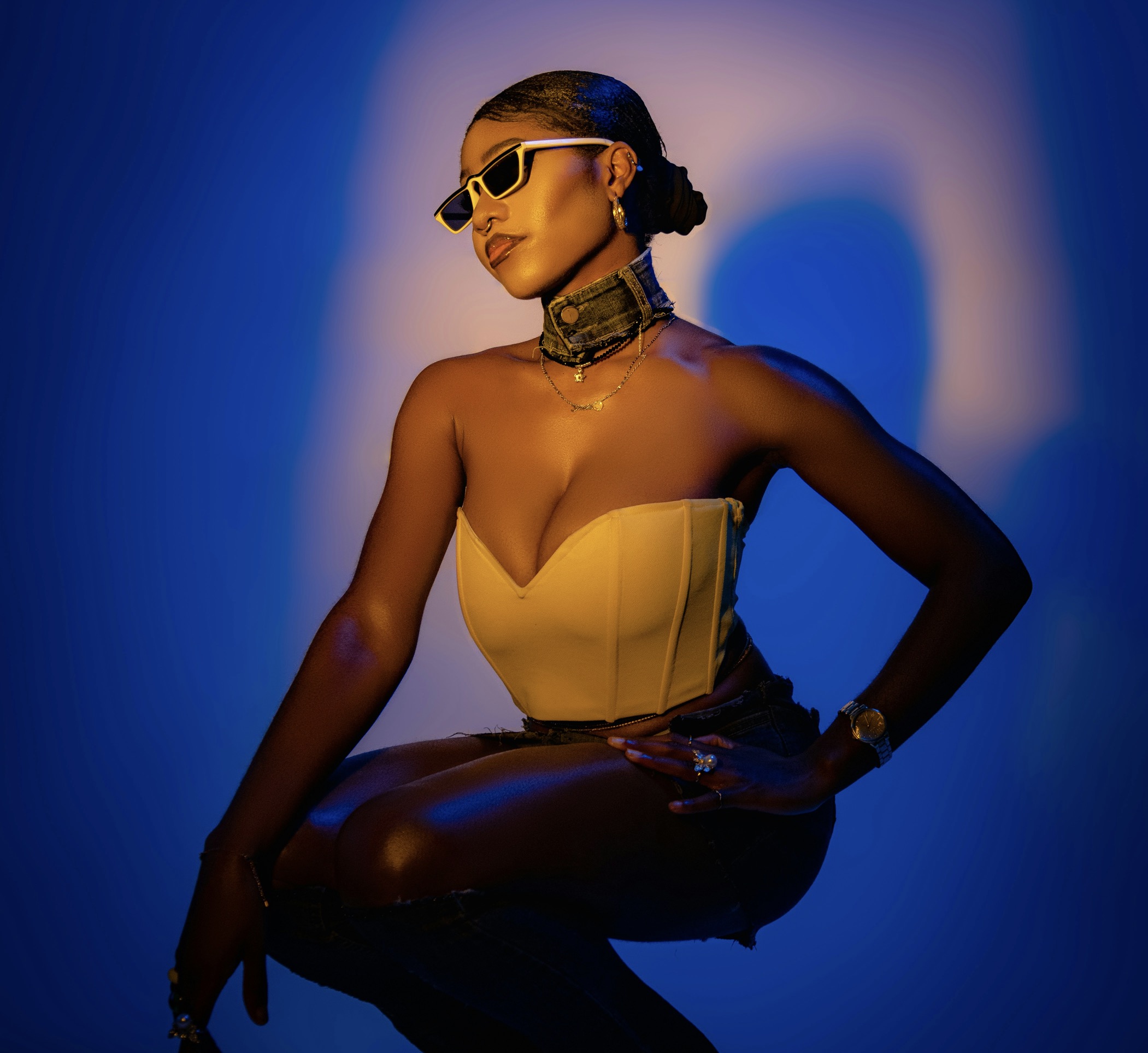
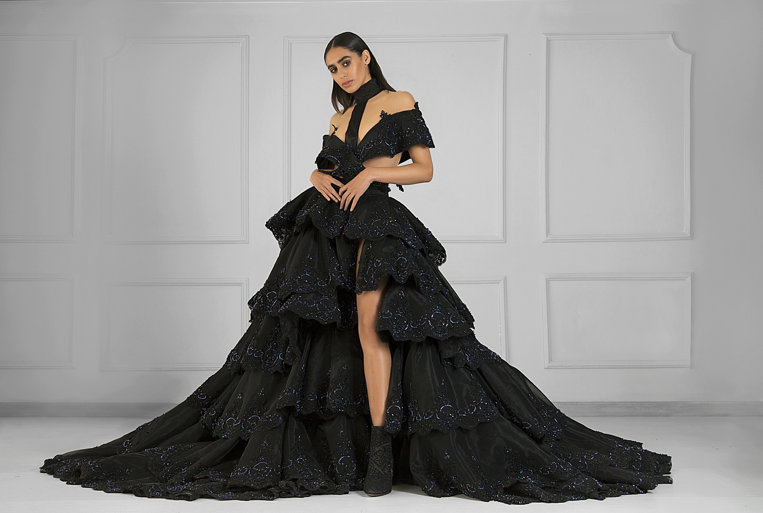
Consider skin tone and lighting to determine flattering hues and contrasts.
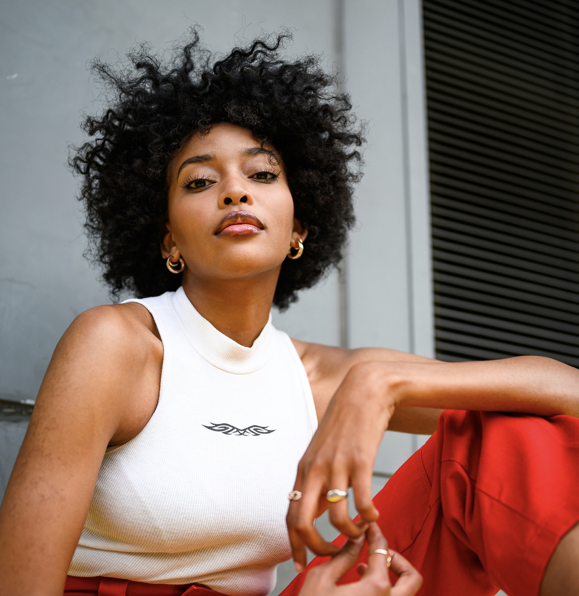
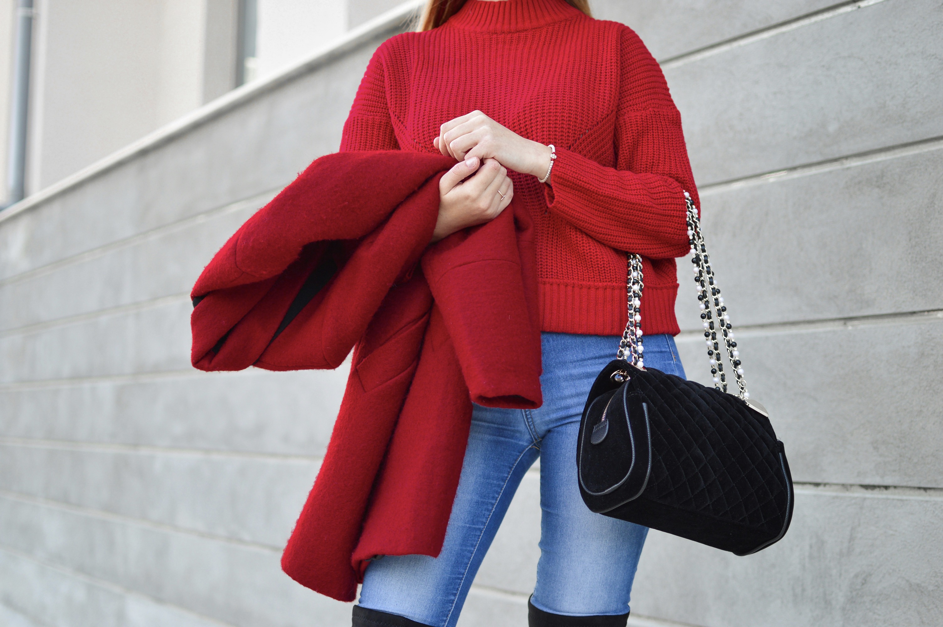
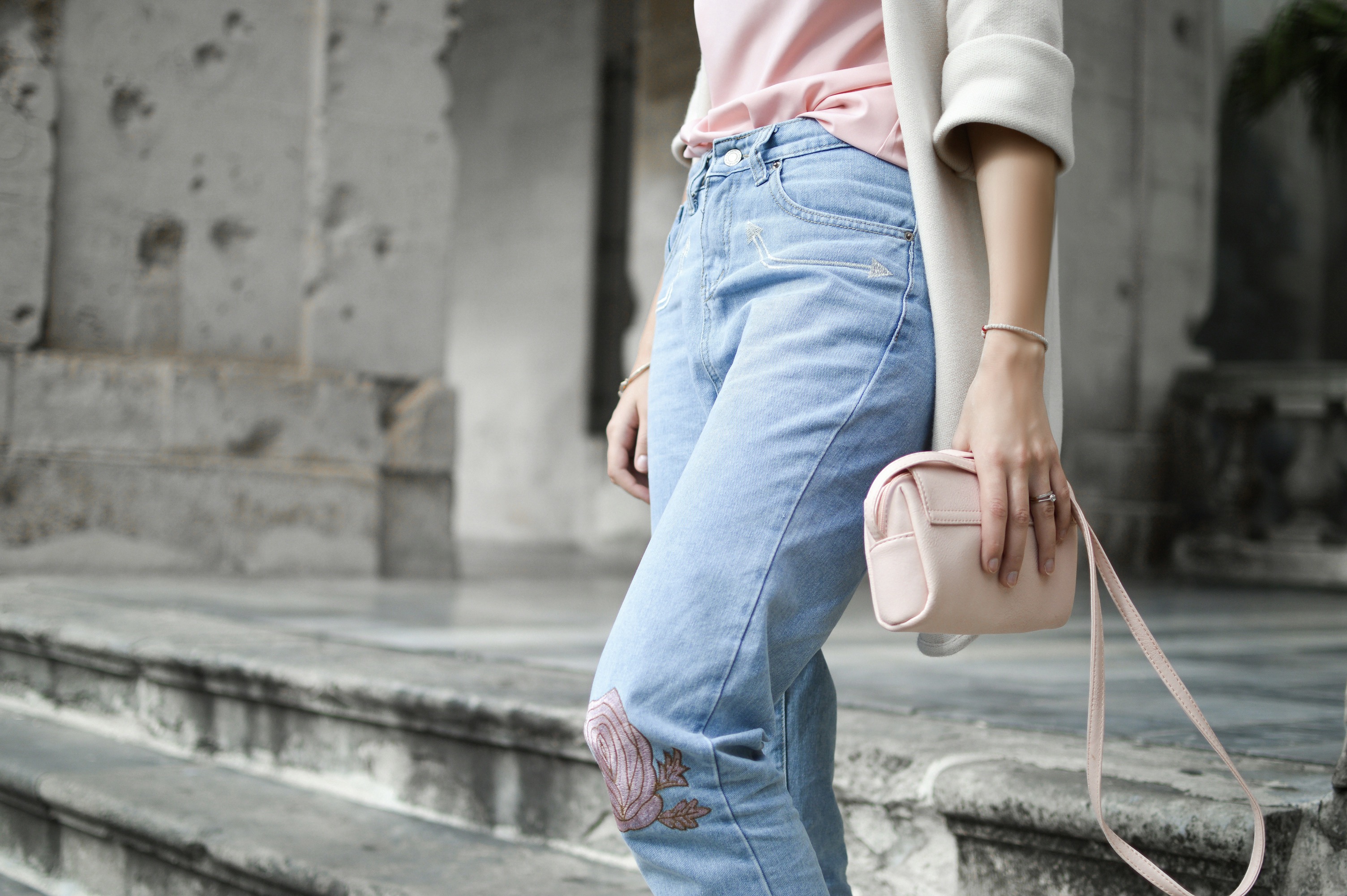
A solid foundation color, like black, navy, or charcoal, provides a versatile canvas for brighter accents. If you introduce a vivid coral or electric lime as the focal hue, keep the rest of the outfit grounded in neutrals so you don’t overwhelm the eye. This approach makes dressing fast and simple in the morning. It also makes it easier to mix and match across workouts and days, cutting down on decision fatigue. When you invest in one bold piece, you can anchor it with two or three supportive items that harmonize rather than clash, ensuring consistency across your training rotation.
Another practical tactic is to seed your wardrobe with color-coordinated sets. Choose a signature color or two and build a few coordinated outfits around them. For instance, a deep blue top with charcoal tights, or a muted olive tee with slate leggings. Sets reduce the mental math involved in outfit planning and ensure you look pulled together, even when you’re in a rush. If you want to push accessorizing without breaking harmony, select a small, repeatable accent—like a headband or a wristband—in a color that recurs in multiple pieces. That subtle thread ties everything together.
Balance function with personality for a cohesive workout capsule.
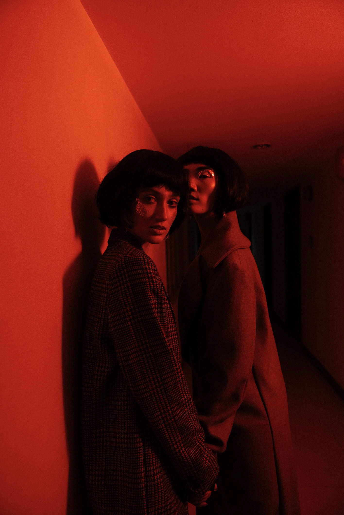
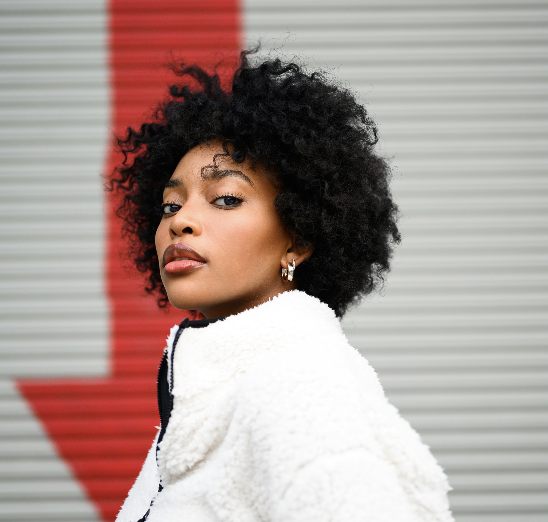
Skin tone can guide your color choices in meaningful ways. Cool undertones often pair well with jewel tones—royal blue, emerald, and amethyst—while warmer complexions glow with earthy tones and warm neutrals such as taupe, camel, or terracotta. In sports settings, gym lighting is often bright and blue-hued, which can alter how colors appear on camera or in person. Test fabrics in natural light when possible to see the true effect. If you regularly photograph workouts, keep a mental note of which hues pop on you and which ones fade, then invest accordingly in your color strategy.
Pattern scale matters for visibility and silhouette. Large-scale patterns can overpower a petite frame and create a sense of bulk, whereas tiny prints can visually lengthen legs and torso. If you want to appear taller, look for vertical lines, tonal gradations, and color blocking that draws the eye upward. For broader shoulders, diagonal patterns and color blocks on the upper body can create balance. The key is to balance scale with proportion: textured fabrics or matte finishes can soften areas you’re mindful of, while glossy fabrics reflect more light and highlight shape, for better or worse depending on your goal.
Build a versatile color roadmap that expands with new pieces.
Function drives fabric choices, too. Compression panels, moisture-wicking fibers, and breathable meshes add comfort and performance. The color and pattern should not only look good but also enhance visibility, reflectivity, and movement. If you train in low-light hours, consider reflective accents in your color palette to improve safety. If your workouts are intense or long, pick fabrics that resist sweat staining and dry quickly, allowing you to stay confident throughout class or run. Choosing performance-conscious colors, like high-contrast combinations, can also help you stay motivated over time.
Pattern choices can influence how you feel during exercise. Subtle tonal blends impart a calm, focused mood, while bright, saturated hues can inject energy into a routine. The psychology of color in sport isn’t just about aesthetics; it can affect tempo and motivation. If you’re transitioning back after a break, you might lean toward softer colors to ease back into a routine, then gradually introduce bolder hues as your confidence grows. Remember that comfort is paramount: fabrics should move with you and feel pleasant against the skin, regardless of the color story.
A practical color roadmap helps you avoid fashion waste and maximize closet longevity. Start with a core palette of three neutrals and two accent colors that you genuinely enjoy wearing. Build on this by adding one patterned piece per season that echoes one of your accent colors. This method creates numerous outfit possibilities without needing a closet overhaul. If you find yourself leaning toward just a couple of hues, you can still mix and match by varying textures, weights, and finishes—matte versus glossy, ribbed versus smooth—so outfits feel fresh while staying coherent.
Finally, test and refine your choices in real life. Take note of how different colors and patterns perform across activities, climates, and lighting conditions. Observe how others respond to your look in classes or runs; feedback can reveal new ideas about what flatters your figure and enhances your energy. Keep a simple log of your workouts and outfits to identify trends over time. The most successful activewear strategy blends personal taste with practical needs, offering a wardrobe that adapts to changing goals while remaining consistently cohesive with the rest of your clothes.