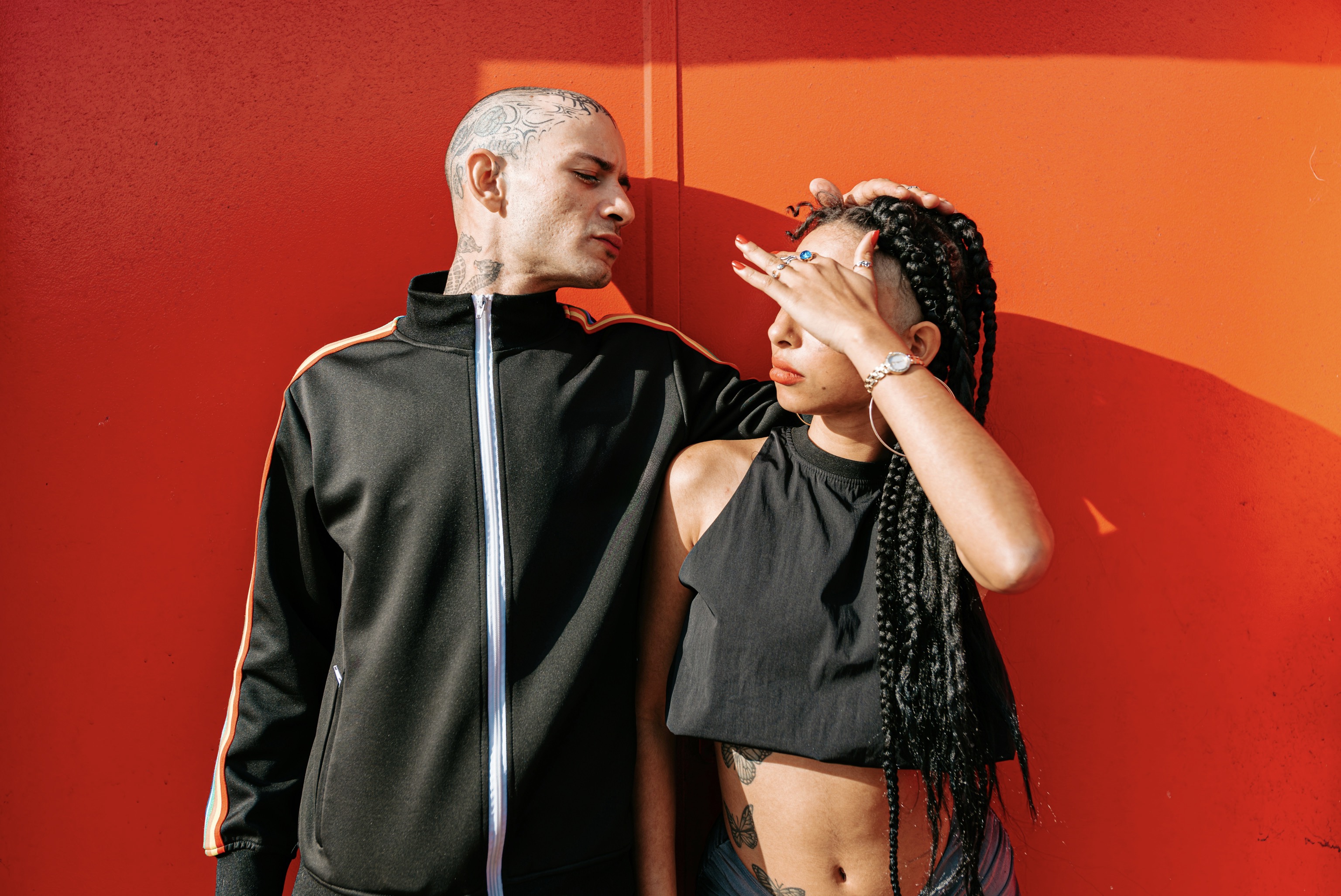
When you plan multiple tattoos across different limbs, the first step is to establish a guiding color framework that feels intentional rather than random. Start by selecting a core palette of two to four hues that resonate with your personality and skin tone. Consider how these tones will interact with natural lighting, both indoors and outdoors, as well as with common wardrobe colors. A cohesive palette should account for warm versus cool undertones and the way colors shift when placed beside each other. This groundwork helps you decide which motifs or styles will anchor the look, ensuring each new piece supports the overall color story rather than competing with it.
Once your color framework is defined, map the placement of your palette across limbs to avoid visual fatigue. Think of the body as a canvas with a rhythm: large areas like the upper arm and calf can anchor dramatic hues, while smaller spaces such as behind the elbow or wrist can carry supportive accents. Use contrast strategically; reserve the boldest colors for areas that will be foregrounded in photos or daily visibility, and let subtler tones drift toward less prominent zones. This distribution keeps the eye moving smoothly and prevents any single limb from overpowering the rest, creating a balanced, cohesive look across the body.
Build a chromatic dialogue that flows from one limb to the next.
A practical way to maintain unity is to repeat key color motifs across sections, such as a recurring secondary shade or a consistent accent hue embedded in different designs. Rather than cloning exact imagery, translate the color language through varied shapes and textures that echo each other. For instance, a cobalt blue found in a sleeve tattoo might reappear as an outline highlight in a wrist piece and as subtle shading in a leg tattoo. Repetition in a controlled, thoughtful manner builds recognition without monotony. The aim is to cultivate a visual thread that weaves through the entire body, guiding the observer’s eye from limb to limb.
It helps to align color temperature with the intended vibe of each area. Warm colors—reds, oranges, and yellows—topically energize, suggesting vitality and movement, while cool tones—blues, greens, and purples—offer calm and depth. When adjacent pieces use opposite temperatures, they create dynamic tension that remains purposeful rather than chaotic. By assigning temperature roles to different limbs or zones, you can orchestrate a palette that feels intentional regardless of where a person is looking. The result is a living, breathing collection of art that reads as a single, deliberate chromatic story rather than a gallery of disparate images.
Use shared color themes and consistent balance across limbs.
Consider the scale and density of each tattoo when integrating color. Larger areas can absorb saturated hues without feeling crowded, while smaller sections benefit from more restrained color usage to maintain legibility and elegance. If you favor dense, intricate work on the forearm, offset it with simpler silhouettes on the chest or calf that still share the same color family. The balance hinges on managing color mass—the total amount of color present per limb. Too much saturation in one area can dominate the narrative, whereas careful distribution invites the eye to travel gracefully across the body in a coherent sequence.
Texture and shading play essential roles in reinforcing color unity. Gradual fades, stippling, or watercolor techniques can blend colors more gently than solid blocks, helping disparate designs “breathe” within the same palette. When a piece features a strong black outline, temper it with softer, warmer tones nearby to prevent harsh sectional breaks. Conversely, dense black work can benefit from cool hints to soften impact without sacrificing contrast. By varying technique while preserving core hues, you create a cohesive, magazine-worthy look that remains expressive and unmistakably yours.
Plan around the body’s natural lines to reinforce harmony.
Narrative motifs can anchor color while remaining versatile. For example, a recurring geometric element or floral motif in your palette can appear in different scales and placements across limbs. The trick is to keep these motifs color-consistent but adapt their form to suit each body region. A large, bold version on the upper arm paired with a smaller, delicate version on the ankle can echo unity without repetition fatigue. When planning, sketch a few mockups to visualize how each piece will contribute to the larger tapestry. This practice makes it easier to adjust color emphasis before any tattooing begins.
Accessibility and longevity should guide your choices. Colors can fade differently based on skin tone, sun exposure, and pigmentation. To safeguard a cohesive look over time, select hues with durability and built-in versatility. Favor mid-range tones over extremes that are prone to rapid fading or skewing as the years pass. Consider how these colors harmonize with natural changes in your physique and wardrobe. A timeless palette will maintain its integrity as fashion shifts, keeping your tattoos relevant and stylish long after you first commit to ink across multiple limbs.
Maintain a mindful, evolving approach to color coordination.
Think about how lines and contours influence color perception. Curved surfaces, bone structure, and muscle definition can alter how a shade sits on the skin, sometimes widening or deepening it. When a color interacts with a prominent bone or tendon, adjust saturation to prevent optical distortion. Conversely, smoother, expansive areas benefit from a richer saturation to anchor attention. A well-choreographed approach respects anatomy while ensuring color reads cleanly from varying angles. Start with test patches or a temporary stencil to observe how the palette translates in motion, under light, and across different outfits.
Palette coherence also relies on scale continuity. Maintain a consistent logic for how large and small elements share color relationships. If a dominant color anchors one limb, ensure its influence appears in secondary accents elsewhere without overwhelming the entire silhouette. You may introduce a tertiary shade as a connecting thread that ties distant pieces together. The objective is to keep visual distance meaningful rather than arbitrary, so each tattoo contributes to a unified narrative rather than competing for attention. When in doubt, step back and reassess the overall composition holistically.
Finally, communication with your tattoo artist is essential. Share your palette strategy early and reference visual sources that illustrate the mood you want. Discuss potential placements, scale, and shading intent so the color plan can be integrated from the outset. A collaborative process yields better outcomes than attempting retrofits after work begins. Bring swatches or digital samples showing how hues interact in different lighting scenarios. By aligning expectations and embracing a shared color language, you increase the likelihood of a harmonious, enduring result that feels intentional and true to your vision.
As your collection grows, periodically reassess the palette to stay cohesive. Personal style evolves, and so might your ink goals. Revisit the dominant colors and confirm they still harmonize with your wardrobe, skin changes, and life stage. When new pieces are added, aim to extend the established chromatic dialogue rather than re-sculpt it entirely. A well-managed palette remains flexible enough to accommodate growth while preserving the integrity of the first ensemble. With thoughtful planning and ongoing care, your tattoos can continue to tell a unified, elegant story across all limbs.