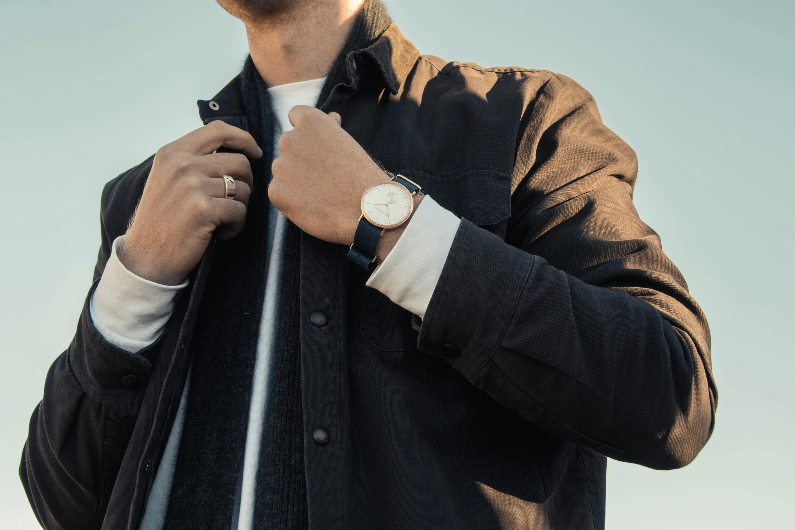
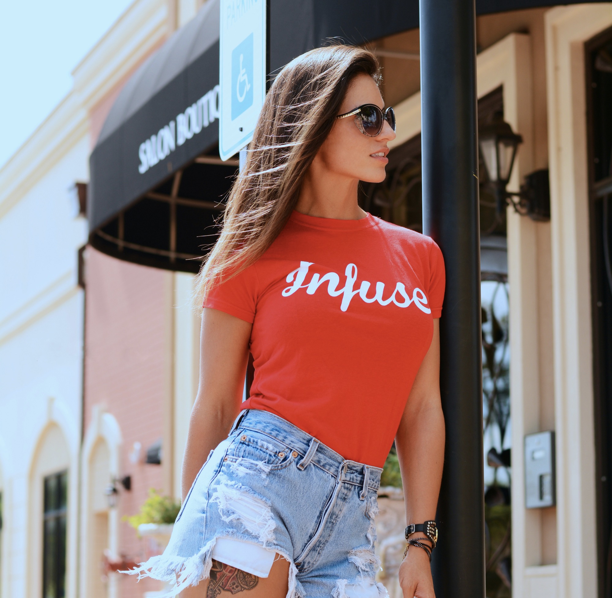
When building a seasonless capsule wardrobe, color strategy becomes as important as fabric selection or silhouette. Tattoos function like a wearable accessory that anchors outfits across occasions, moods, and changing wardrobes. Start by identifying your baseline neutrals—quiet blacks, soft grays, and earthy browns—that echo established staples such as denim, leather, and tailoring. Neutral tones create a versatile canvas that allows bold hues to stand out without clashing. This approach also ensures that your tattoo remains relevant through shifts in fashion, weather, or personal preference, offering a sense of continuity even as your clothing rotates through seasons and events.
After establishing neutrals, you can introduce color in a thoughtful, controlled way. Consider a palette that pairs muted tones with brighter accents, enabling you to switch emphasis without rethinking your entire aesthetic. For instance, a grayscale tattoo with a single accent hue like emerald, burgundy, or deep cobalt can mirror a handful of capsule pieces and their accessories. The key is to map color relationships to your wardrobe’s core pieces, ensuring that tattoos reinforce rather than compete with the outfit’s focal point. With intention, you’ll enjoy flexibility for layering, layering, and accessorizing across countless occasions.
Balancing durability, readability, and personal meaning across color choices.
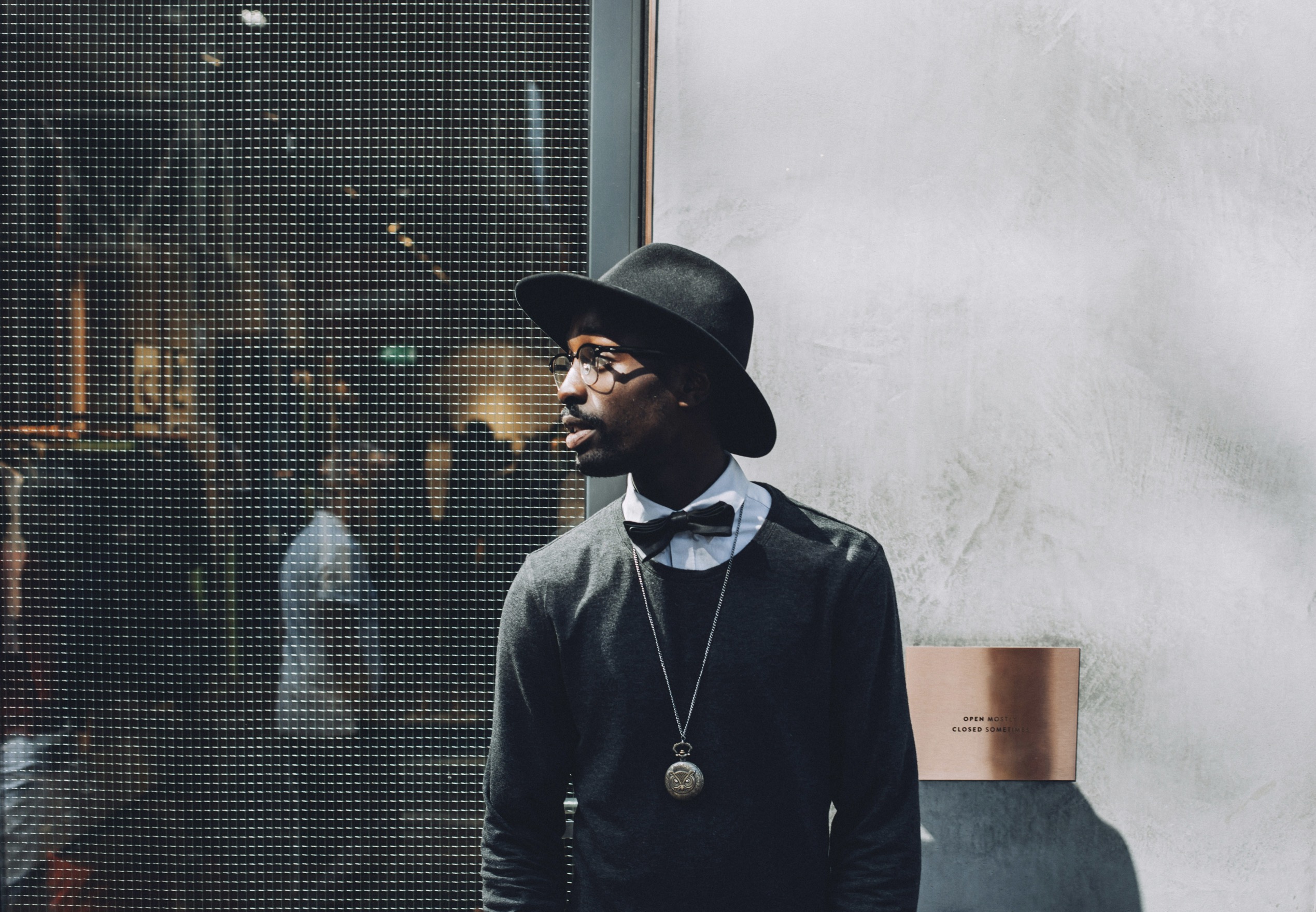
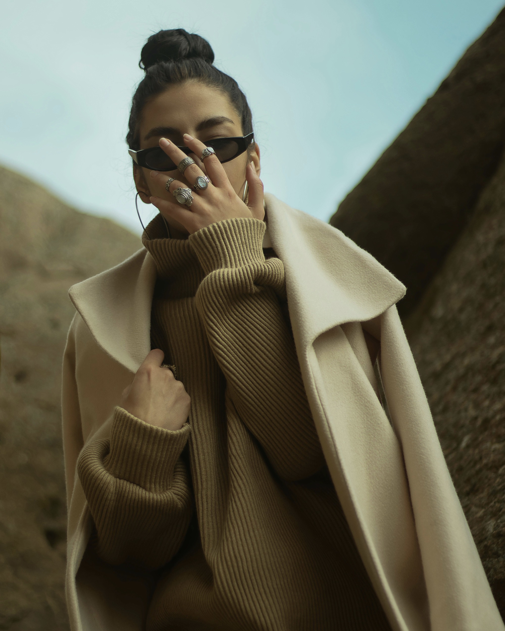
Color choices should reflect the way your wardrobe moves through time. Neutrals act as a grounding force that doesn’t shout, while bold tones provide energy for statement moments. When selecting tattoo colors, think in terms of what complements your most-worn garments: a black leather jacket, a camel coat, or a charcoal suit. Neutral inks blend with these staples, maintaining a cohesive feel across seasons. Bold elements, kept to a single color family, keep the design from feeling gimmicky as trends shift. A restrained approach ensures your tattoo remains modern without overpowering the rest of your curated closet.
A pragmatic approach emphasizes durability and maintenance. Some pigments age differently, and skin tones influence how a shade reads over time. Lighter inks may require touch-ups to preserve vibrancy, whereas darker, saturated pigments tend to endure longer with less fading. When styling, consider the optical effects of color density: denser blacks and rich earth tones often read as more timeless, while saturated primary colors can be striking but more prone to looking dated if overused. Pairing a sturdy neutral base with small injections of color gives you longevity and flexibility in a capsule wardrobe that doesn’t chase every current trend.
Integrating color psychology and practical design for timeless impact.
In practice, designing a capsule-inspired tattoo palette means prioritizing readability and harmony. Start with a primary neutral base—think graphite gray or rich espresso—and pick one or two accent colors that feel seasonless yet expressive. Your choice of placement matters, too; consider areas that are visible enough to anchor outfits but can be concealed when needed. The goal is a unified narrative: the tattoo should complement the clothing story rather than overwhelm it. As you update your wardrobe, the tattoo can evolve through subtle changes in shading or shading depth, maintaining continuity while reflecting personal growth and style evolution.
Another layer to weigh is the emotional resonance of color. Colors carry mood and symbolism that can align with how you present yourself each day. Softer neutrals tend to convey calm sophistication, while deeper hues evoke confidence and intensity. If you prefer a more directional approach, reserve bolder colors for accessories and accents rather than large, intricate designs. This strategy preserves your capsule wardrobe’s flexibility while still giving you a signature mark. The result is a well-balanced, seasonless look that feels intentional rather than ephemeral.
Strategic design considerations for long-term wardrobe cohesion.
Beyond aesthetics, consider the technical aspects of tattoo color stability. Skin chemistry affects how pigment settles, so choosing pigments rated for longevity can reduce the need for frequent retouches. A carefully planned palette helps you avoid color drift where a once-bold shade shifts toward a muddy hue over the years. Talk to a skilled tattoo artist about color-fast options, layering techniques, and how shading can create depth without a heavy-handed appearance. By discussing expectations upfront, you’ll achieve a finish that remains legible, refined, and in sync with a seasonless wardrobe in every light.
The placement of color can also govern how easily your tattoo pairs with outfits. Subtle, high-contrast placements—like a crisp line along the collarbone or a small forearm motif—tend to harmonize with outerwear and knits. Larger panels or sprawling designs, by contrast, might dominate a look unless kept in a controlled palette. When designing for longevity, think about how your tattoo will interact with evolving silhouettes: jackets, oversized pieces, and streamlined dresses. A thoughtful palette and placement strategy ensure your tattoo behaves like a versatile accessory that remains relevant.
The enduring value of a curated, color-conscious tattoo plan.
The process of choosing neutral and bold tones can be guided by a simple, repeatable method. Start with a mood board inspired by your most-worn outfits, focusing on fabrics, textures, and color cues that repeat in your closet. Translate those cues into ink by selecting shades that echo the palette rather than clash with it. Consider a small symbolic motif for the bold color to keep the energy contained and meaningful. This approach makes it easier to imagine how the tattoo will age in harmony with the rest of your wardrobe and lifestyle.
Consistency over flamboyance is a reliable principle for seasonless dressing. If your neutrals are cool-toned, then your bold accents should align with that temperature to avoid jarring contrasts. Conversely, if you lean warm, a warm accent hue will typically integrate more gracefully. The resulting effect is a wardrobe that never looks out of place, no matter what year or season you’re dressing for. With a stable base and limited bright color, your tattoo becomes a quiet anchor rather than a loud disruptor.
Finally, approach the tattoo as a form of permanent personal branding that evolves with you. A capsule wardrobe thrives on minimalism with intentional variation, and your ink should reflect that philosophy. A neutral foundation offers compatibility with almost any garment, while a well-chosen bold hue can elevate an otherwise reserved ensemble. Your choices should feel timeless enough to wear for decades, and flexible enough to adapt with your changing tastes. Periodically reassess the palette in light of new purchases or shifts in style, and adjust where necessary to maintain harmony.
With deliberate planning, you’ll enjoy a seamless integration of tattoos and a seasonless capsule wardrobe. The strategy hinges on restraint, layering, and smart color selection—neutral bases paired with selective, meaningful bolds. This combination supports outfits across all occasions, from casual weekends to formal events, without the fear of color fatigue. The ethics of longevity apply to ink as much as to fabric: invest in quality, plan ahead, and let your tattoo serve as an enduring accent that enhances your daily uniform rather than dictating it. Your style thus stays coherent, confident, and timeless.