Creative ideas for integrating typography and imagery into tattoos that tell a layered story
Typography can weave with imagery to create tattoos that unfold meanings over time, inviting viewers to read between the lines, notice subtle contrasts, and witness a personal journey etched in ink that speaks beyond simple symbols.
Typography and imagery can be sculpted together so they converse rather than compete. When a sentence becomes a landscape, the letters curve with hills and rivers; when imagery speaks, the font shifts to a more compact, emblem-like style. Start by mapping a narrative arc onto the skin: a line of text that introduces a character, then a companion image that represents a turning point, followed by a final, reflective line. The trick is to harmonize line weights, spacing, and rhythm so neither element overwhelms the other. A well-composed piece invites the eye to travel across the skin, savoring each word and each image in turn.
The planning stage lays the foundation for a layered tattoo that remains legible decades later. Gather references that feel emotionally precise: poetry stanzas with vivid imagery, dates that carry memory, and symbolic drawings that resonate personally. Then decide how to fuse them: do you want the typography to weave through the imagery like vines, or sit as a separate but co-equal panel? Consider the body’s contours—should the text wrap around a limb, echo a bone line, or ride along the curve of a shoulder? Foresee aging effects, such as skin tightening, ink migration, and font legibility, and choose ink densities and line weights accordingly.
Layered storytelling grows when text and imagery are allowed to breathe together.
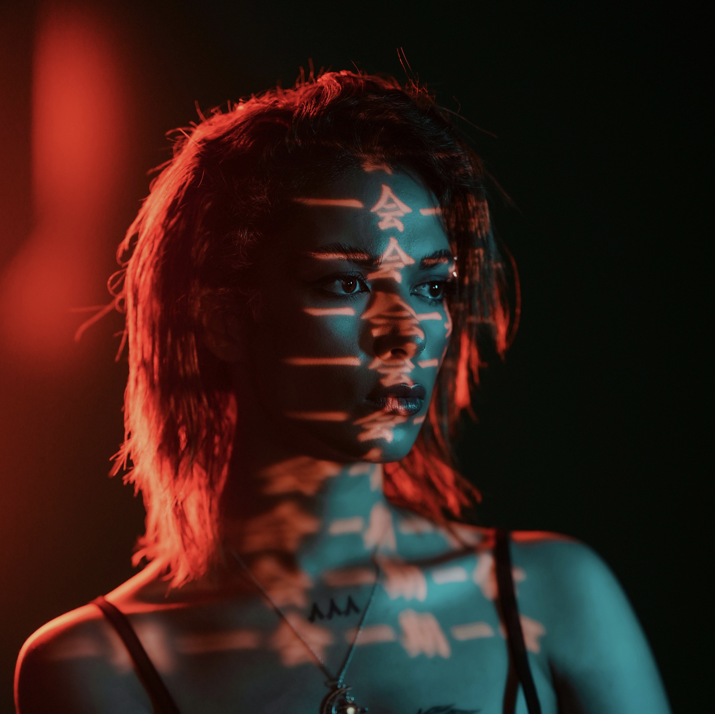
The concept of layered storytelling thrives when typography is treated as a character. Each font carries voice: a handwritten script can feel intimate and spontaneous, while a geometric sans communicates precision and restraint. Overlay a stark letterform with a delicate illustration, but ensure there is negative space to guide the viewer’s gaze. The text may begin as a whispered caption and gradually emerge into the foreground as the imagery recedes. This dynamic invites interpretation, encouraging people to slow down and read the tattoo as a mini narrative rather than a single, static motif. The result is a design with depth and mood.
Color can reinforce the narrative without muddying legibility. In black-and-gray work, typographic lines stay crisp and timeless, while selective color cues highlight symbolic moments or themes. If you prefer color, use a restrained palette that echoes the imagery rather than competing with it. For example, a blue accent may hint at water or memory, while a gold highlight can signal a moment of revelation. Experiment with subtle gradients that travel along the line of text, guiding the eye from word to image as if following a map. The key is cohesion: color tells you where to look, typography tells you what to feel.
Subtle contrasts render a layered tattoo that rewards patient readers.
Thematic anchors create continuity across multiple panels. A line of dialogue can become the thread that ties a series of images—each scene representing a chapter, each image decoding a mood. Use recurring motifs or symbols to represent recurring ideas: a compass for direction, a clock for time, a feather for memory. Let typography carry the tonal shift between chapters—soft, cursive handwriting for nostalgia, bold serif for decision, or angular display type for conflict. By planning the sequence, you invite viewers to experience a story as a journey rather than a snapshot. The tattoo becomes a living storyboard that ages with you.
Texture adds another dimension to typography-driven imagery. Consider blending dotwork shading with crisp letterforms to create contrast, or layering light washes behind a strong type title to evoke atmosphere. The juxtaposition of rough and refined textures mirrors inner tension: rough lines may hint at struggle, while clean type indicates clarity gained through experience. Experiment with typographic shadows or embossed effects that interact with the surrounding imagery. Even small details—kerning tweaks, baseline shifts, or ligatures—can communicate subtle personality shifts over time. A textured approach invites closer inspection and rewards repeated viewing.
The inked narrative benefits from deliberate chronology and spatial logic.
Narrative tattoos often succeed when there is a quiet, deliberate cadence. Begin with a short opening line that feels like a prologue, followed by a central image that embodies the turning point, then finish with a closing sentence that resonates as a personal epilogue. The typography should rise and fall with the story’s emotional terrain; let the font breathe in moments of calm and tighten in moments of tension. Rhythm can be achieved through line breaks, aligned margins, and the interplay of uppercase and lowercase forms. A well-timed pause—like a comma, or a deliberate blank space—can be as powerful as any drawn symbol.
Imagery should act as mnemonic anchors that support the text’s meaning. Choose symbols with personal resonance rather than generic tropes. A lighthouse might symbolize guidance through darkness, but an anchor paired with a handwritten note can speak to resilience and grounding. When you attach a visual cue to a line of text, ensure its scale and placement reinforce the reading order: read first, notice the emblem, then absorb the emotion behind the words. The tattoo should feel intentional, almost architectural, with each component serving a purpose in the whole story. A thoughtful pairing makes the piece legible and meaningful for years to come.
A timeless approach blends personal meaning with universal readability.
Placement is storytelling as well as decoration. Wrists and forearms invite short, intimate lines that can be read in sequence with a simple gesture. Upper arms and backs offer room for expansive typography and larger imagery, enabling a more cinematic arc. Consider how the wearer moves through space; the tattoo should align with natural body motions, so line breaks occur at comfortable reading points. For a layered approach, plan a map-like layout where each chapter occupies a zone or panel that flows into the next. Think in terms of readability and transformation: the person wearing the tattoo should become a living manuscript.
Maintenance and aftercare influence long-term readability. Ultraviolet exposure can fade certain inks, while skin changes over time can alter how text appears. Ask your artist about pigment choices known for longevity and contrast. Shield exposed work from sun during the healing phase and adopt sun protection thereafter. Regular touch-ups can preserve line integrity and color depth, especially for intricate, detailed typography. Documenting the original color palette and font guidelines helps ensure future sessions stay faithful to the intended design. A well-cared-for tattoo continues to tell its layered story clearly.
Creating a layered tattoo starts with a clear concept and a collaborative process. Share your story aloud, collect references, and test how words interact with lines and shapes on skin. The artist will translate your narrative into a sequence that respects typography rules while embracing artistic freedom. Expect revisions as you refine the balance between text and image. A successful piece maintains legibility, emotional honesty, and visual harmony across decades. It should invite scrutiny without demanding a single correct interpretation. In the end, the strongest tattoos offer a dialogue: what you read reveals what you feel, and what you feel colors what you read.
Practice patience and give the design time to mature. Allow the story to unfold gradually as you live with the tattoo. You may find that certain phrases gain significance only after a season of reflection, or that new imagery clarifies an emerging theme. A layered tattoo is a living document—its typography and imagery evolve with you as your perspective shifts. Choose a studio and artist known for cohesive storytelling and technical precision. When you look at it years from now, you should sense a coherent narrative arc, an intimate memory, and a piece of art that feels inevitable rather than imposed.