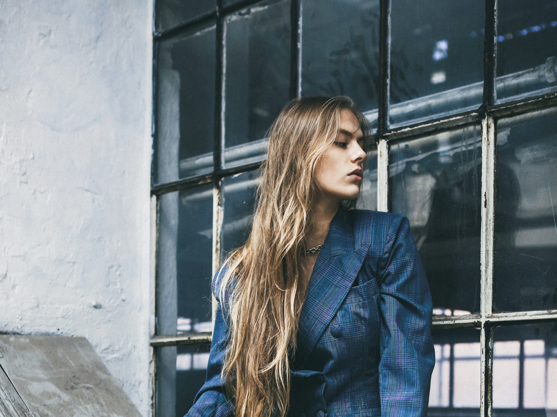
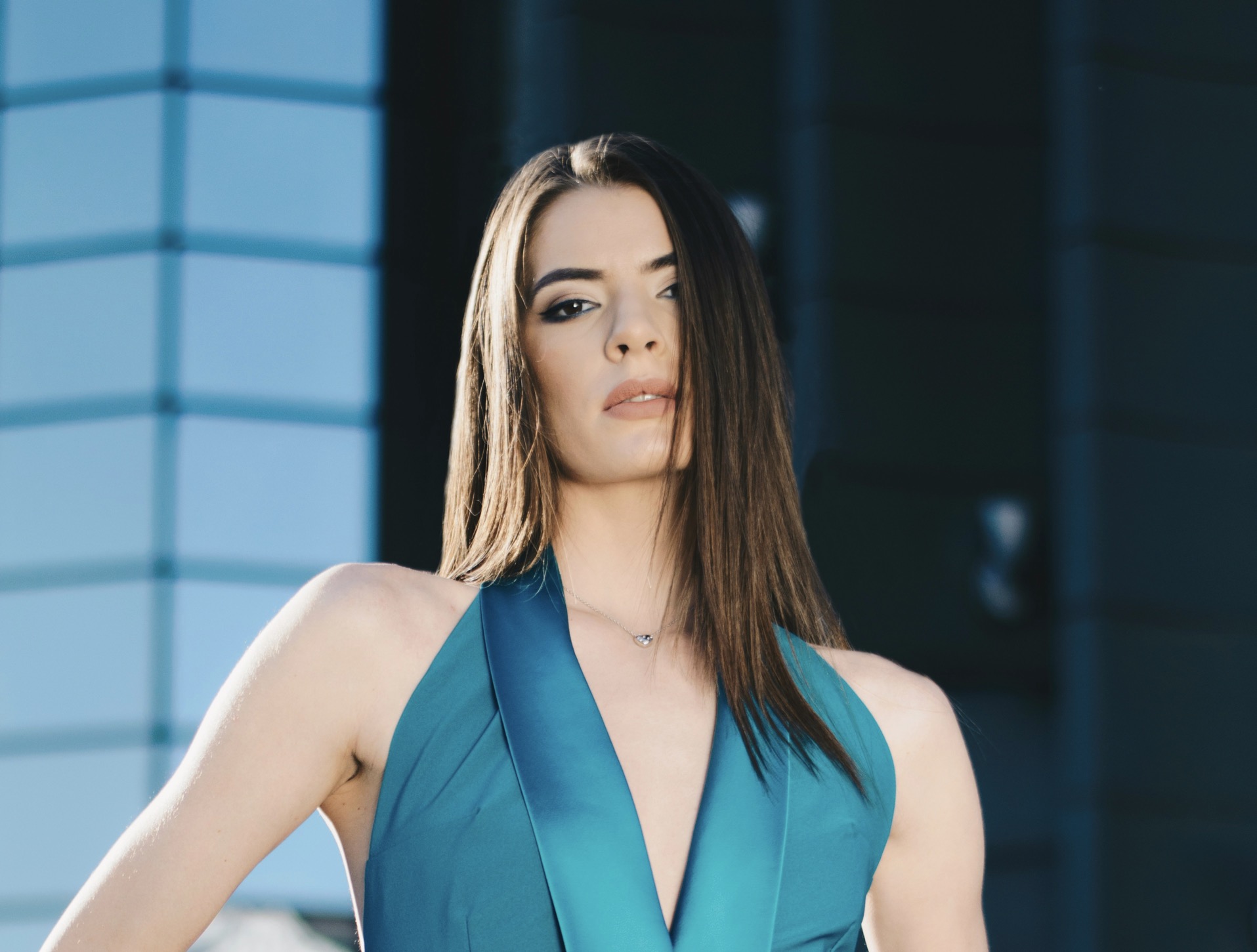
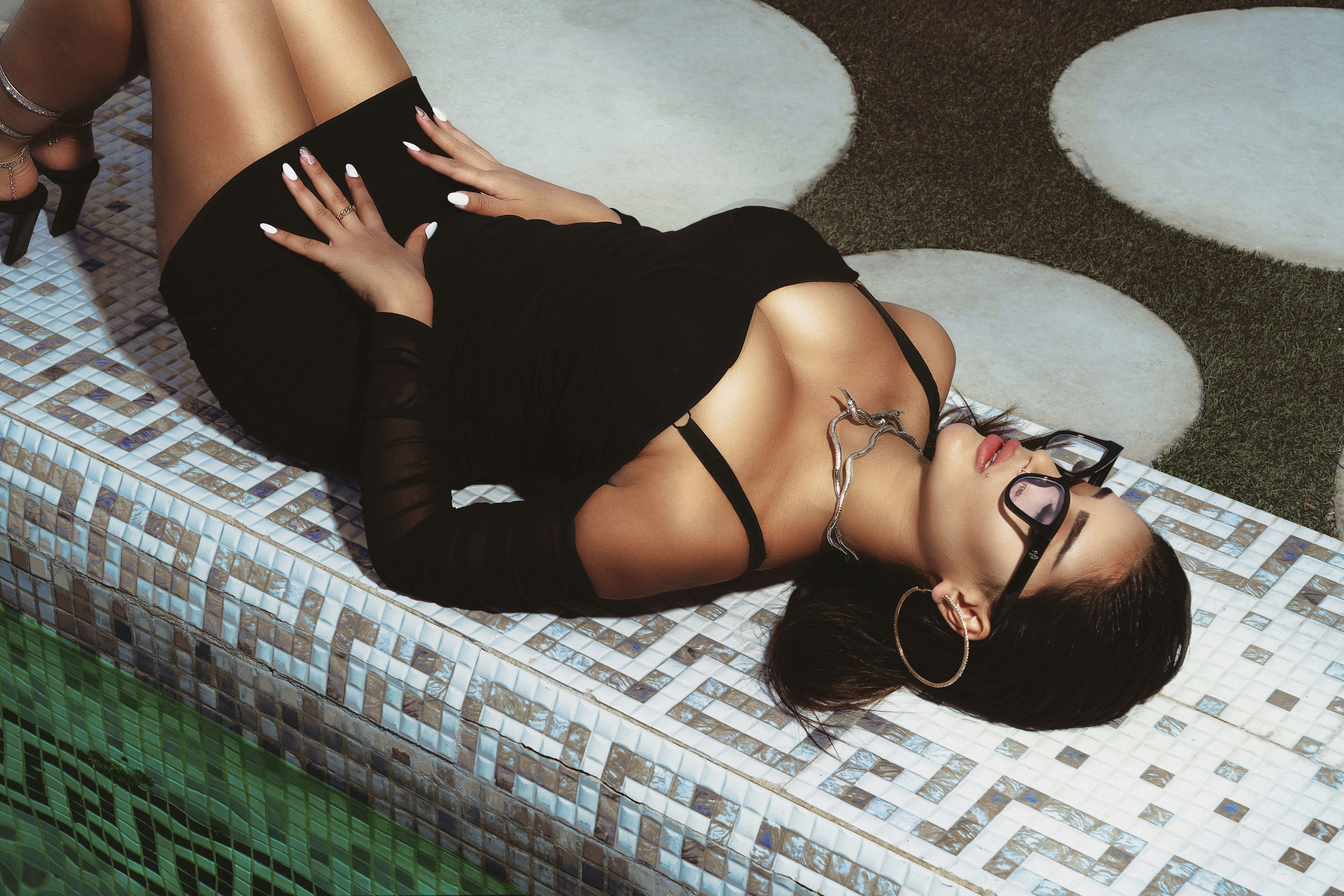
Seasonal editorials translate materiality into visual language so shoppers can anticipate how garments feel and move. Photographers use close-ups, motion shots, and textured backdrops to emphasize fiber content and surface finish. Lighting choices reveal sheen or matte surfaces while models’ poses demonstrate stretch, weight, and structure. Color grading and depth of field further imply softness or rigidity by highlighting edges and silhouette clarity. Art direction often pairs tactile pieces with complementary props to suggest context: a chunky knit shown beside weathered wood signals warmth, whereas silk garments staged near reflective surfaces communicate smoothness and fluidity. Together these elements let consumers infer touch without direct contact.
Beyond individual garment depiction, editorial sequencing constructs comparative touch cues across an entire collection. By juxtaposing coarse tweeds with luminous satins across spreads, editors create contrast that sharpens viewers’ perception of each fabric’s attributes. Styling choices such as rolled cuffs, exposed seams, or layered looks reveal practical handling and potential pairing options. Models interacting naturally with clothing—zipping, draping, or clasping—offer behavioral clues about fit and comfort. Captions and short copy often reinforce tactile impressions by naming fibers or recommending care, reinforcing sensory expectations. Collectively, these curated narratives allow shoppers to visualize wearing ensembles and make better-informed purchase decisions online and in-store.
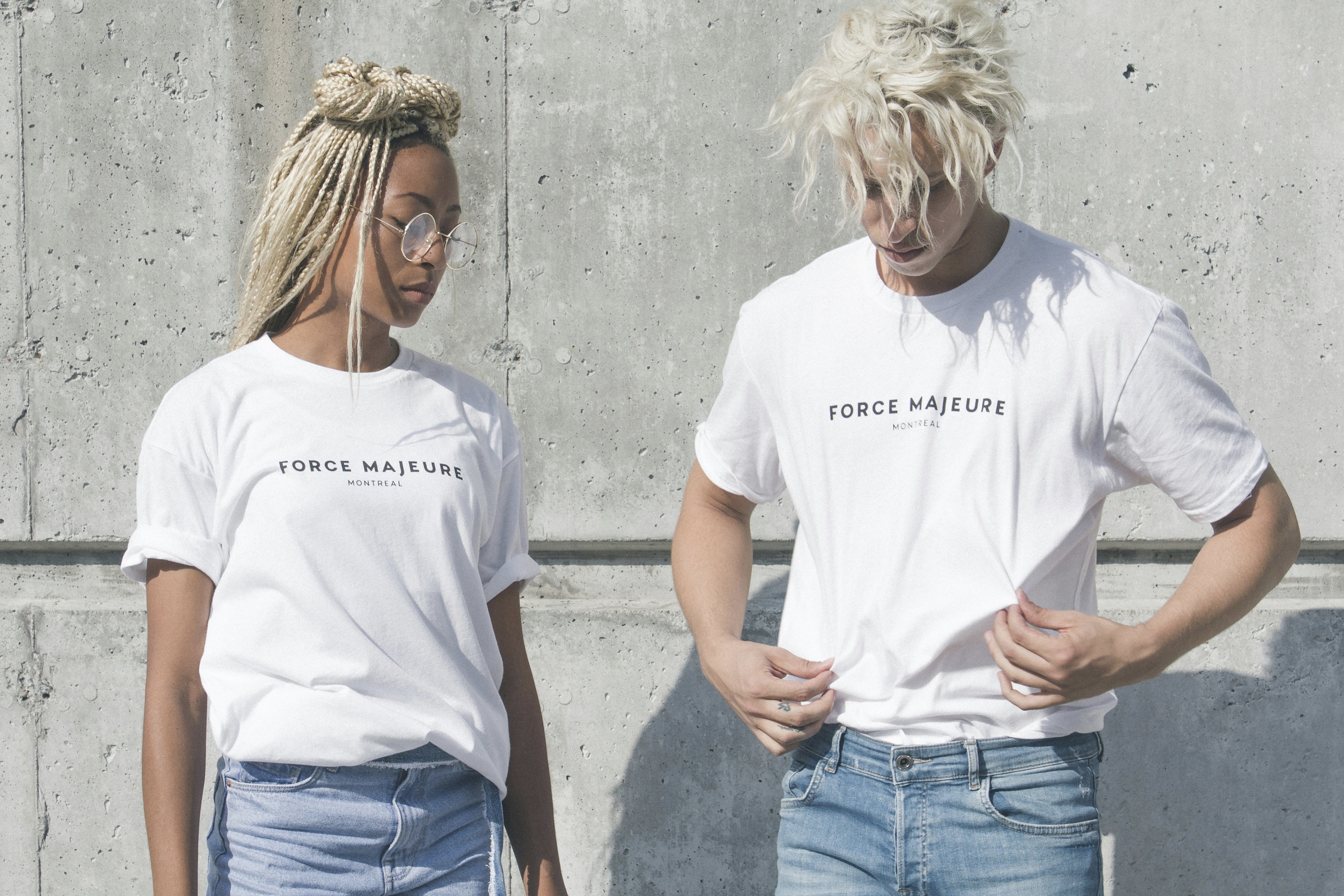
Styling choices that teach consumers how to wear pieces together.
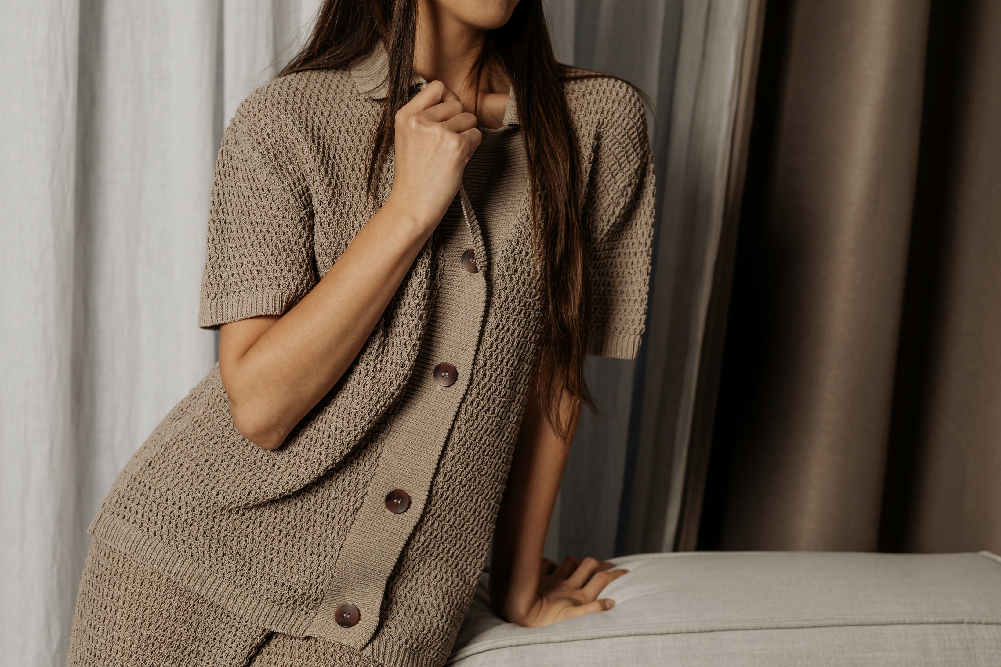
Close-up photography is one of the most reliable tools for conveying textile detail to an audience. Macro shots capture thread direction, weave density, and surface irregularities that signal coarseness or fineness. A detailed image of knit loops implies stretch and warmth, while a macro of satin reveals characteristic light bounce and slip. Photo editors crop frames to emphasize grain or stitch patterns while maintaining context with portions of the whole garment visible. When combined with a shallow depth of field, these images isolate important tactile markers and direct focus to material quality. These portrayals are particularly crucial for digital retail where consumers cannot touch fabrics physically.
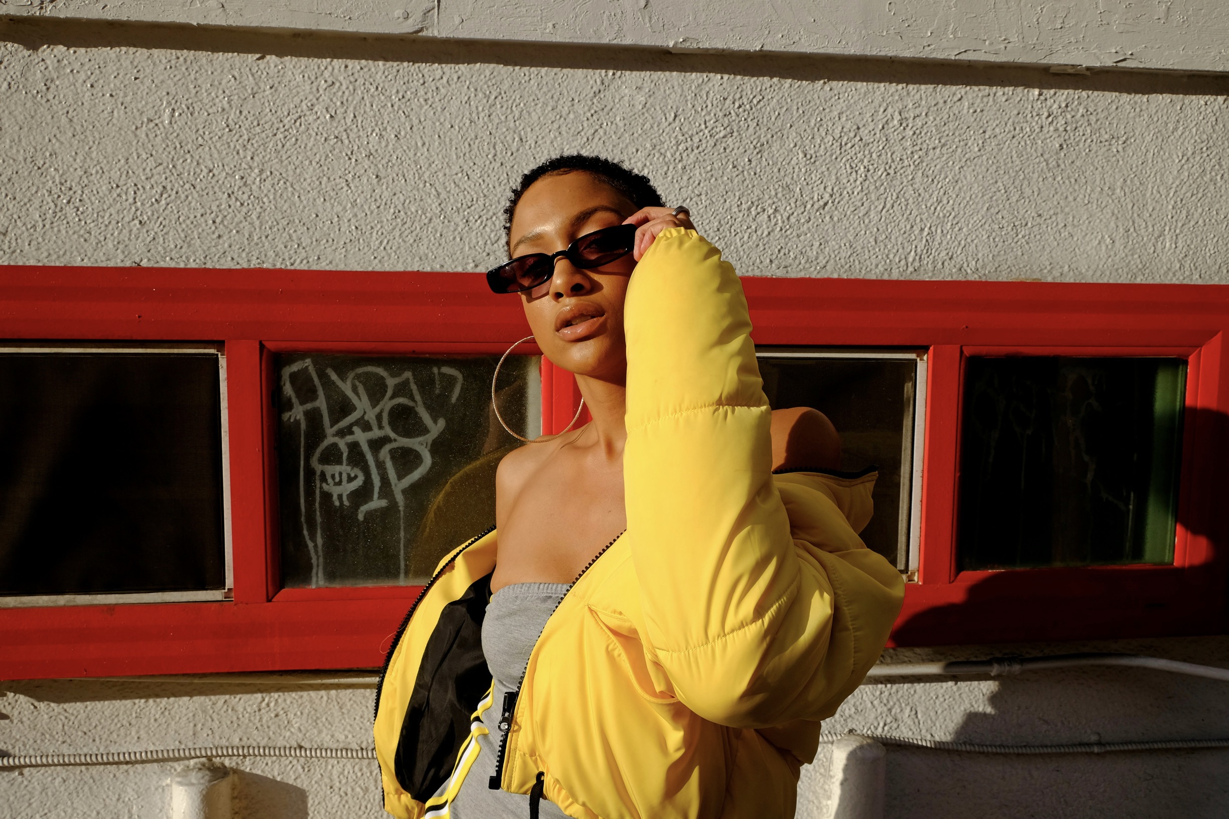
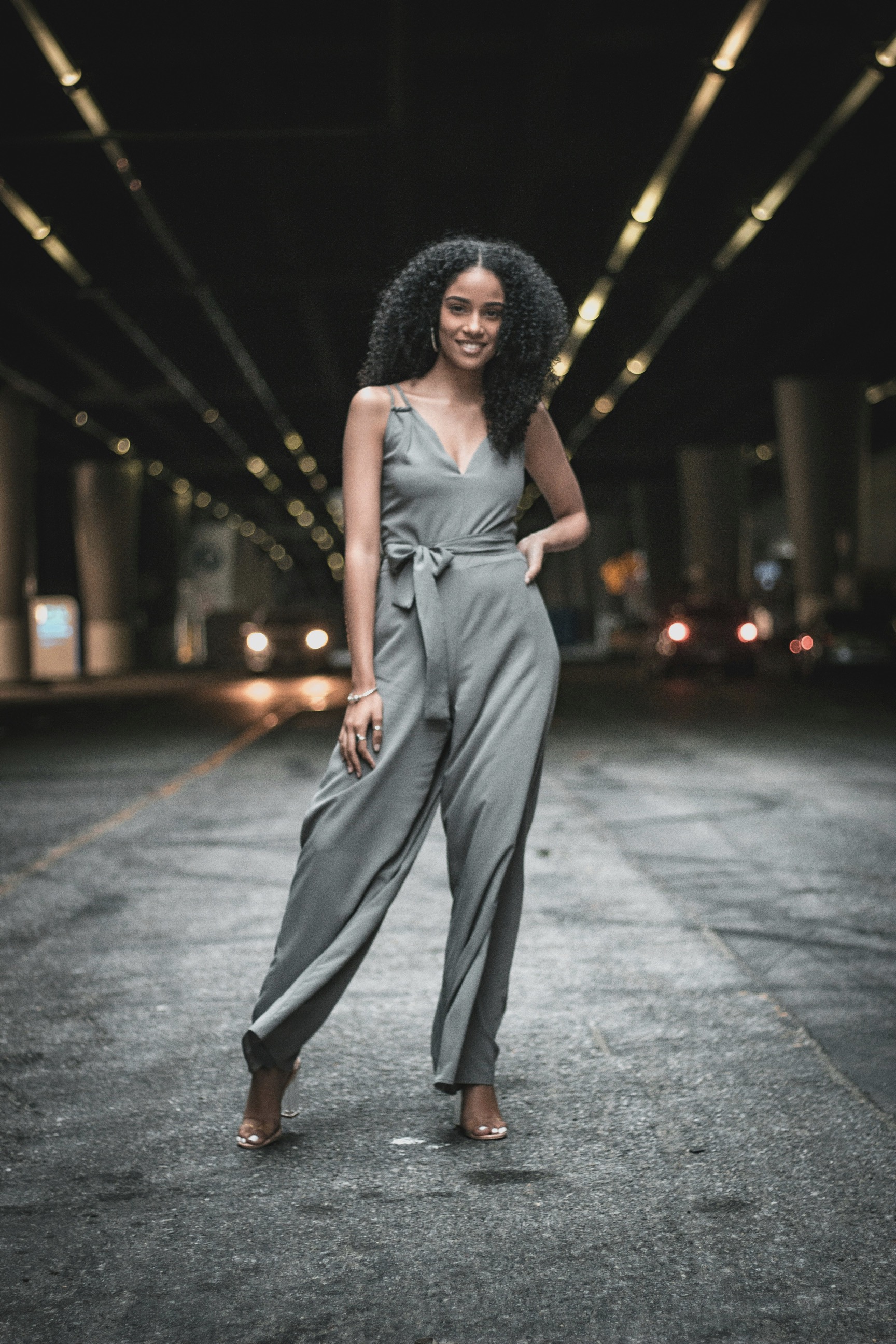
Motion imagery, including GIFs and short videos, augments static photography by demonstrating fabric behavior during movement. A skirt twirling on camera illustrates drape and weight, while a jacket settling on shoulders reveals structure and stiffness. Slow-motion clips capturing wind through fringe or tassels transmit the sense of flow and reaction to motion. Behind-the-scenes footage showing fittings and fabric handling can also humanize the production process and underscore tactile attributes. By integrating motion into campaigns, brands help buyers anticipate how garments will perform in real life, reducing uncertainty and increasing confidence in styling and purchase choices.
Design elements that emphasize material quality and garment functionality.
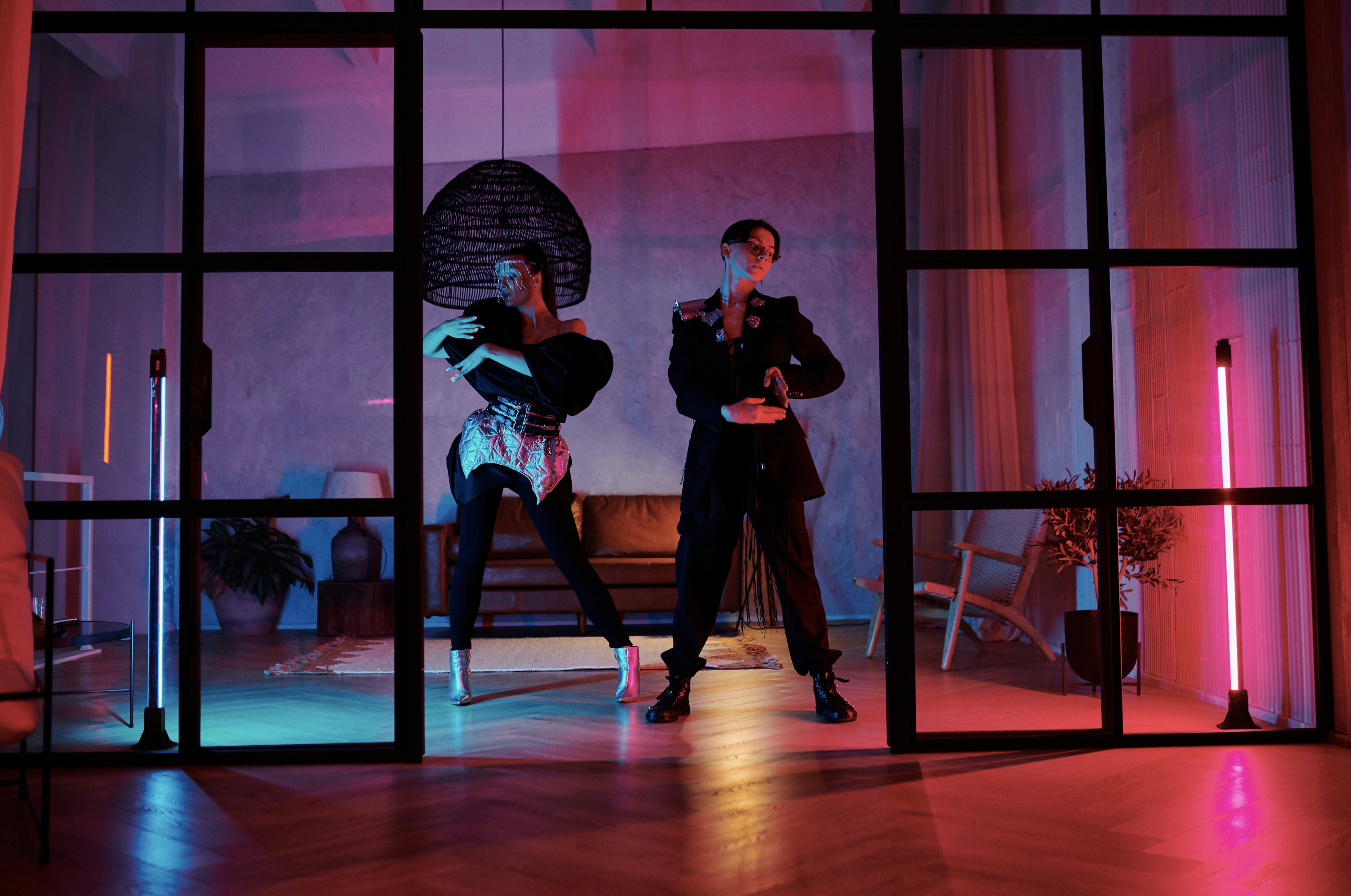
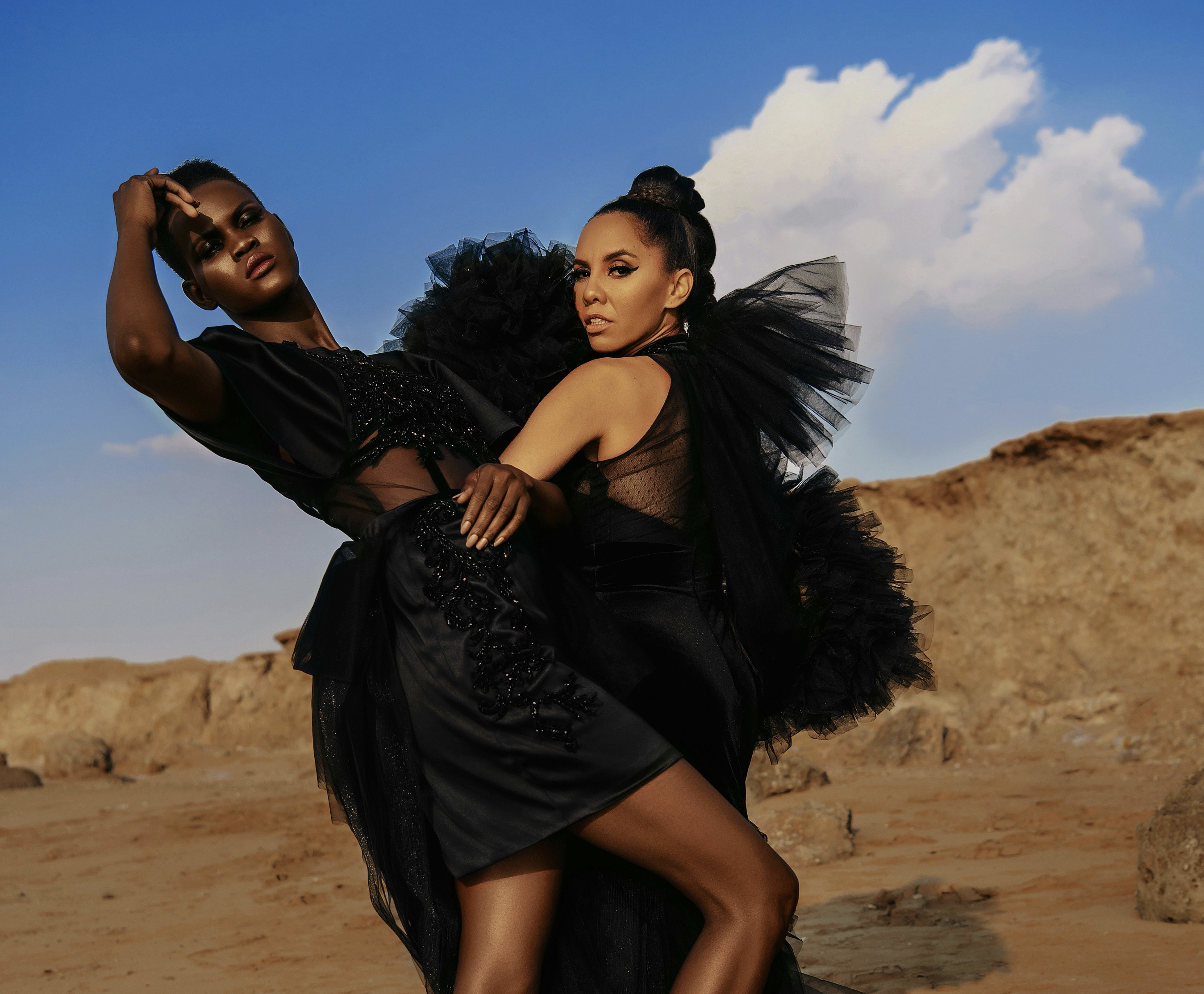
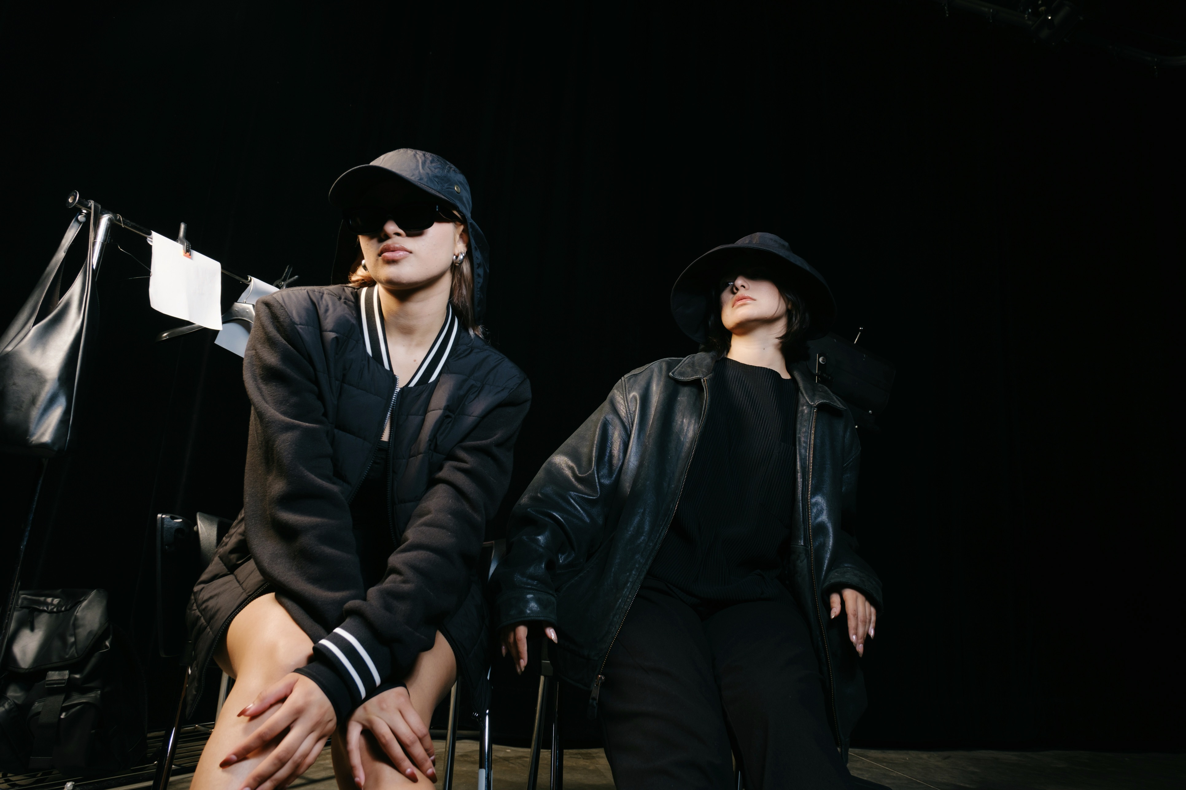
Editorial stylists intentionally assemble looks to communicate practical pairing strategies and highlight tactile interplay between materials. Combining textured sweaters with sleek leather informs consumers about balance and contrast, while monochrome ensembles emphasize material differences through silhouette rather than color. Layering techniques demonstrated in shoots—such as tucking, belting, or cuffing—give actionable guidance on how to manage volume and reveal material edges. Accessories are curated to either contrast or harmonize textures, guiding viewers toward creating complete outfits that read cohesively in real life. These considered styling decisions function as educational moments within imagery, enabling audiences to replicate polished combinations when curating their own wardrobes.
Editorial sequencing also uses contextual scenarios to reinforce the functionality of materials within real-world settings. Showing rainproof outerwear in an urban storm scene clarifies water resistance and seam construction, while lounge sets photographed in a cozy interior suggest softness and ease. Seasonal contexts—brisk coastal backdrops for wind-resistant fabrics or sunlit terraces for breathable linens—teach consumers when and where to deploy specific garments. This narrative framing helps buyers understand not only how items feel, but how they should be styled and used in everyday life. Consequently, editorial storytelling reduces mismatch between expectation and experience after purchase.
Photography and copy working together to shape tactile perception.
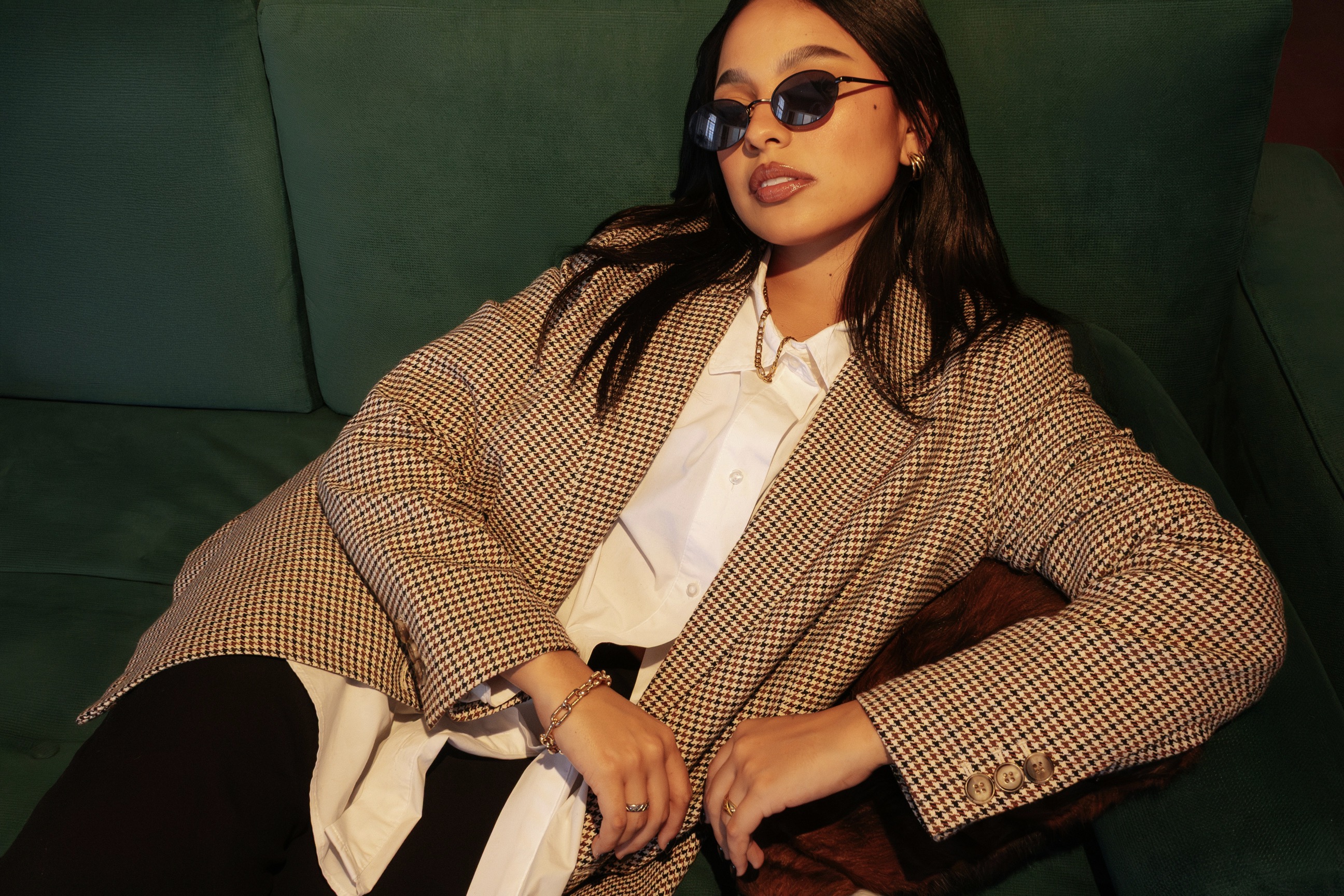
Art direction often highlights seams, linings, and hardware to signal construction quality and tactile intent. Exposed seams indicate a deliberate design aesthetic and can suggest flexibility or reinforcement, whereas refined, hidden stitching speaks to smoothness and luxury. Showcasing lining textures through open jackets or turned cuffs informs consumers about inside feel and potential temperature regulation. Hardware choices such as matte zippers or polished clasps contribute to perceived weight and tactile contrast. These details, when photographed thoughtfully, communicate durability and user interaction elements, enabling viewers to assess whether a piece meets their expectations for touch, wearability, and maintenance.
Typography, captioning, and short editorial copy within imagery also contribute to sensory interpretation by naming fabrics and suggesting care routines. Words like “brushed,” “raschel-knit,” or “mercerized” provide technical anchors that clarify visual cues for informed shoppers. Copy that recommends layering techniques or pairing options supplements the imagery with actionable styling tips, directly linking tactile characteristics to wear scenarios. The combination of textual labels and visual evidence empowers customers to match garment properties with personal preferences and climates. This synergy between language and picture increases clarity around tactile qualities and sharpens the consumer’s ability to make confident styling decisions when browsing collections.
Consumer education through imagery and accessible product information.
Color grading and lighting are subtle yet powerful methods for suggesting fabric surface and weight. Warm tones and diffused light can impart a cozy, plush impression suitable for knits and brushed materials, while crisp, cool lighting accentuates the slickness of technical fabrics or glossy finishes. High-contrast lighting brings out texture depth, revealing raised patterns and tactile relief, whereas soft illumination minimizes shadows and implies smoothness. Color temperature influences perceived thickness and warmth, helping consumers determine seasonal appropriateness. Thoughtful manipulation of these visual variables supports the editorial goal of translating tactile sensations into an accessible visual language for shoppers making styling choices.
Model selection and movement direction also factor into tactile communication strategies within editorials. Different body types and posing styles reveal how materials stretch, cling, or drape across varied silhouettes, offering practical insight into fit and proportion. Choosing models who interact naturally with garments—buttoning, tucking, or adjusting—shows how fabrics respond to everyday motion. Directional movement, such as walking shots or seated poses, highlights stress points and tells viewers where garments sit during activity. This human element connects tactile expectation to real-world use, helping consumers visualize how pieces will behave on their own bodies and guiding more accurate styling decisions.
Integrating product details and tactile descriptions into editorial layouts increases buyer confidence and supports informed choice. Tags, overlays, or companion product pages that list fiber content, weight per square meter, and recommended care bridge the gap between visual impression and technical reality. When editors pair these specifications with close visual examples and styling suggestions, customers gain a fuller picture of how items will perform. Educational callouts that explain why a fabric behaves a certain way or how it should be layered demystify tactile attributes for less-experienced shoppers. Clear, accessible information reduces returns and enhances satisfaction by aligning expectation with the garment’s actual tactile profile.
Finally, consistent visual language across campaigns fosters brand trust and simplifies decision-making for repeat customers. When a label reliably uses the same cues to denote softness, structure, or performance, shoppers learn to decode material signals faster and apply styling choices more confidently. Consistency in photography style, copy tone, and contextual framing builds a sensory vocabulary that audiences internalize. Over time this reduces reliance on touch and encourages buyers to experiment with mixes and matches because they understand the brand’s shorthand for tactile qualities. Such coherence in editorial practice ultimately strengthens consumer relationships and supports smarter, more satisfying styling outcomes.