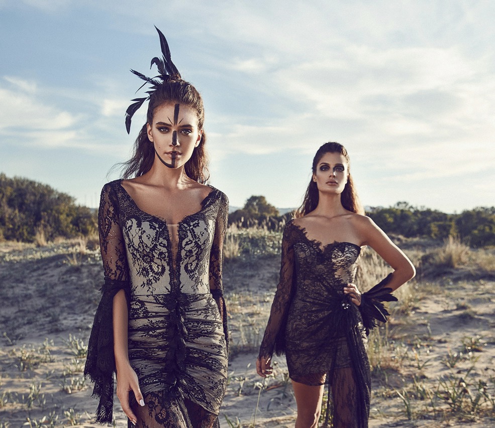
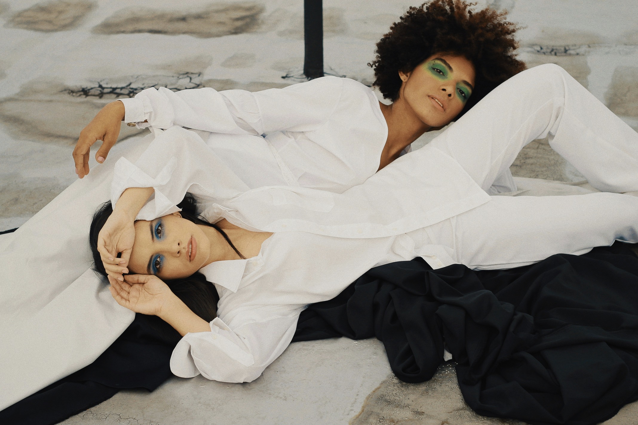
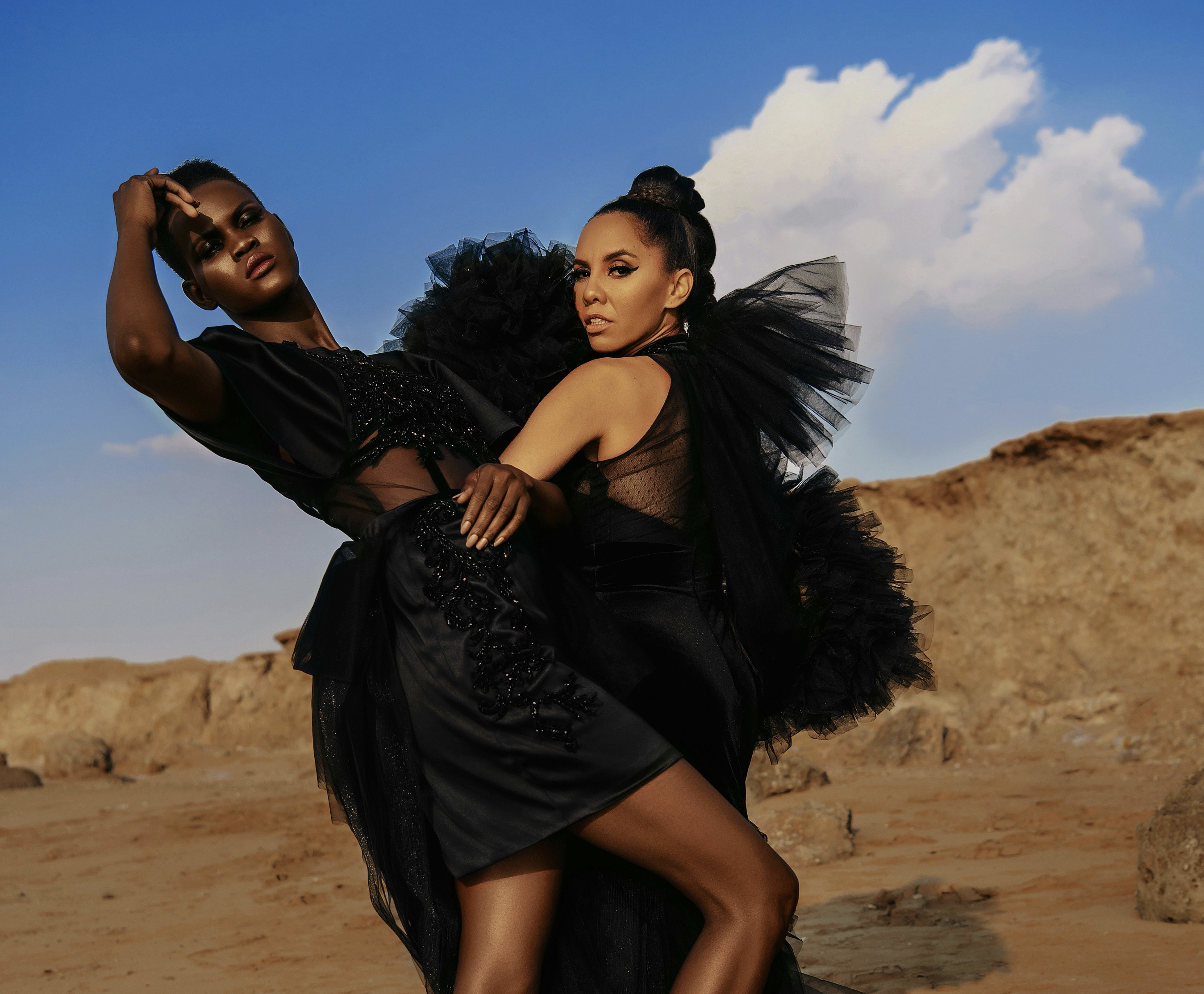
From early collections that tested contrasts and harmonies to later capsules that refined balance, the label developed an intuitive understanding of color relationships. Designers experimented with temperature, saturation, and scale, blending cool neutrals with saturated accents and sometimes reversing expectations with muted primaries. These choices were repeatedly applied across garments, accessories, and marketing imagery, creating a pattern of expectation. Consumers began to notice a throughline: certain hues paired with specific textures and silhouettes signaled the brand at a glance. Over time, this consistent approach produced a visual shorthand that communicated identity without logos, allowing audiences to identify pieces by mood and palette as much as by cut or craftsmanship.
The brand’s process favored intentional restraint alongside bold punctuation, a strategy that shaped consumer perception. Instead of chasing fleeting trends, color decisions focused on longevity and cross-season versatility, selecting palettes that could migrate between spring breezes and winter layers. Photographers and stylists reinforced this aesthetic by staging campaigns with repeated tonal families and ambient lighting that accentuated chromatic relationships. Retail displays echoed the same scheme, arranging merchandise to emphasize complementary shades and tonal progressions. This omnichannel consistency taught shoppers to read color cues as part of the brand’s story, embedding the label’s aesthetic into everyday wardrobes and encouraging repeat recognition regardless of the time of year.
Material choices allowed color to remain relevant across seasonal shifts.
Consumers responded to the clarity of the label’s chromatic decisions, which offered both visual comfort and novel combinations. Some pairings felt familiar yet fresh, like a classic navy paired with unexpected terracotta or a pale sage offset by deep ink. These mixes balanced familiarity with discovery, encouraging purchases for both their utility and their stylistic statement. Social sharing amplified that recognition; customers photographed outfits in natural settings that highlighted the brand’s signature groupings. Influencers and editors adopted the look, reinforcing the palette as a cultural reference. Because the color system was thoughtfully scalable, it could be adapted to different garments and accessory categories without losing coherence, sustaining the label’s visual language across varied releases.
The evolution toward a seasonless palette involved shedding strict color calendars in favor of adaptable harmonies that traveled through seasonal transitions. Rather than restricting warm tones to autumn or cool pastels to summer, designers layered shades to create reversible associations that worked year-round. Fabrics played a key role: a dye that read vibrant on silk could appear softer on wool, enabling the same hue to suit multiple contexts. This material sensitivity expanded how colors were perceived, making them less tied to a single climatic message and more to a continuous brand identity. The result was a catalog where garments from different drops felt like parts of a single, evolving composition rather than discrete seasonal statements.
Consistent visuals across channels cemented the label’s chromatic identity.
The label’s merchandising strategy supported the seasonless theory by curating in-store groupings that mixed new arrivals with archival pieces under consistent color stories. This presentation method normalized mixing across collection cycles and encouraged consumers to see purchases as investments in a coherent wardrobe. Visual merchandising teams used fixtures, lighting, and backdrop hues that complemented the core palette, ensuring that even disparate items read as harmonious together. Online, product photography adhered to the same tone rules, with color-corrected images and cohesive model styling reinforcing the brand’s chromatic narrative. These tactics reduced the friction of decision-making for buyers and amplified resale potential, as pieces remained desirable beyond a single season.
Packaging and communications extended the visual language beyond garments into tactile and digital touchpoints, strengthening associations between color and brand identity. Gift boxes, shopping bags, and labels used restrained color accents to remind customers of the brand’s palette even after purchase. Email campaigns and social posts continued to present curated palettes, guiding viewers through suggested pairings and seasonal edits that aligned with the brand’s neutral-but-distinct schemes. This continuity made the brand’s color system a persistent thread in customers’ experiences, transforming occasional purchases into sustained recognition. By embedding the palette across touchpoints, the label ensured its chromatic choices influenced perception from unboxing through daily wear.
Thoughtful collaborations and analytics supported gradual chromatic refinement.
Collaboration and limited-edition drops provided opportunities to test new color combinations while maintaining overall coherence. When partnering with artists or external designers, the label selected collaborators whose sensibilities complemented existing palettes, ensuring experimental hues still felt part of the brand family. Capsule releases introduced accent tones that, when successful, were integrated into the permanent scheme or reinterpreted in different mediums. This iterative approach allowed the brand to evolve without alienating its audience, as shifts appeared intentional and curated rather than erratic. Customers who followed these collaborations experienced growth in the palette organically, perceiving the label as both innovative and trustworthy in its chromatic stewardship.
The data-driven side of the brand informed color decisions through sales insights and customer feedback, bridging aesthetic intuition with commercial reality. Best-selling colorways were identified and then expanded across categories, while lagging combinations were quietly retired or reformulated. Customer service interactions and social metrics revealed how particular shades resonated emotionally, guiding designers toward palettes that stimulated loyalty. Retail analytics also showed which pairings encouraged cross-category purchases, allowing teams to craft assortments that nudged shoppers toward complete looks. This feedback loop refined the visual language over time, embedding market-tested combinations into future collections and ensuring that aesthetic coherence aligned with consumer preferences.
The label’s palette became a sustainable, recognizable cultural asset.
Education played a role in helping consumers decode the label’s seasonless approach, with styling guides and in-store consultants demonstrating how pieces could transition across weather and occasions. Lookbooks showed layered outfits combining the brand’s core hues with new accents, while staff training emphasized the logic behind pairings to assist shoppers in creating versatile wardrobes. Workshops and styling events invited customers to explore personal color mixes within the brand’s parameters, strengthening the sense of belonging to an aesthetic community. This pedagogical element demystified design choices and empowered buyers to participate in the label’s visual language, increasing their confidence in mixing items from different seasons and solidifying the brand’s recognizable chromatic signature.
Over years of disciplined application, the color system became a differentiator amid a crowded market, enabling the label to command a distinct place in consumers’ minds. Media coverage referenced the palette as a hallmark, and resale platforms used color tags that matched the brand’s vernacular. The seasonless approach also aligned with sustainable consumption trends, as garments that worked across seasons reduced the pressure for constant turnover. Customers appreciated the ability to build curated wardrobes based on a trusted chromatic framework, which simplified shopping and promoted longer-term use. In turn, the label reinforced its identity by continuing to apply consistent color logic, ensuring that its visual language remained both recognizable and relevant over time.
The long-term impact of this chromatic strategy extended into customer loyalty and cultural resonance, with fans adopting the aesthetic in personal styling and lifestyle choices. Community forums and social feeds showcased coordinated interiors and travel outfits inspired by the label’s colors, turning a design system into a broader cultural reference. Aspiring designers studied the brand’s approach as a case study in restraint and coherence, while retailers sought to emulate the seamless mix of seasonless hues. As the palette permeated different spheres, it affirmed the brand’s role not only as a clothing company but as a curator of mood and taste, shaping how a generation thinks about color in the context of daily dressing and visual identity.
Looking forward, the label can continue to evolve its visual language by balancing innovation with fidelity to core principles, ensuring new experiments respect the established chromatic grammar. Introducing subtle shifts in proportion, texture, or finish can refresh the palette while maintaining continuity. Ongoing dialogue with consumers and attentive analysis of cultural shifts will allow the brand to adapt responsibly, keeping the seasonless vocabulary relevant without abandoning the signals that made it recognizable. By treating color as a living system rather than a fixed formula, the label can preserve its distinctive voice while embracing thoughtful growth, allowing its intentional combinations to remain meaningful to both devoted followers and new audiences.