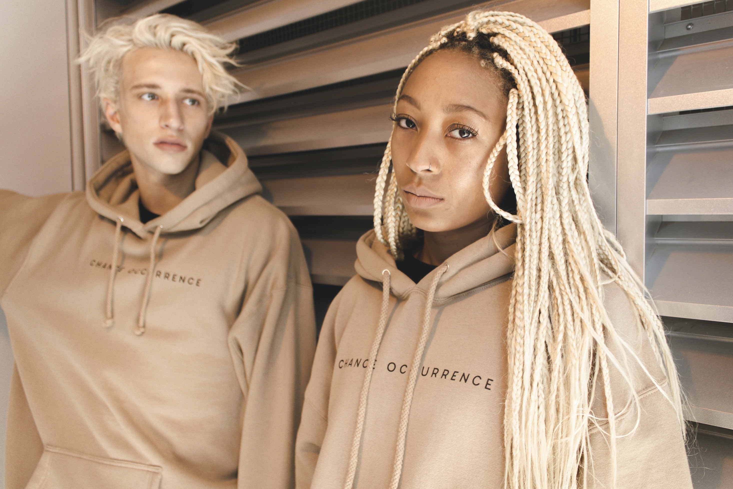
Smart strategies for mixing patterns and textures in menswear without looking overstyled or mismatched.
A thorough guide to combining patterns and textures in men's outfits, offering practical, timeless strategies that foster confidence, balance, and distinct personal style without tipping into busy or mismatched territory.
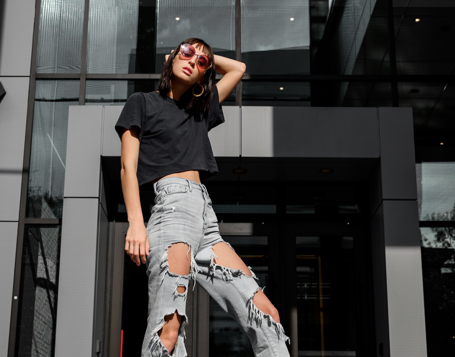
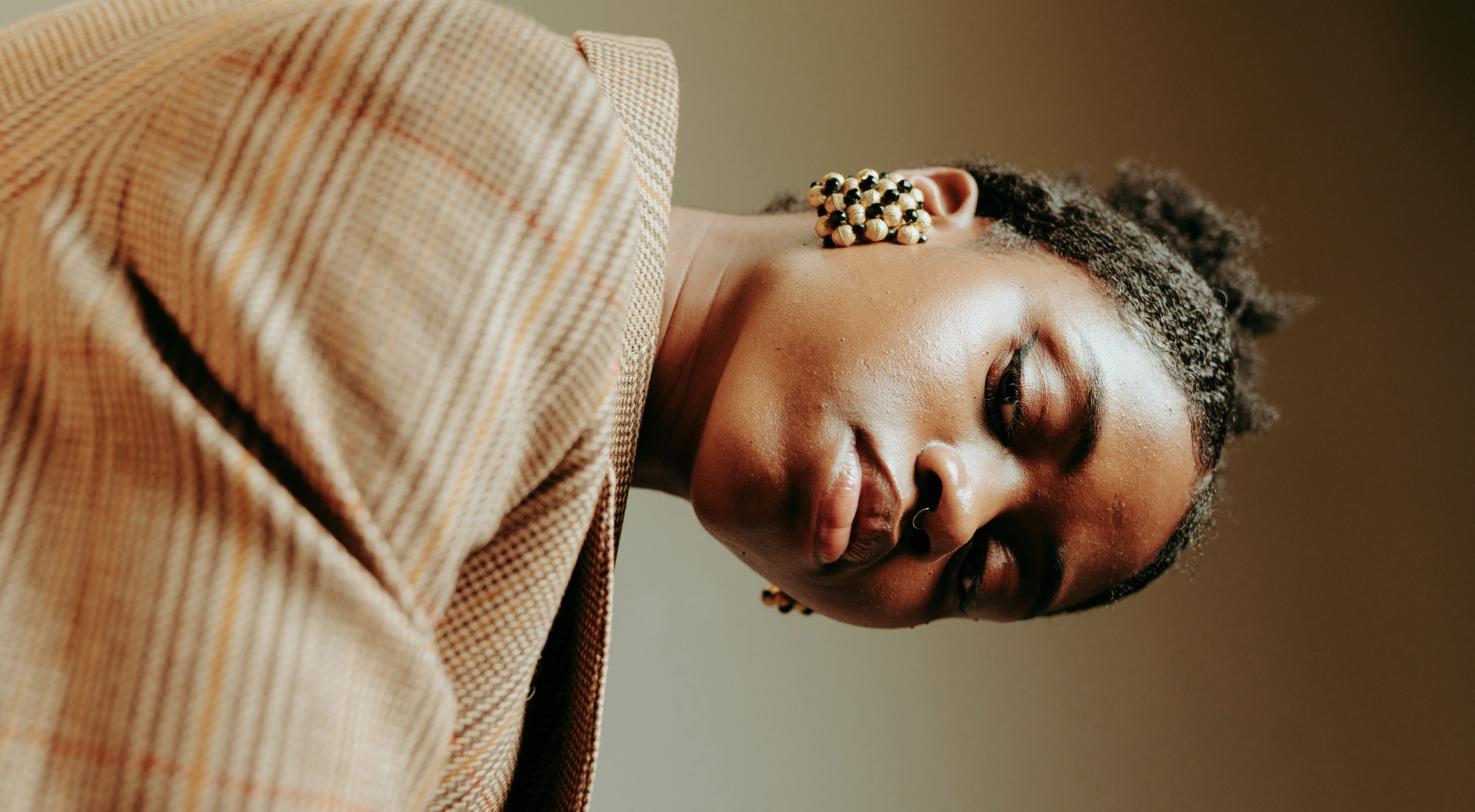
Pattern and texture play in menswear can be a delicate art, yet with a clear approach you can achieve depth without clutter. Begin with a unifying element, such as a dominant color that runs through the entire look, then layer contrasting patterns and textures around it. For example, pair a fine striped shirt with a subtle check blazer and a knit tie or textured pocket square. The key is scale: large motifs contrast with smaller ones, while rough textures sit against smoother fabrics to create visual interest without shouting. This approach invites experimentation while preserving cohesion across the ensemble.
A practical framework for mixing boldly is to treat patterns as musical chords and textures as rhythm. Start with a solid foundation piece—typically trousers or a coat—in a neutral shade. Introduce a pattern on the top half that’s no louder than a mid-volume print, then add a secondary texture in a complementary hue. If the primary pattern involves crisp lines, offset it with a softer texture like brushed wool or a suede belt. Avoid competing color families; instead, lean on tonal harmony. By balancing intensity through proportion and tactile contrast, you maintain polish rather than an overload of signals.
Texture creates depth; patterns define personality; balance maintains harmony.
Balance is the backbone of a well-constructed outfit, especially when patterns collide. Begin with one dominant print and keep the other elements subdued. For instance, a charcoal suit with a narrow pinstripe can tolerate a micro-check shirt, provided the shirt color aligns closely with the suit’s base. Introduce texture through materials that don’t compete visually—think a matte knit tie with a smooth shirt, or a brushed leather belt to anchor a lighter shoe. The goal is to let each element breathe while contributing to a unified silhouette. By foregrounding restraint, you empower bold choices without appearing discordant.
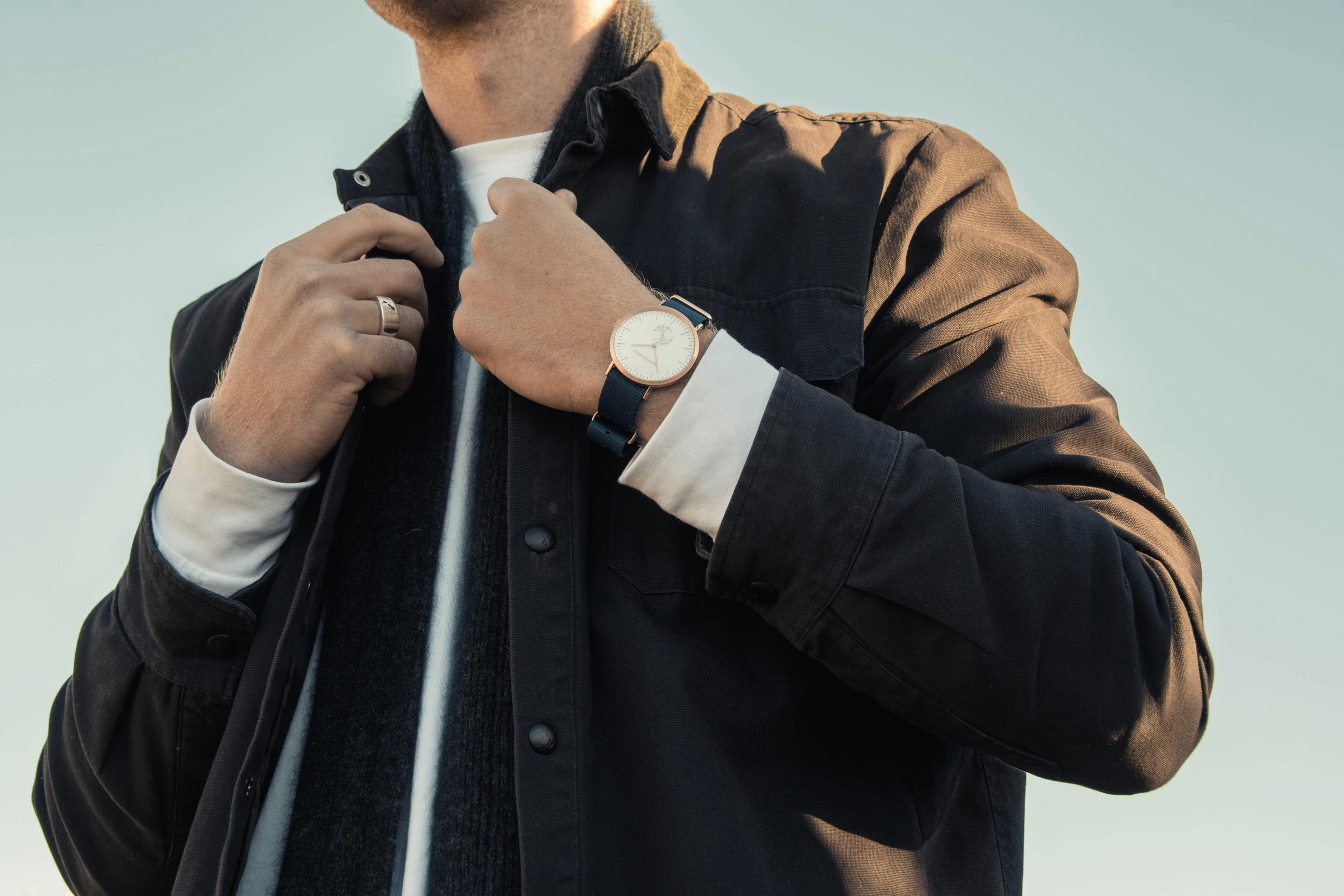
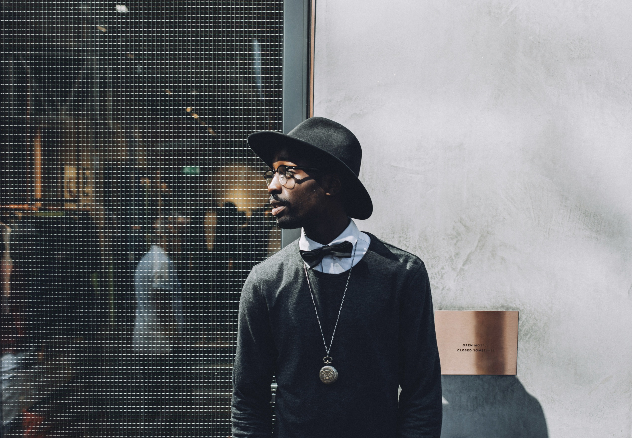
Contrast, when applied thoughtfully, enhances style rather than overwhelms it. A crisp, light dress shirt meets a darker, louder jacket by choosing complementary weight fabrics. If your jacket features a bold geometry, soften the rest of the look with plain accessories and a simple, untextured shoe. Conversely, a plain base can be enlivened by a subtly patterned scarf or a textured sweater peeking from under a blazer. The objective is to create a dialogue between pieces where patterns speak in turn and textures provide supportive harmony. When in doubt, step back and review the overall rhythm.
Intentional scale and color grounding unify varied textures and patterns.
Texture layering requires discipline to avoid bulk and distraction. Start with fabrics that drape well and stay neat through the day—lambswool, flannel, and lightweight tweed offer tactility without wear-time bulk. A structured wool blazer benefits from a soft knit tie or a cashmere scarf that introduces warmth without visual heaviness. Leather and denim can anchor casual looks, but keep them from competing with refined fabrics upstairs. If you’re wearing suede, allow smoother fabrics nearby to prevent the ensemble from feeling rough or busy. The trick is pairing tactile diversity with clean lines, so the eye moves smoothly rather than leaping between elements.
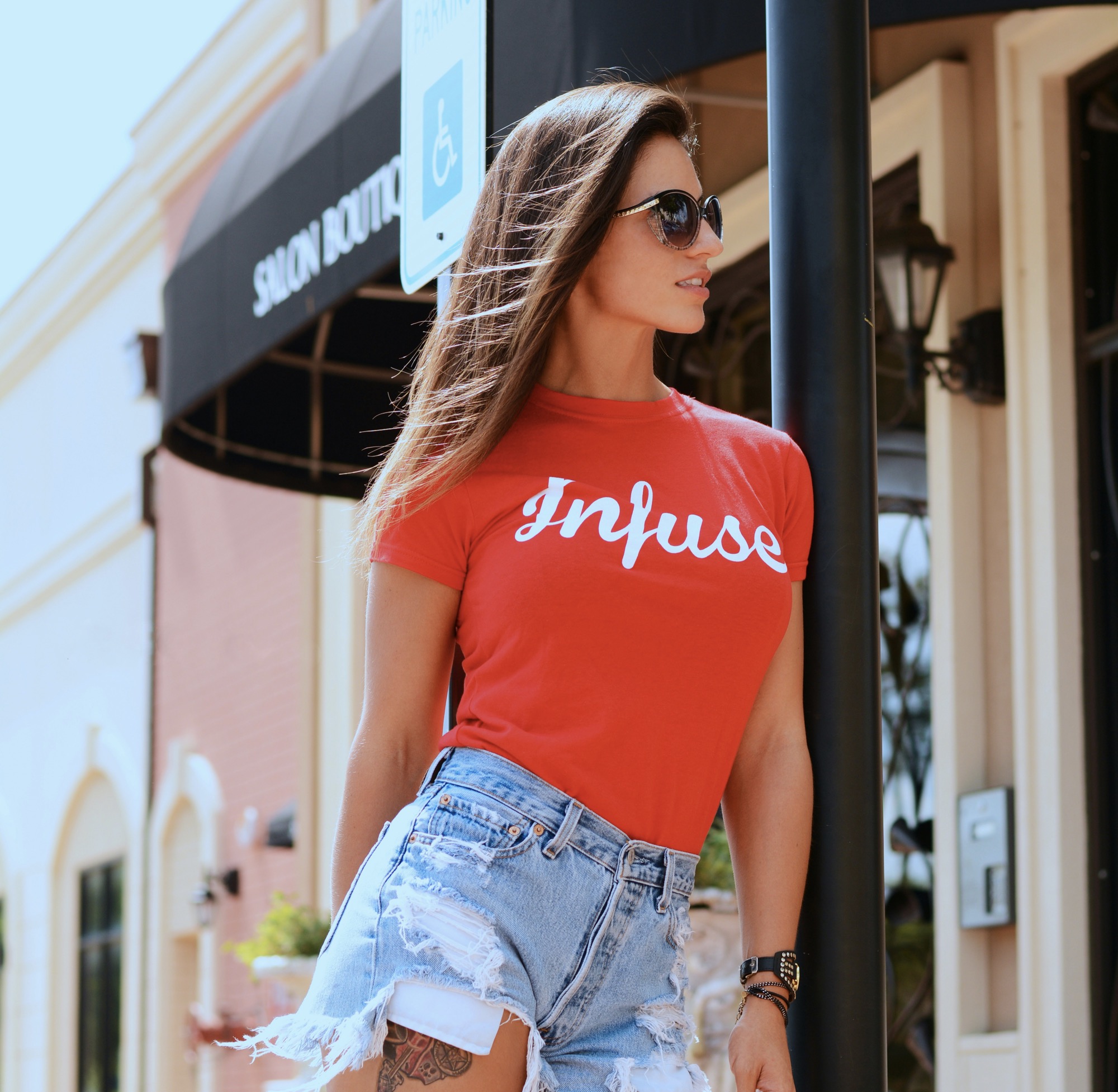
Patterns carry mood as much as color, so choose with intention. Narrow pinstripes can elongate the torso when placed on suits or trousers, while checks scale up confidence in jackets or knitwear. When mixing, limit the number of distinct patterns to two or three per outfit, and vary the ethos: a geometric motif with a floral-inspired motif can read as intentional if their sizes and tones are compatible. Use a consistent baseline color across patterns to create continuity, such as navy or charcoal. Accessories should reinforce this harmony, featuring subdued textures and minimal prints. With deliberate choices, contrasting patterns feel purposeful rather than chaotic.
Cadence in color and texture sustains sophistication across settings.
A thoughtful approach to scale helps translate initial impressions into a cohesive outfit. Choose a dominant element with a clear, repeating motif, then mix in secondary pieces that echo its color family rather than its pattern. For example, a large-windowpane blazer pairs well with a fine pinstripe shirt if both share a common blue undertone. Textures can then operate as an independent layer—think a smooth satin tie against a matte wool jacket or a ribbed knit beneath a structured cardigan. By treating scale as your anchor, you ensure visual alignment while still inviting tactile richness that elevates the overall appearance.
Introduction of lighter or darker shades across layers adds depth without disruption. A mid-tone suit can be complemented by a lighter shirt and a slightly darker, textured belt. Silvered or pewter accessories provide subtle glints that unify rather than distract. When patterns repeat, ensure their rhythm feels intentional; too many repeats can feel mechanistic, whereas measured repetition creates a confident cadence. Consider the environment—office lighting, summer heat, or evening events—and adapt texture choices to maintain comfort and presentability. The right balance supports versatility across occasions while preserving a timeless aesthetic.
A practical framework keeps pattern and texture choices intentional.
Keeping outfits resilient means prioritizing fit as much as fabric. A well-fitted garment underpins every successful mix: no amount of pattern play can compensate for awkward cuts or baggy silhouettes. Start with a tailored base—slim or classic fit according to body type—and let accessories perform the pattern play. A patterned shirt speaks best when sleeves are not overwhelmed by a chunky jacket. Footwear matters, too: textured loafers or cap-toe oxfords should harmonize with belt color and level of formality. When each piece aligns in proportion and finish, even a bold combination remains poised and polished.
Finally, develop a personal framework you can reuse. Catalog your favorite combos, noting the dominant color, pattern type, texture weight, and occasion. Over time you’ll recognize which pairings yield cohesion and which feel forced. This practice doesn’t hamper creativity; it protects it by preventing overstatement. Keep a small mental checklist: is there a unifying color? do the textures complement, not compete? is the overall silhouette balanced from head to toe? By building muscle memory around these questions, you’ll craft outfits with intent and ease, every morning and for every event.
When you encounter unfamiliar patterns or tones, step back and translate them into familiar equivalents. Replace a loud floral with a restrained micro-check that mirrors its color, or substitute a chunky knit with a refined merino layer that enjoys smoother drape. The goal is legibility: in public, others should read your intent at a glance. If a piece feels off, remove or swap it for something simpler and more cohesive. By refining choices to neutrals and carefully integrated accents, you preserve elegance while allowing creativity to shine through in a controlled, confident manner.
In the end, smart mixing is less about rule following and more about thoughtful purpose. Patterns and textures should enhance your shape and suit the moment, not dominate it. Start with a clear foundation, introduce a controlled statement, and finish with accessories that tether the look. Practice translating seasonal trends into timeless variants rather than copying them outright. With patience and attention to proportion, you’ll cultivate a signature approach that remains relevant across years, events, and evolving fashion landscapes. Confidence, balance, and coherence—these are the lasting marks of truly versatile menswear.