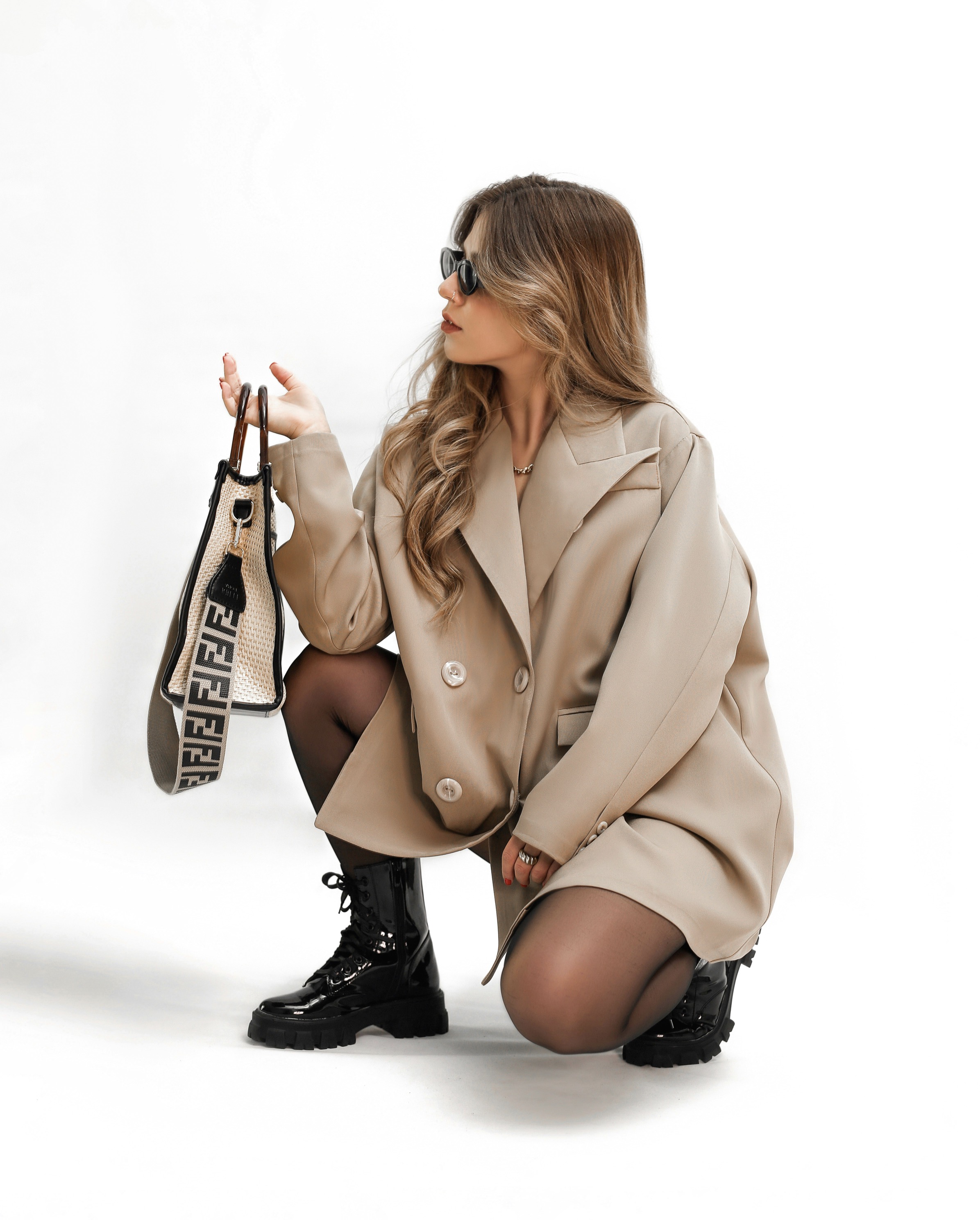
Step-by-step methods for choosing contrasting stitching and trim on shoes to enhance design without appearing busy.
A practical guide that demystifies stitching and trim choices, guiding readers through color theory, balance, material compatibility, and finish, to elevate footwear design without overwhelming the overall aesthetic.
When designing shoes, the first step is to determine the level of contrast you want to achieve. Contrast can highlight the lines of the silhouette, define panels, or draw attention to details like toe caps and heel counters. Start by selecting a dominant color for the upper material and then choose a secondary thread that either echoes a color found in the lining or creates a deliberate pop. Consider the environment where the shoes will be worn; a professional setting rewards restrained contrasts, while casual or fashion-forward contexts welcome bolder choices. The goal is cohesion rather than chaos, so practice visualizing the finished product from multiple angles before committing to a stitch color.
Next, study the materials at hand. Smooth leathers, nubuck, suede, and textured fabrics respond differently to stitching choices. A fine, tight stitch in a high-sheen leather can appear too sharp if the contrast is excessive, whereas a matte finish benefits from a lighter accent that provides definition without shouting. If the trim is made from a different material, ensure tonal harmony by matching undertones rather than exact hues. Practical tests matter: mock up a few sample swatches, stitch styles, and thread thicknesses to observe how light reflects and how the seam sits within the shoe’s geometry.
The right stitch and trim choices elevate design without overwhelming.
When planning stitch patterns, scale matters. Simple topstitching along seams often delivers quiet sophistication, while decorative stitches can become busy if applied too broadly. To maintain elegance, limit decorative stitching to strategic zones, such as along the eyestay, pocket, or along a single panel edge. Use a thread color that either closely matches the upper or subtly contrasts by a shade or two. Avoid a spectrum of hues across the same shoe, which can fragment the design. The principle is unity: every stitch should reinforce the silhouette rather than compete with it.
Consider the width and texture of the thread itself. A thicker thread will dominate more than a fine one, especially on smaller areas. For light-colored uppers, a slightly darker thread can create crisp definition without drawing too much attention, whereas a lighter thread on a dark background can appear almost invisible and refined. In materials with texture, such as leather grains or fabric weave, test whether the stitch line catches light in a way that highlights texture or contradicts it. The right balance emerges from careful observation and repeated testing.
Balance and proportion keep contrasting details tasteful.
Dimensional contrast is another tool. A slim, raised edge can separate panels without introducing additional color, creating the illusion of depth. This approach works well when the main color remains constant, letting the trim function as a subtle outline. If you opt for color contrast, keep it consistent across all stitching to avoid a patchwork feel. The eye travels more smoothly when the trim acts as a visual border rather than a focal point. Remember, restraint often translates to sophistication in footwear design.
Finally, assess finish and durability. The appearance of stitching evolves with wear, so choose thread that preserves its tone after exposure to light, moisture, and abrasion. For leather goods, waxed or bonded polyester threads can maintain color fidelity longer than standard cotton. Suede and nubuck benefit from contrasting trims that are slightly matte to minimize glare. Always verify performance in real-world conditions with stress tests or wear trials, ensuring that the aesthetic stays reliable across seasons and activities.
Practical testing and iteration refine stitching decisions.
Proportion is the silent conductor of design. The stitch line should follow the shoe’s natural geometry, aligning with existing seam lines rather than creating new, distracting angles. A good rule is to mirror the scale of the panel itself: large panels deserve proportionally bolder stitches, while narrow sections call for finer threads. You can also play with anchor points—placing stitches at the toe, quarter, or heel—so the contrast reads as a deliberate rhythm rather than random ornament. When done thoughtfully, contrasting stitching appears as a signature detail rather than a fashion hazard.
Finally, consider the overall wardrobe ecosystem. Shoes rarely exist in isolation; they complete an outfit and echo other accessories. If a bag or belt uses a particular trim color, aligning the shoe stitching with that hue can unify the look. Conversely, you may decide to use a complementary but distinct color to anchor a statement pair. The key is consistency across pieces, which solidifies a coherent personal style instead of a piecemeal assortment of highlights.
Structured approaches create timeless, versatile footwear details.
The testing phase should include both visual and tactile evaluation. View the shoes under natural light to see how color shifts with orientation, and inspect stitching at different distances to assess legibility and impact. A good practice is to photograph the footwear from several angles and compare how the trim reads in close-up versus at a distance. Tactile feedback matters too: run a finger along the seam to judge thread tension and edge smoothness. Any snag or stiffness can signal the need to adjust thread type or stitch spacing before mass production.
Iteration continues until the design feels intentional rather than accidental. Record each variation with notes on color, material, stitch type, and panel placement. Build a small library of combinations you know to work, then select one or two safe bets for production while reserving space for seasonal changes. The beauty of this process lies in its adaptability; a well-documented method reduces guesswork and speeds up decision-making when timelines tighten.
Long-term style resilience comes from disciplined planning. Start with a broad concept—do you want a crisp, minimal look or a richer, more textured sensation? Then narrow to exact stitching parameters: color family, thread thickness, stitch style, and recommended panels. Keep a standardized set of rules for specific shoe categories, like dress, casual, or athletic designs. When every model follows these criteria, contrast feels intentional and consistent across a brand lineup, strengthening recognition without compromising wearability.
Concluding the method, remember that subtlest choices often yield the strongest outcomes. The interplay of stitch and trim should enhance lines and materials, not distract from them. By prioritizing balance, proportion, and durability, designers can craft shoes that look refined in any setting. Practice from real-life samples, document your results, and refine your rules as tastes evolve. The result is footwear that speaks with quiet confidence, where contrasting detail adds character without shouting for attention.