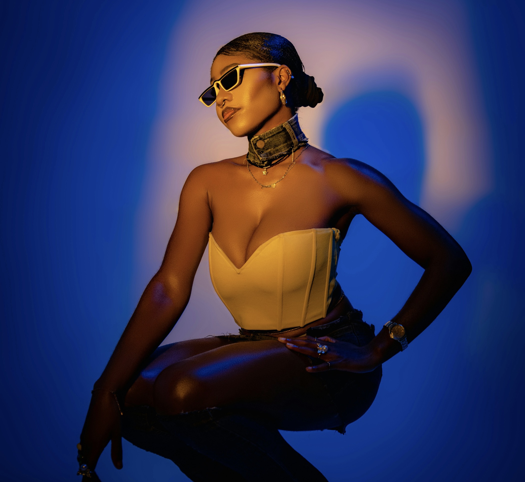
When building a refined ensemble around a patterned garment, the color intensity of your shoes becomes a pivotal balancing act. Start by identifying the dominant hue within the pattern—not the slightest accent—and let that shade anchor your footwear choice. If the pattern is high-contrast, you may opt for a shoe in a medium tone that bridges the pattern and the rest of the outfit. Conversely, a subtle pattern benefits from a slightly deeper shoe color to ground the look. Consider the fabric’s sheen as well: velvet and satin footwear often read more luxurious in darker tones, while matte leathers can relax a loud pattern without dulling its character. The aim is seamless cohesion rather than a jarring clash.
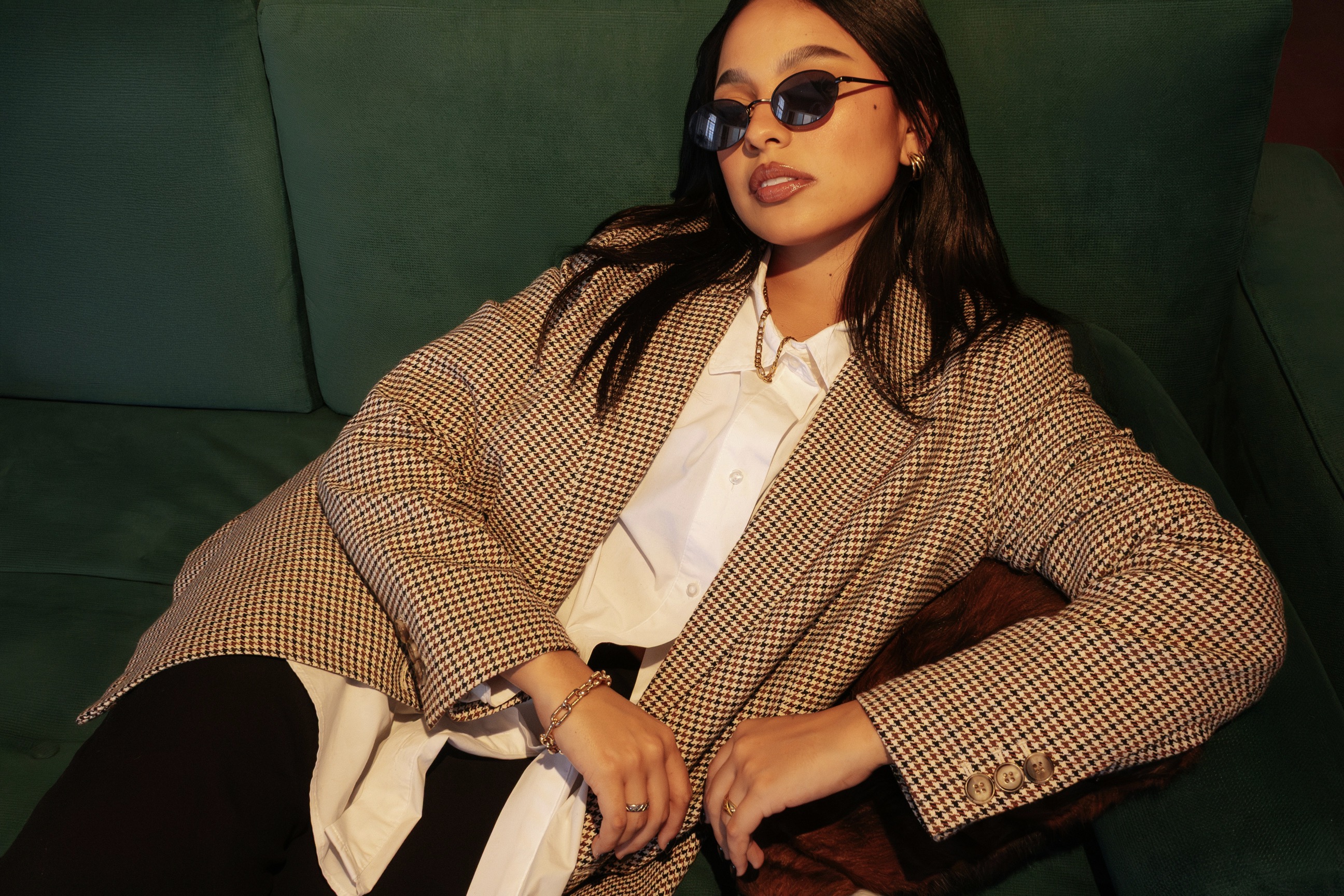
Beyond simply matching colors, assess the overall mood of the patterned piece. A playful polka dot or botanical print may invite a lighter shoe, such as taupe or soft caramel, to keep the ensemble airy and modern. In more formal patterns like pinstripes or subtle houndstooth, lean toward richer, more saturated footwear to create a sense of depth. When patterns include metallic threads or irregular textures, the shoe color should mirror the shade found in those accents to unify the look without duplicating every color. The right shoe hue acts as a bridge, translating bold prints into wearable sophistication.
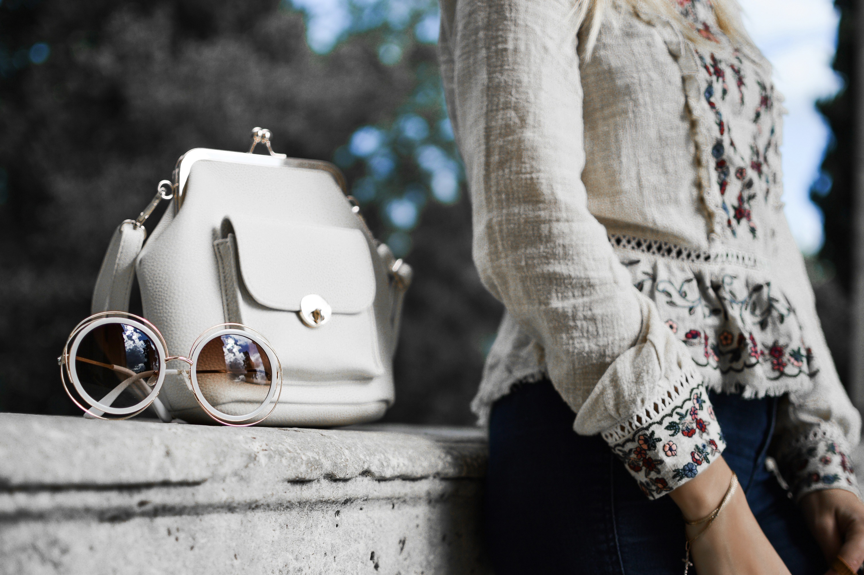
Patterned pieces demand mindful color practice to avoid visual discord.
A practical method for determining that bridge color is to isolate three core values within the print: the lightest background, the midtone, and the darkest detail. Use these as a miniature palette for your footwear. If the print’s darkest detail aligns with a stable, grounded tone such as chocolate brown or charcoal gray, selecting a shoe in that range can create a calm anchor. On the other hand, if the pattern’s midtone dominates and the edges fade away, a shoe that reflects the midtone will harmonize without overshadowing the pattern’s brightness. Execute this by testing swatches against the fabric in natural light, ensuring the chosen hue neither competes with nor disappears within the print.
Texture matters as much as hue when pairing shoes with patterns. A glossy patent pump can elevate a lively print by catching the eye with controlled shine, while a suede finish softens high-contrast motifs and reads as more approachable. For very intricate patterns, a minimalist shoe—clean lines, solid color, and restrained finish—often yields the most elegant outcome. If your patterned piece already carries metallic specks or sequins, mirror that shimmer with a subtle metallic shoe or simply select a neutral that echoes the base color. The goal is to avoid competing textures and hues that create visual static; instead, choose a color story that flows naturally from pattern to footwear.
Practical rules help curate sophisticated color relationships with purpose.
When pairing with a bold floral or ornate motif, a solid color shoe in a muted version of the pattern’s dominant tone provides stability. This approach prevents the eye from bouncing between the shoe and the fabric. If the pattern includes a strong cool undertone, a gray-blue or taupe-gray shoe can elegantly tie the look together without overpowering the wearer. For warm-toned patterns, consider a cognac, chestnut, or rich olive that picks up the warmth without amplifying contrast. Remember that the shoe’s brightness should complement the garment’s vividness, not compete with it. Small, deliberate shifts toward deeper or lighter versions of the base hue can yield refined, gallery-worthy ensembles.
A grid of color theory fundamentals can guide your choices when patterns dominate the scene. First, embrace the idea of analogous pairing—shoes in colors adjacent to the pattern’s primary hue—so the combination feels natural and continuous. Second, apply the concept of reducing saturation; patterns usually carry more visual weight, so a less saturated shoe prevents overload. Third, consider optical balance: if your bottom half uses a heavy pattern, a simpler, darker shoe can balance proportion with poise. And finally, test the look in daylight and indoor lighting to confirm that the intensity feels right across environments. Pairing responsibly with pattern intensity creates ensembles that endure.
Evening style thrives on intentional contrast and controlled shine.
In professional wardrobes, patterns are often subtler, inviting a disciplined approach to shoe color. Choose footwear that approximates the pattern’s anchor tone rather than the accents. For example, if a suit or dress features a navy base with lighter motifs, a deep navy or charcoal shoe will create sleek continuity. If the pattern’s base reads black, you can either keep the same shade for a seamless silhouette or introduce a slightly lighter gray to avoid a rigid, heavy impression. The key is ensuring the shoes neither vanish against the pattern nor shout above it. A quiet, well-chosen hue communicates confidence and polish in business settings.
For eveningwear, the interplay between shoe intensity and pattern becomes a little more daring. A striking pattern—like a metallic-tinged jacquard—pairs beautifully with shoes that pick up one of the subtle notes in the weave. Deep burgundy, midnight blue, or emerald can echo the garment’s richest tones without competing for attention. If the apparel carries a high-gloss surface, a satin or patent finish on the shoe can amplify the luxe mood. Conversely, a softer pattern deserves a shoe with a sheened but restrained finish to maintain elegance. The idea is to choreograph light and color so the finish and print unite rather than contend.
Consistency and intention keep outfits cohesive across occasions.
Casual ensembles invite flexibility, but even here, intentional color anchoring matters. A plaid shirt dress or a striped sweater paired with sneakers or ankle boots benefits from footwear in an unobtrusive shade close to one of the shirt’s dominant colors. If you prefer a bolder statement, select a shoe that mirrors a secondary color present in the print, creating a playful link rather than a direct mimic. Footwear with a matte finish tends to work better for day-to-day looks, while a subtle gloss on a loafer or boot can elevate a casual outfit without appearing overdone. The trick is to maintain a relaxed vibe while preserving thoughtful color planning.
For travel-ready outfits, longevity of color relationships matters. Choose shoes that remain versatile across patterns and outfits by sticking to timeless neutrals or a single deep accent hue tied to the wardrobe’s base palette. If your patterned piece is dynamic and colorful, a classic navy, chocolate, or charcoal shoe acts as a steady counterpoint. This consistency reduces decision fatigue while still permitting expressive patterns to take center stage. Remember that footwear in a naturally finished leather ages gracefully, ensuring the color relationship stays coherent as fabrics wrinkle and move with you through the day.
The final attribute to consider is seasonality, which subtly influences perceived color strength. In spring and summer, brighter shoes in softer versions of patterns can read fresh and refined, especially with airy fabrics and lighter patterns. Autumn and winter palettes support deeper shoes, like espresso browns or oxbloods, which can ground heavier prints and heavier fabrics. If a trend encourages mixing, choose one anchored hue across both pattern and footwear to preserve unity. Don’t be afraid to swap out accessories to maintain balance; sometimes a belt or bag in the same tonal family can unify the entire ensemble. Color intensity should feel intentional, not accidental.
The smartest way to practice is through mindful trial and reflection. Build a small, color-focused checklist for different patterns: identify the dominant hue, select a bridge tone, assess finish compatibility, and test in varied lighting. Practice by styling a sequence of outfits around a single patterned piece with two or three footwear options, and compare how each option transforms the overall impression. Keep notes on how the eye travels across the ensemble and whether the footwear creates a moment of cohesion or distraction. Over time, your instincts will sharpen, and you’ll routinely craft sophisticated looks where shoe color intensity enhances rather than competes with patterns.