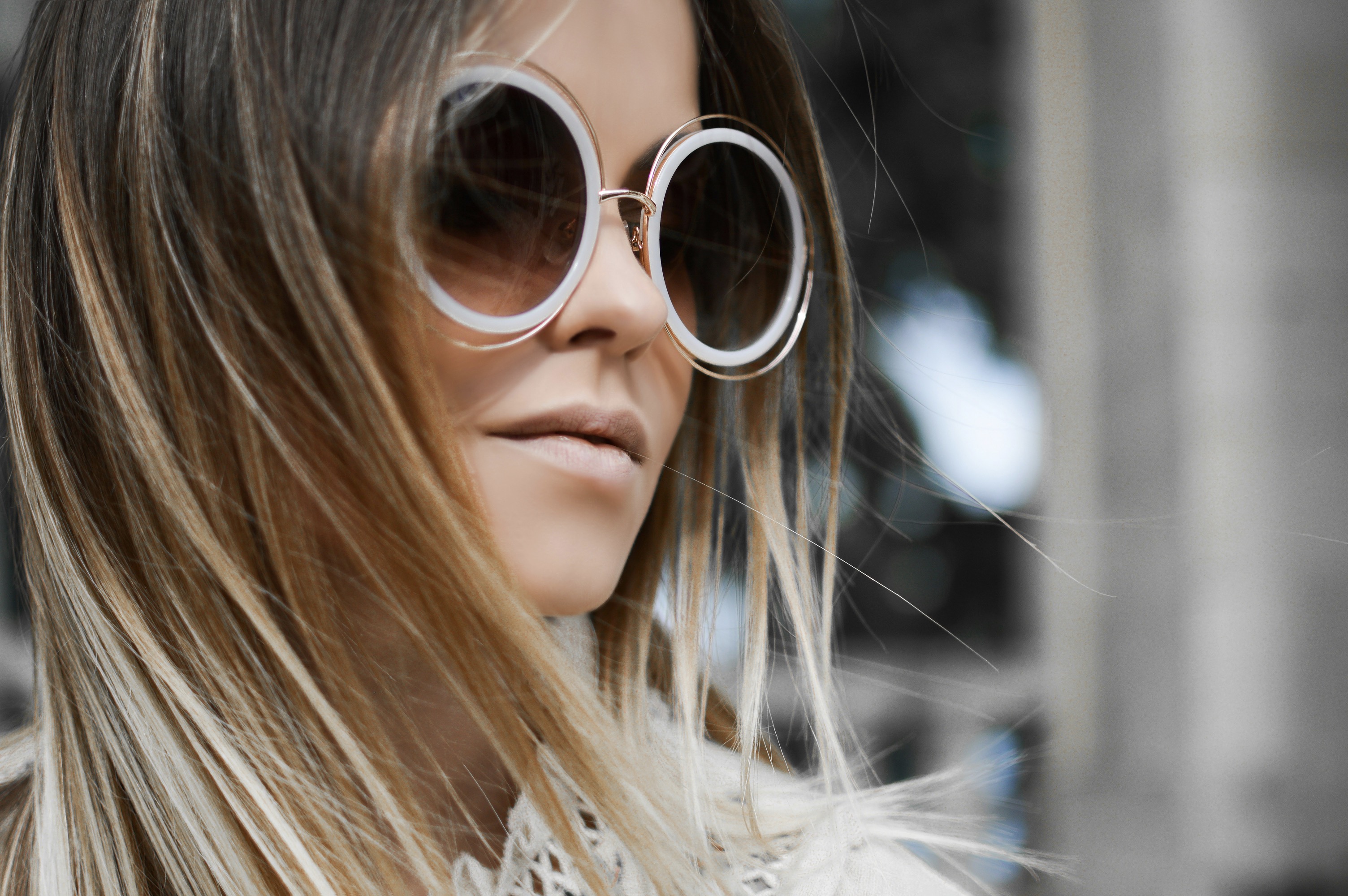
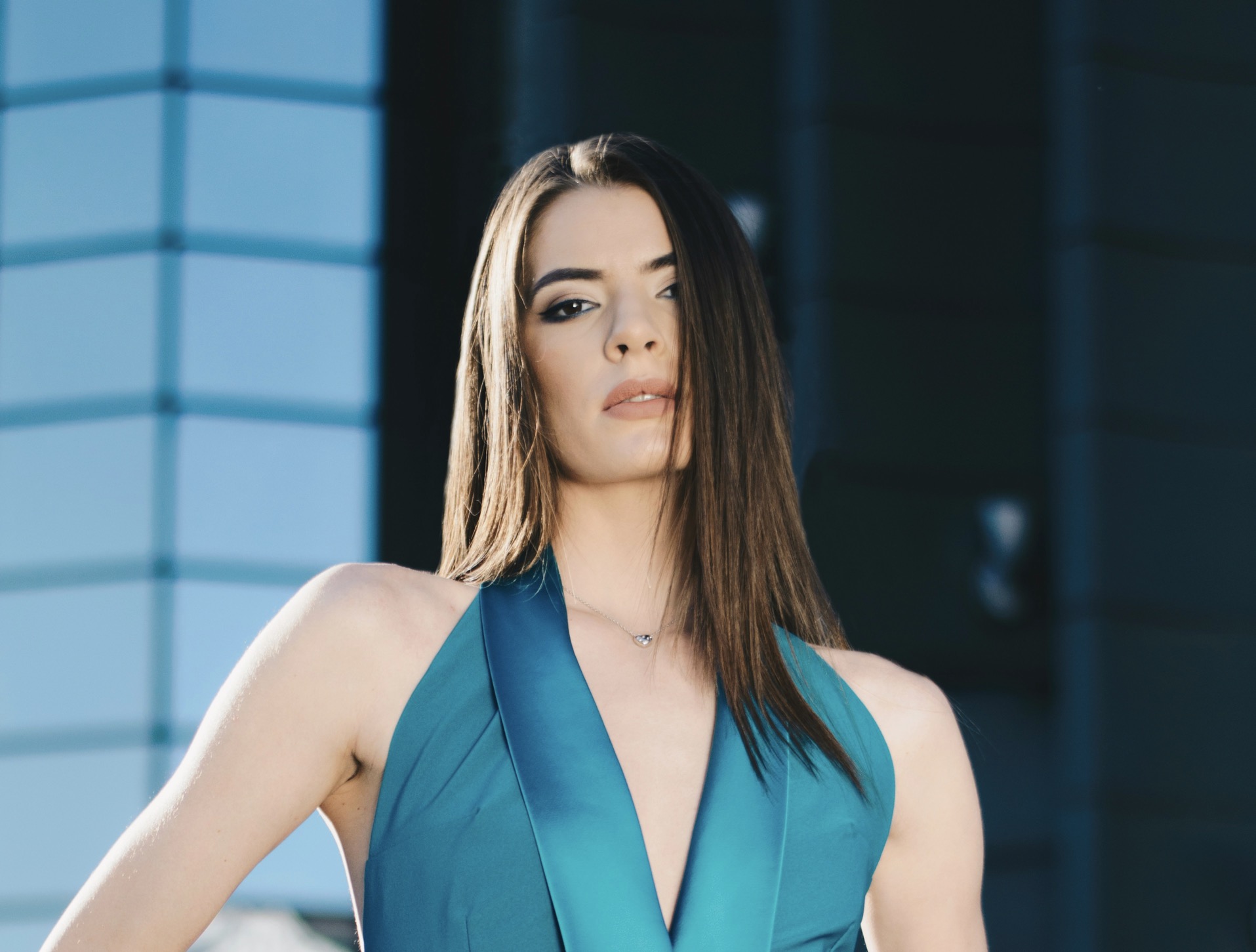
Color is the backbone of an outfit, but balance is the compass that keeps it navigable. Start with a unifying base shade that resonates with your skin tone and the season, then layer accents that echo that foundation. The trick is to choose one dominant color, one secondary, and one accent, ensuring that the transitions feel natural rather than forced. When you select these hues, consider the undertones—cool blues, warm terracottas, neutral beiges—and map them to your different garment categories. This approach reduces visual noise and creates a sense of rhythm, even when textures vary. The goal is a polished silhouette that reads as intentional rather than accidental.
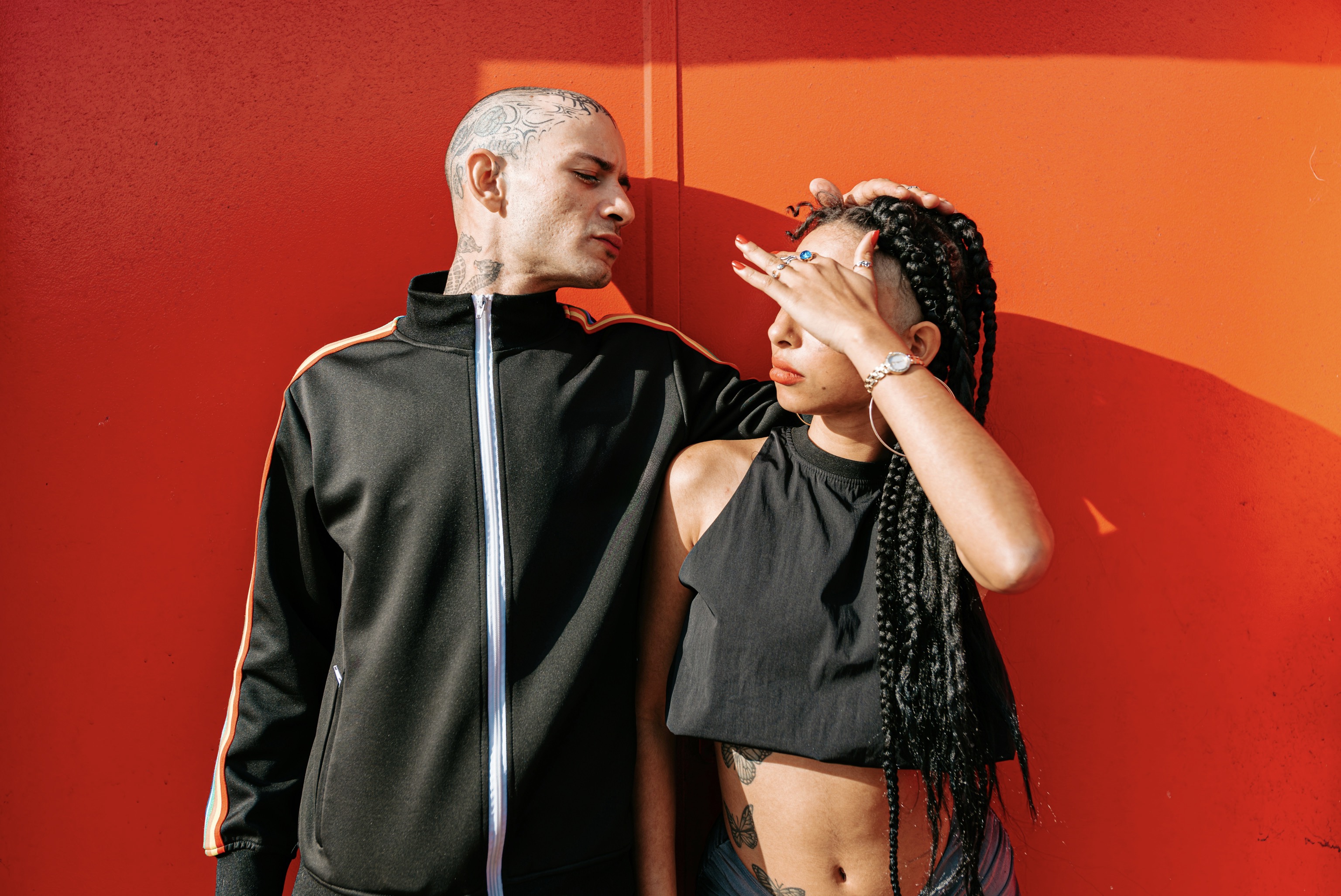
Beyond choosing colors, you should evaluate how much of each color appears in the outfit. A single large swath of color casts the entire look, so allocate most of the palette to items with broad surface areas in muted tones. Reserve brighter or deeper notes for small, strategic elements such as belts, shoes, or a pocket square. This distribution helps the eye travel smoothly from one piece to another, avoiding jagged color jumps. It also leaves room to experiment with seasonally appropriate shades without overloading the composition. Remember that contrast is a tool, not a rule, and harmony emerges when the color weights feel evenly distributed.
Distribute warmth, coolness, and texture for balanced depth.
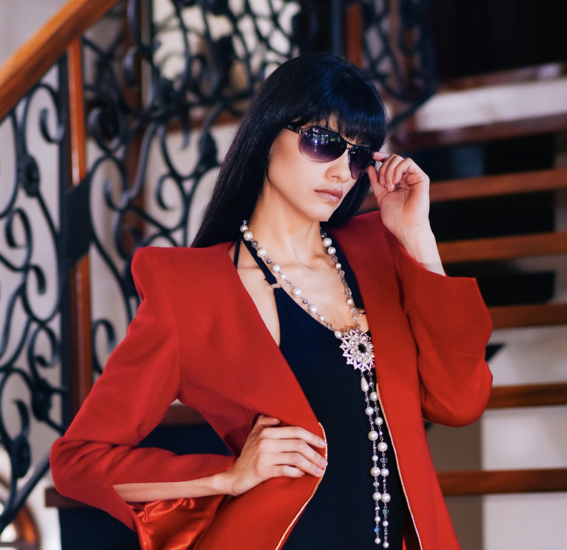
The first principle of harmonious color is repetition, not sameness. Reiterate a particular hue or a related shade across multiple pieces to weave a thread through the outfit. For instance, a navy coat can echo the blue in a scarf and the stitching on a handbag, unifying disparate textures. Repetition offers visual continuity, which makes the ensemble easier for the eye to scan. It also creates a subtle sophistication that reads as deliberate rather than accidental. When you repeat colors, vary the saturation or brightness slightly to preserve interest and depth. A slightly lighter or darker variant keeps the palette dynamic while preserving its cohesion.
Balance naturally emerges when you mix warm and cool components with intention. If your foundation leans cool, offset it with a warm accent in a small-scale form, such as shoes, a hat, or a belt. Conversely, if your base is warm, pepper the look with cool notes to keep the eye engaged. The key is to avoid stacking multiple warm or cool pieces in close proximity, which can overwhelm the senses. Instead, create micro-balances within the outfit by alternating textures and finishes. Matte fabrics against glossy surfaces, knits beside leather, or suede against satin—all strengthen the harmony without flattening the overall color story.
Let pattern decisions inform calmer, more deliberate color choices.
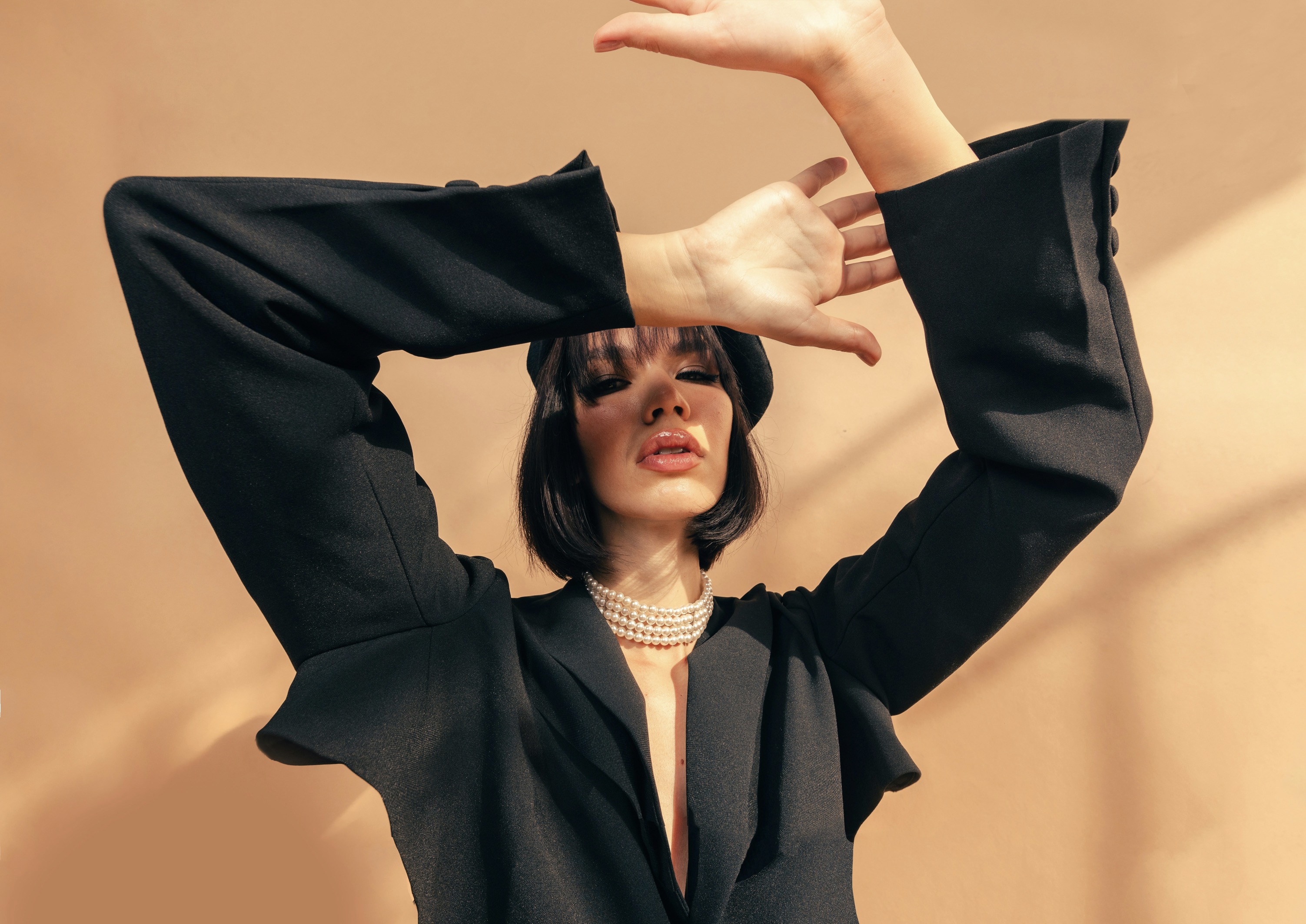
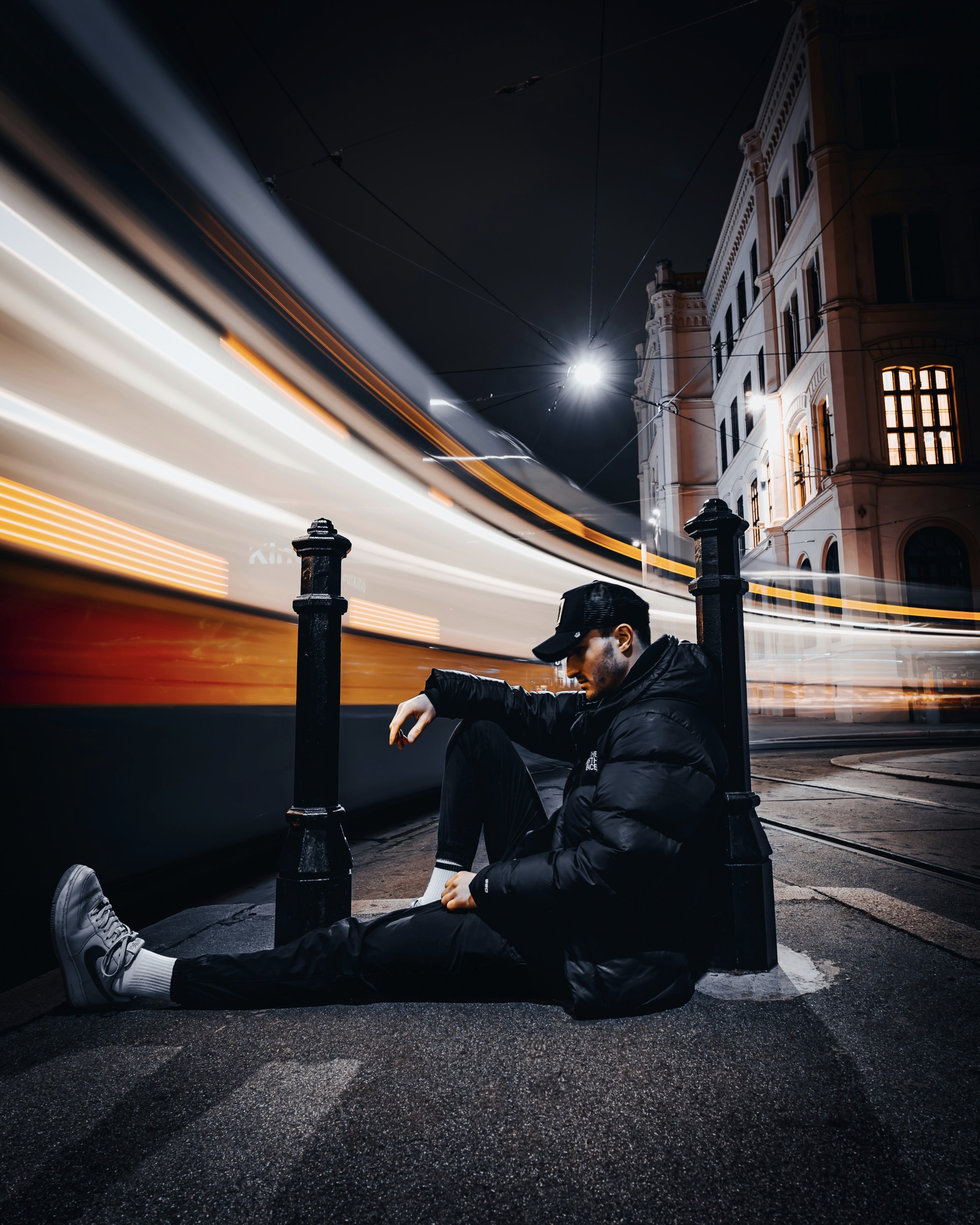
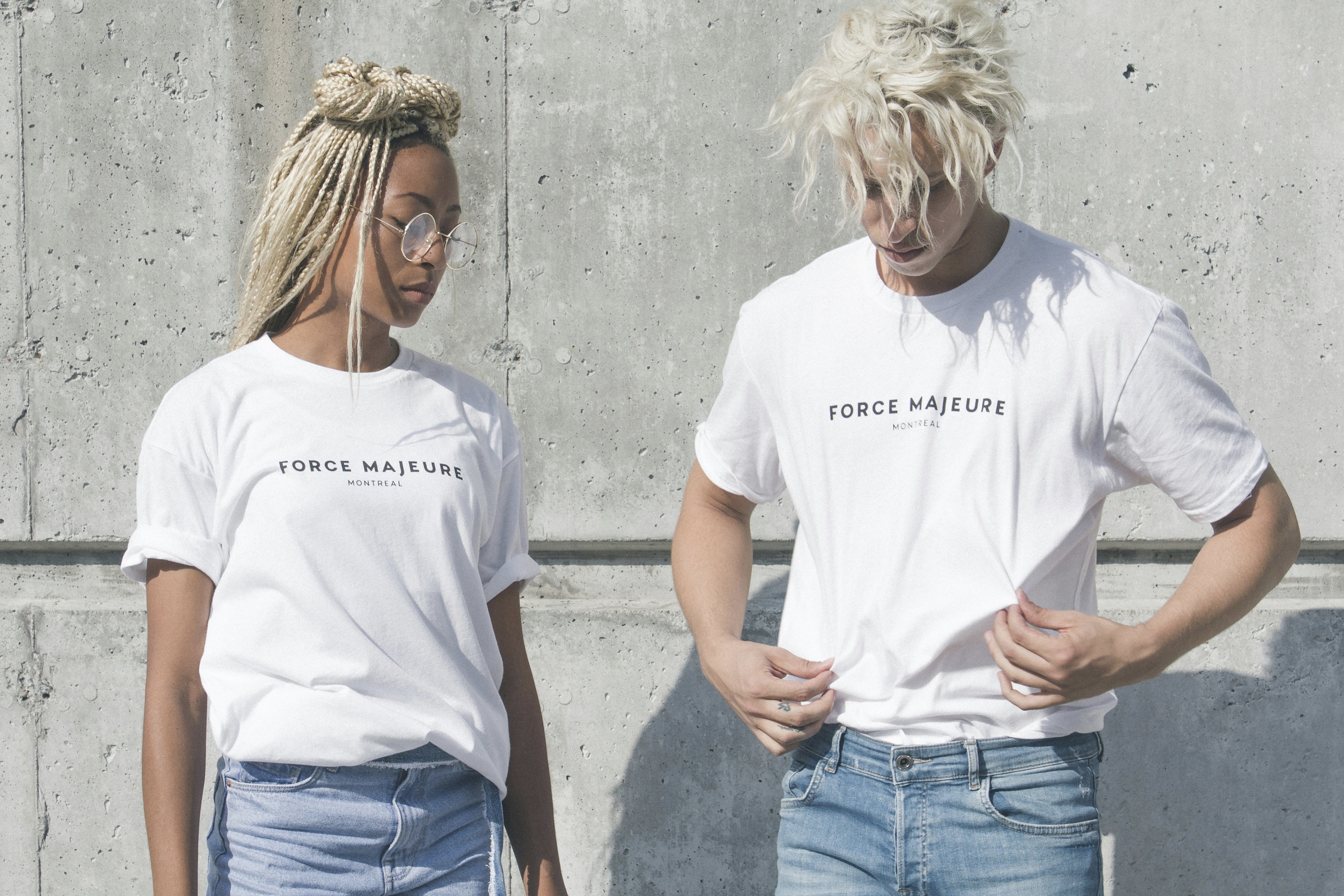
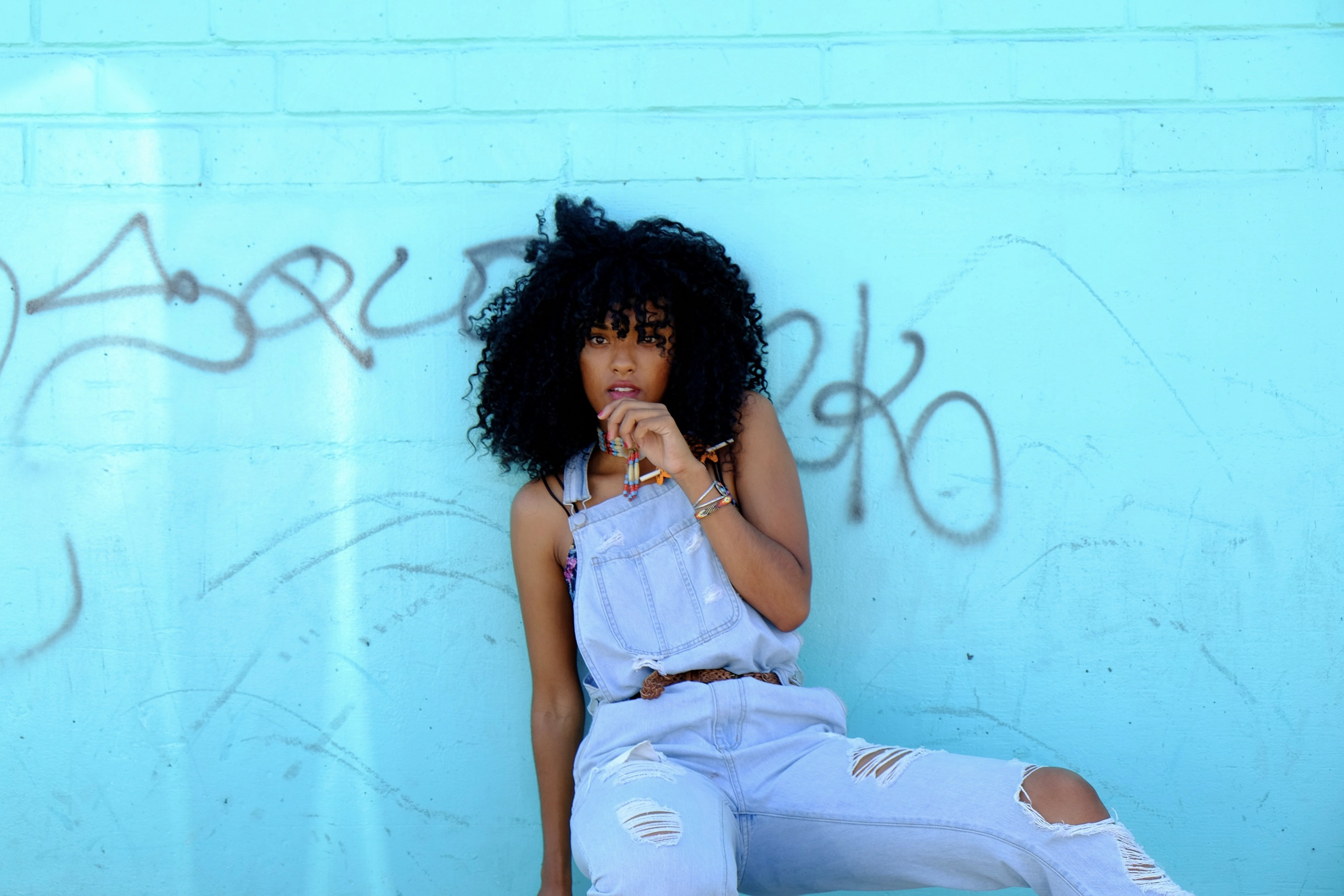
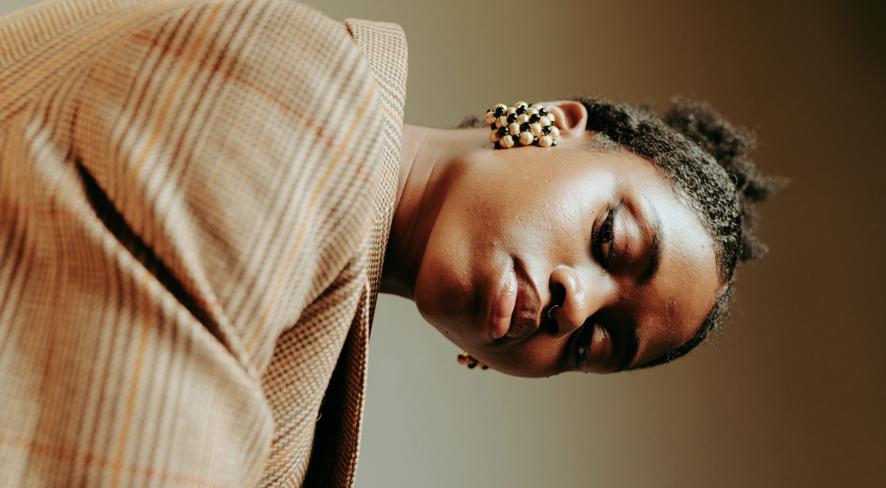
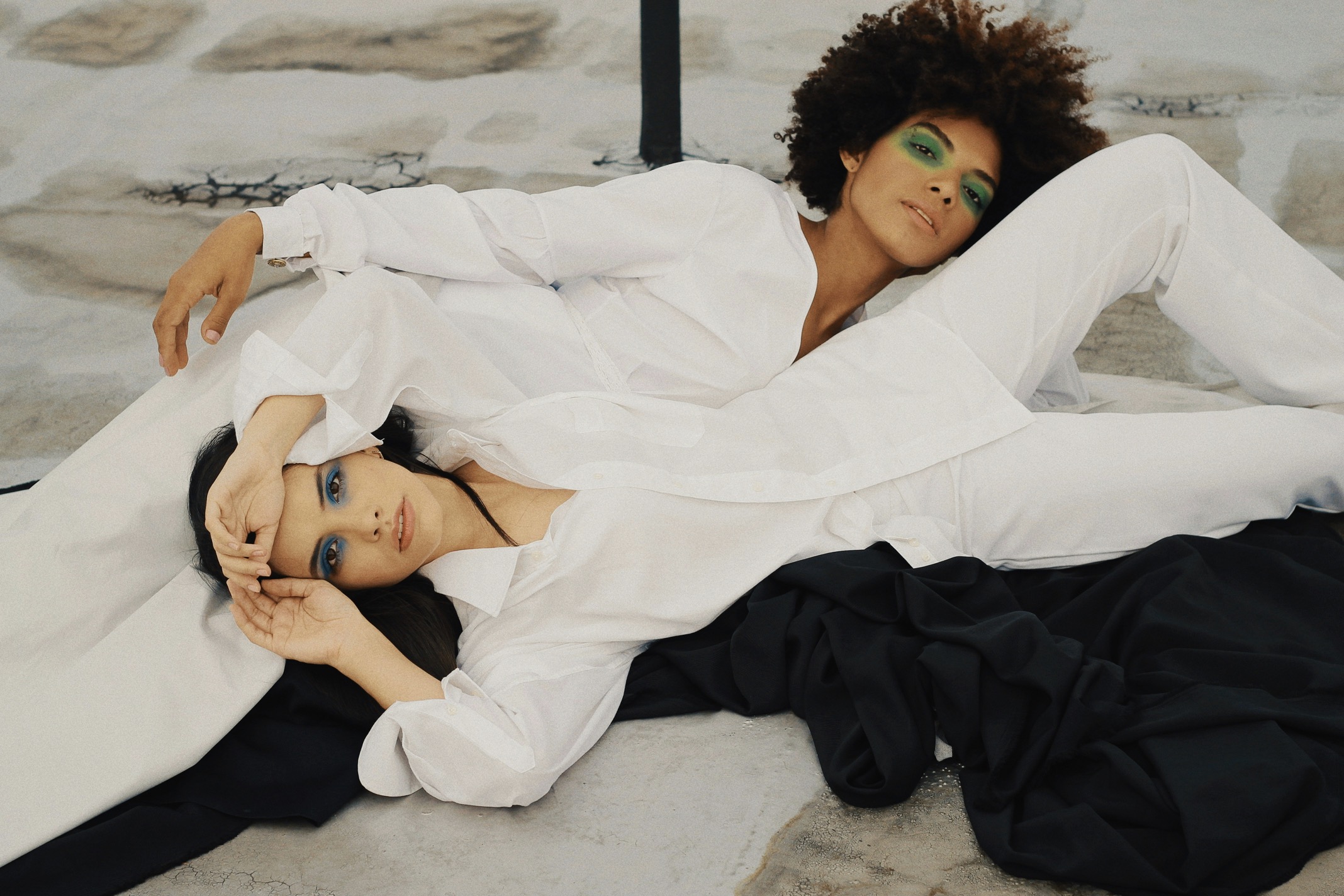
Neutrals anchor the palette and offer an escape hatch when you want quiet sophistication. Incorporate a reliable neutral—gray, taupe, ivory—across several items to anchor your brighter hues. Neutrals provide breathing space and help you rotate seasonally without tonal shock. If you’re experimenting with bold color, neutrals act as a referee, preventing overstatement while preserving personality. The trick is to choose neutrals with undertones that harmonize with your dominant color. A cool-gray base may harmonize with cobalt and slate, whereas a warm taupe can better harmonize with olive or burgundy. This approach ensures longevity for your wardrobe as trends shift.
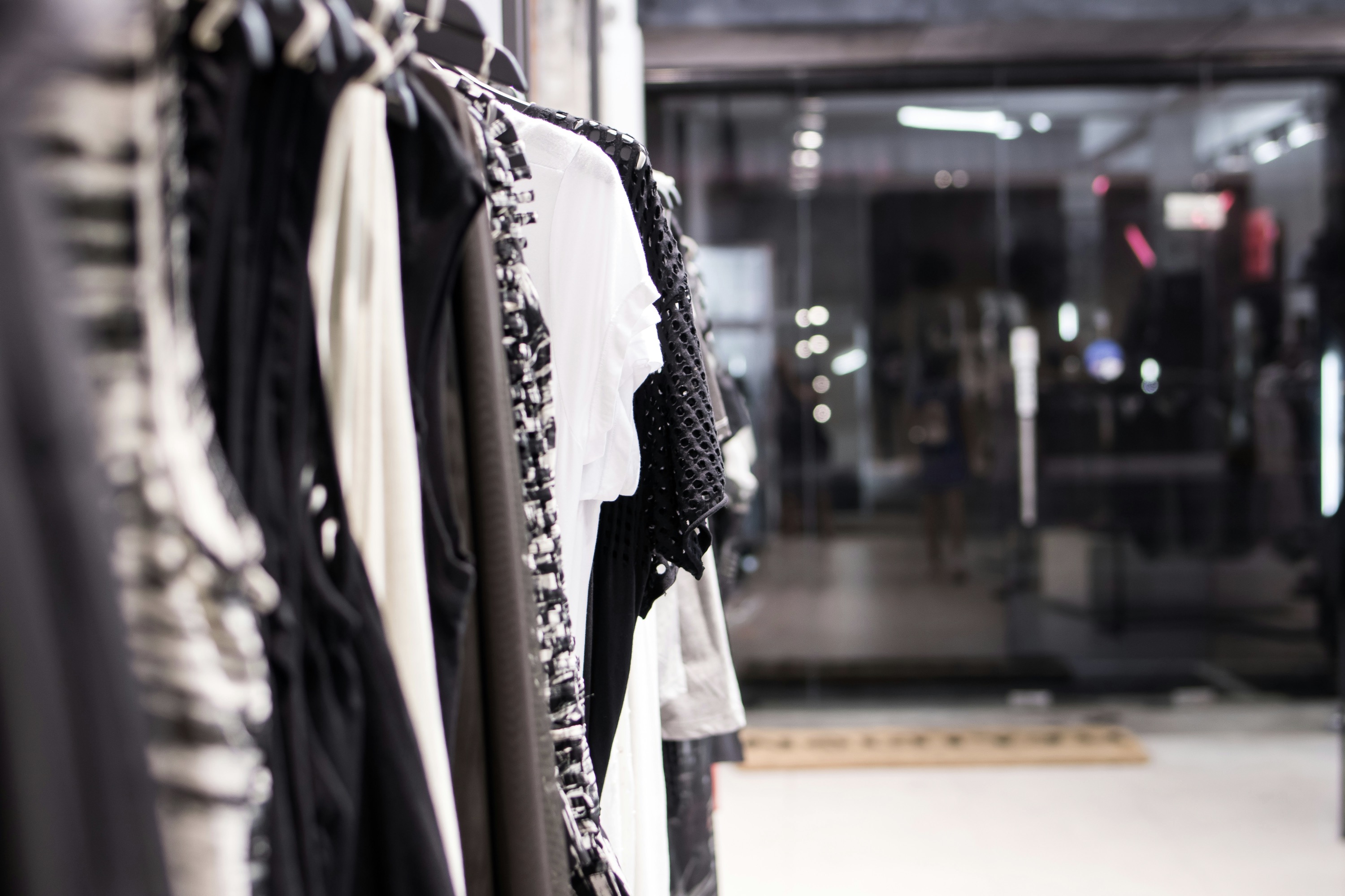
Pattern and color interplay adds complexity but can be managed with a disciplined framework. When a print introduces multiple hues, choose one of those hues as your anchor color and carry it into your solids or accessories. This creates a deliberate dialogue between print and plain pieces rather than a chaotic clash. If the pattern is bold, keep other garments subdued to avoid saturation overload. Conversely, a subtle textile like a pinstripe or herringbone can support brighter color accents without competing. The goal is to let the pattern glow within a controlled color ecosystem that your eye recognizes as a single composition.
Use texture and light to modulate color perception.
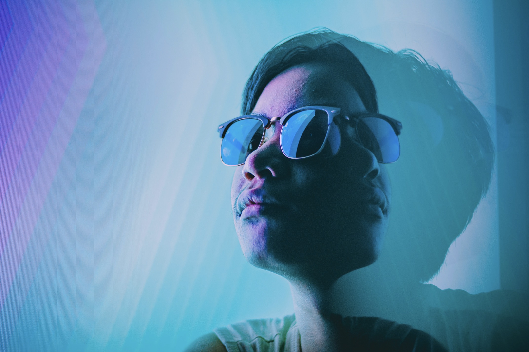
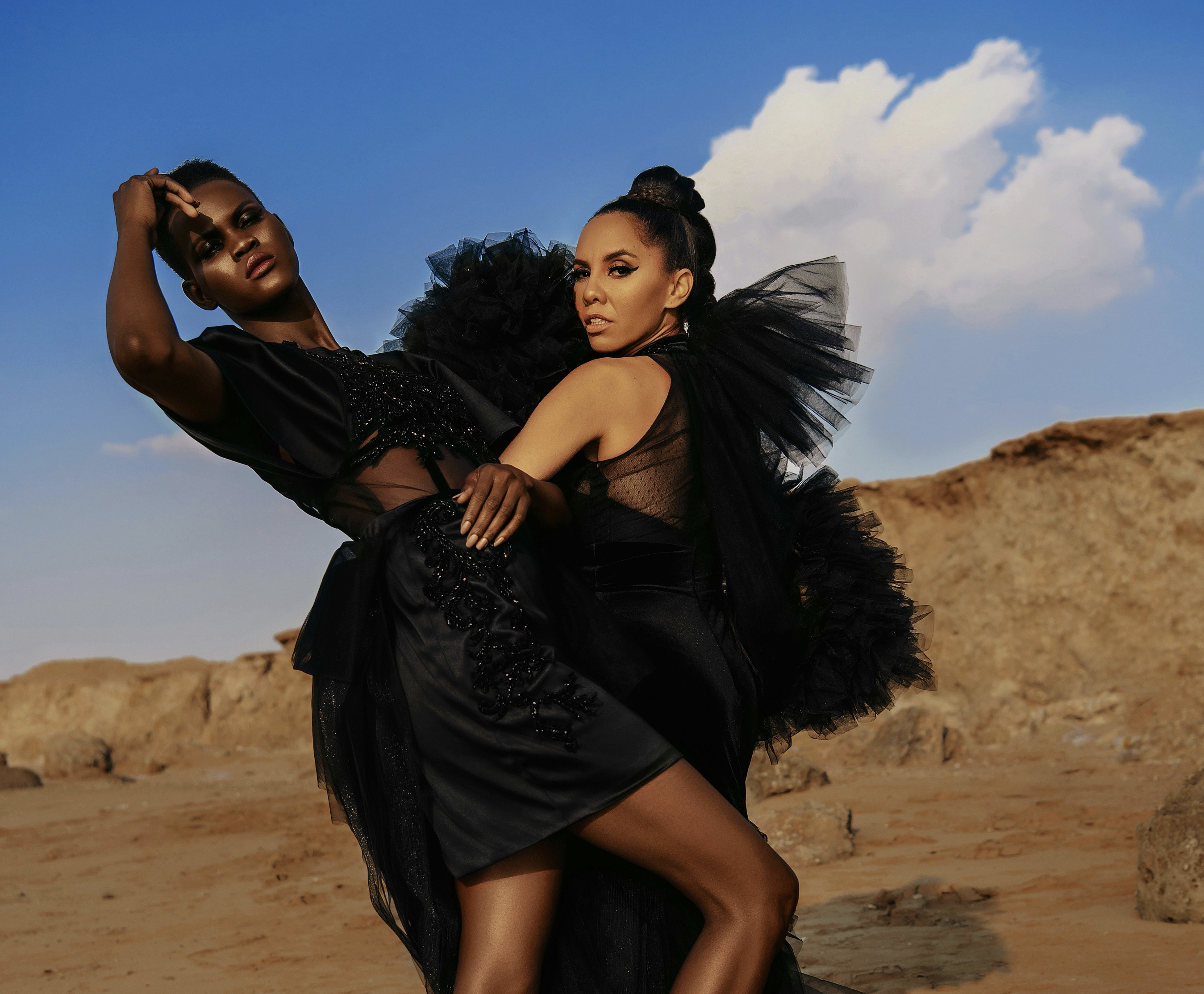
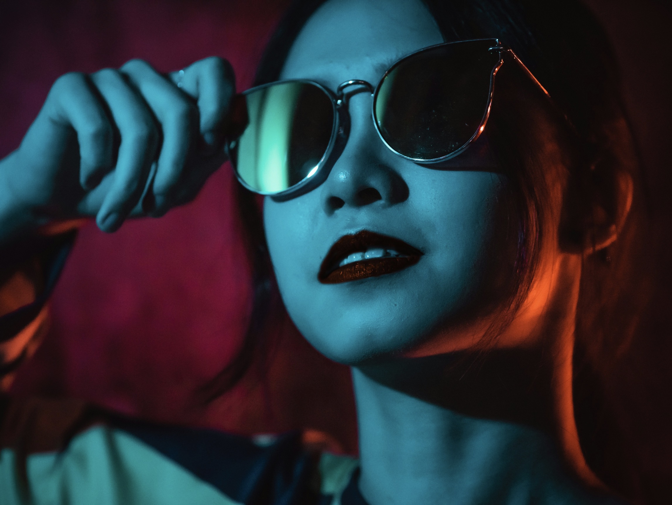
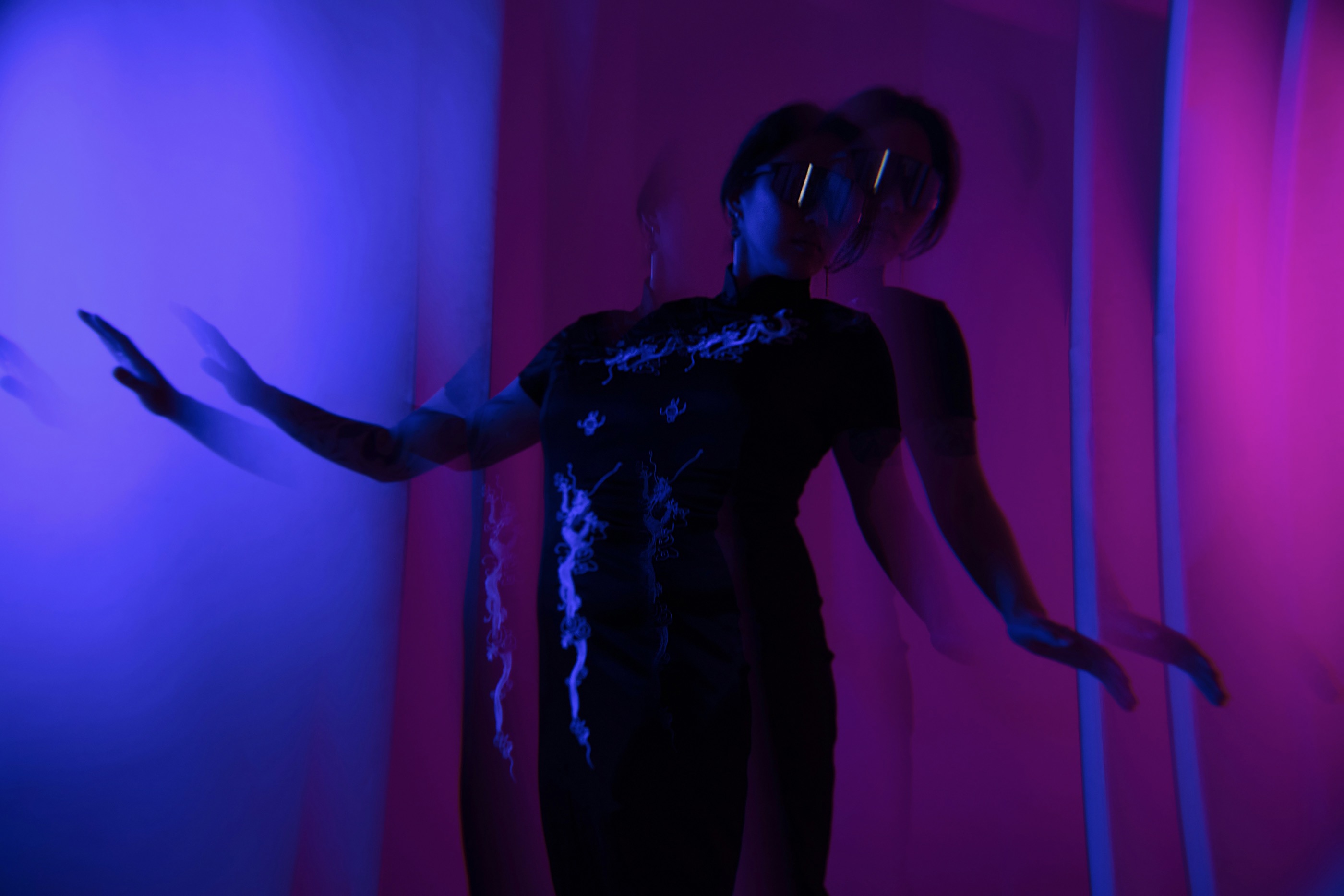
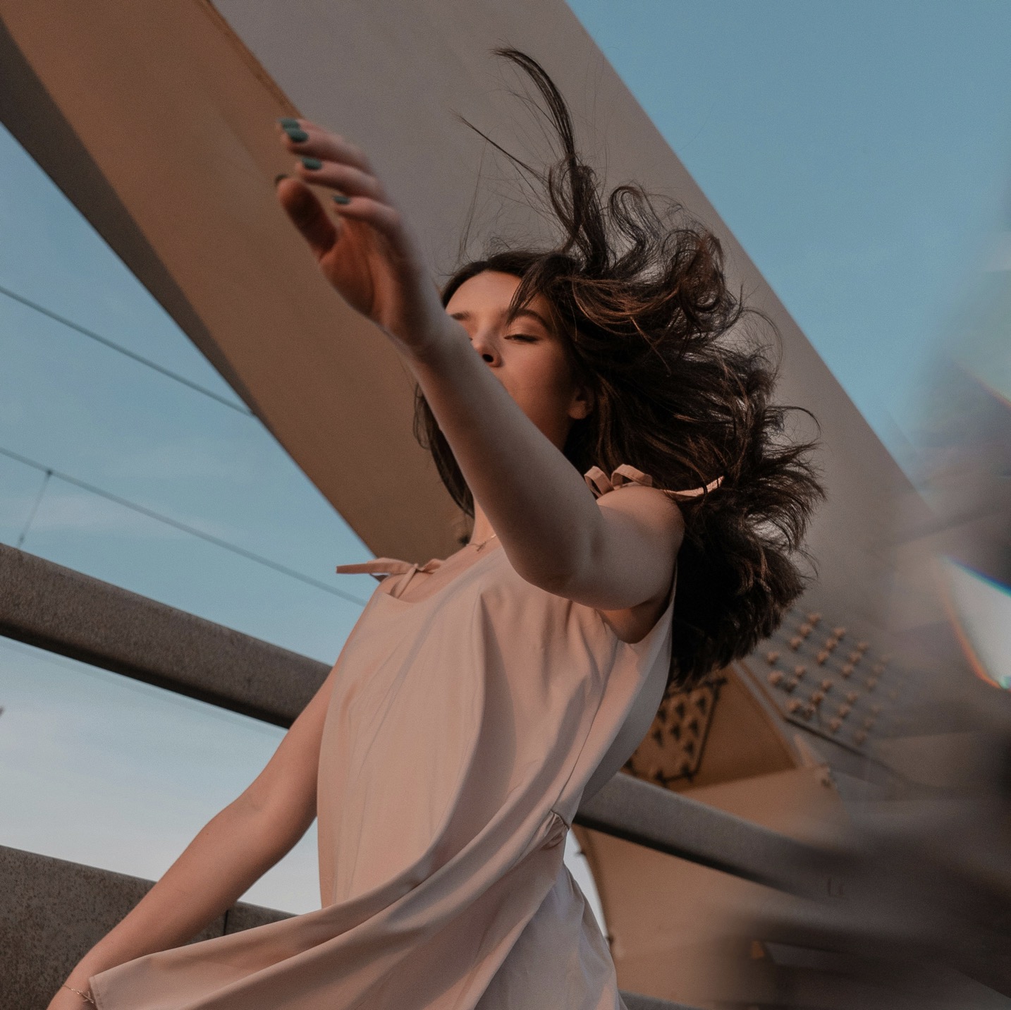
Lightness and darkness are powerful modifiers of balance. By varying the luminance of your palette, you create a sense of depth that keeps the eye moving. A light top with dark bottoms, or vice versa, establishes a diagonal rhythm that feels natural and flattering. If you want a soft, approachable vibe, lean toward higher-key colors with gentle contrast. If you crave drama, introduce deeper, jewel-toned pieces against pale neutrals. The balancing act is about ensuring that the lightest and darkest elements are not clustered in one region of the outfit. Spacing them out across the torso and limbs sustains visual interest while maintaining cohesion.
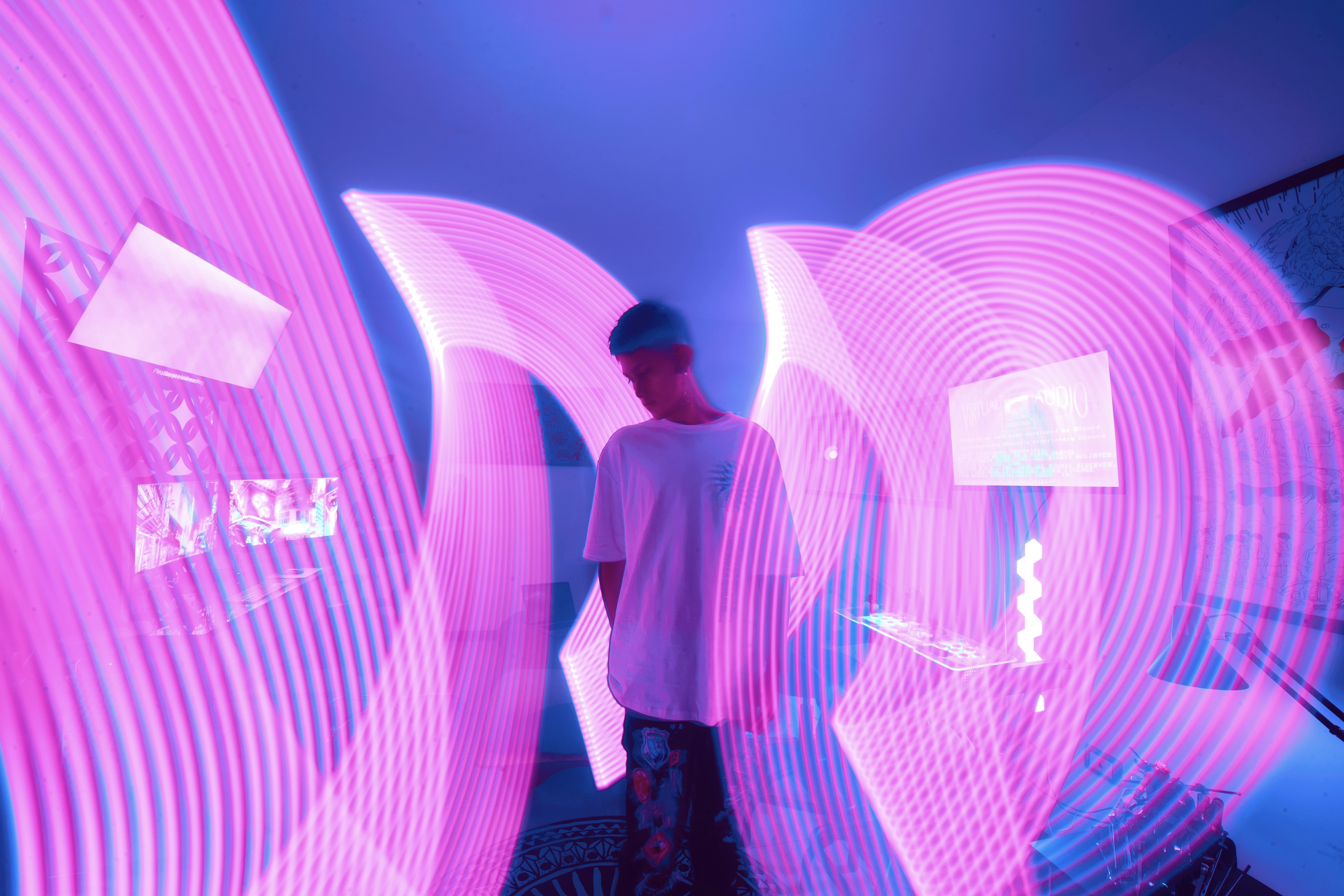
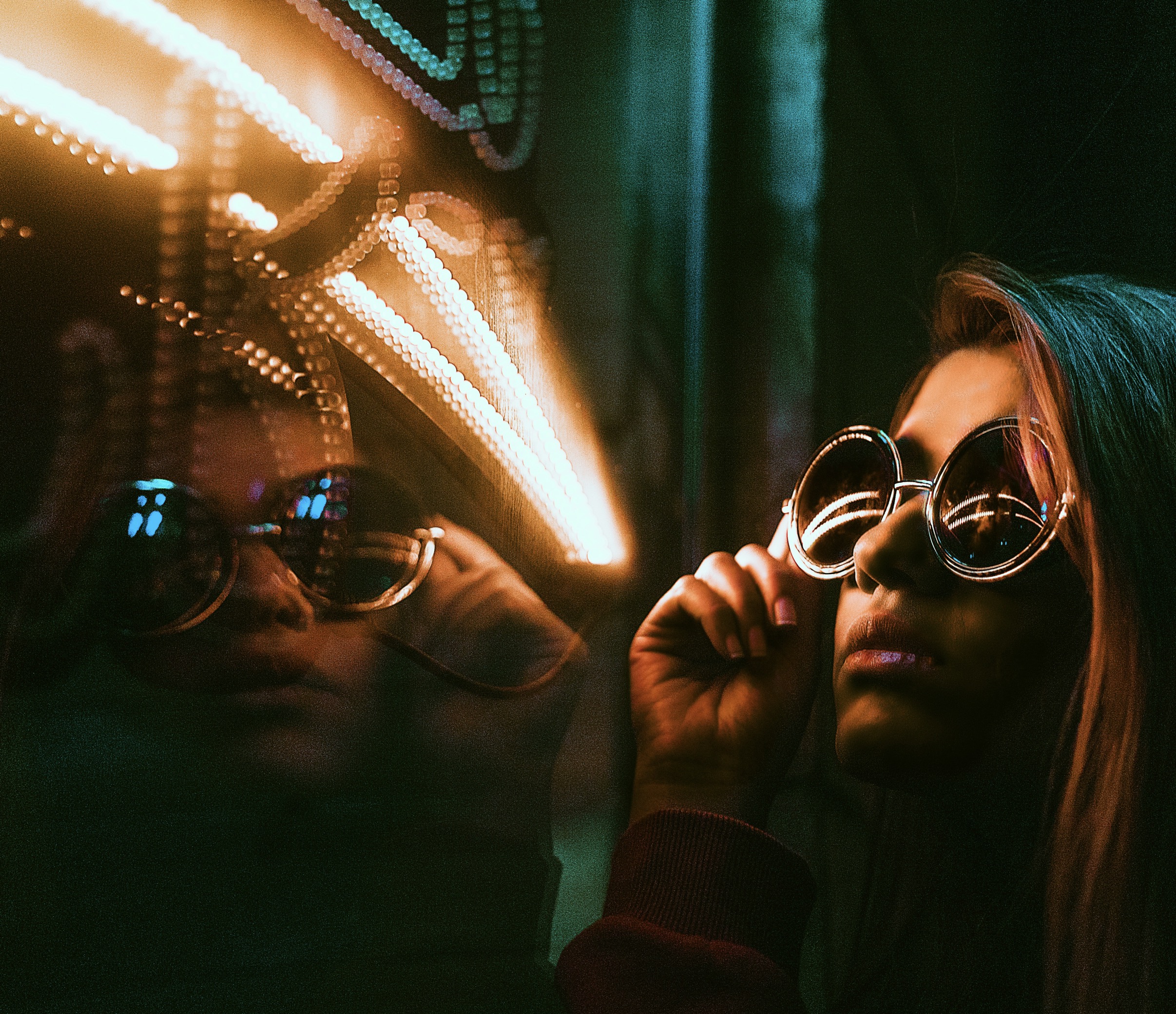
Texture acts as a color amplifier, influencing how we perceive hue. A matte garment can soften a saturated color, while a glossy fabric can intensify it. Use this property to calibrate your palette; pair a bright color with a matte finish to mellow its impact or match it with a shiny surface to heighten emphasis. Texture variations also help break monotony in monochrome looks, giving depth without introducing new colors. When constructing a palette, consider how fabric textures interact under different lighting. The same color can appear completely different indoors versus outdoors, so test outfits in natural light to confirm harmony before leaving the house.
Test, refine, and translate color theory into daily practice.
The realm of color psychology offers another layer to your balancing act. Colors convey moods—calm, energy, confidence—and the way you combine them can reinforce an intended message. If you want a professional, timeless appearance, favor subdued tones like navy, charcoal, and cream with restrained pops. For creativity and warmth, blend earthy hues with richer accents in amber or moss. Remember that color can also reflect your environment; a wardrobe designed to harmonize with a neutral closet system or a seasonal landscape feels more cohesive. The psychology of color informs your choices but should remain flexible to personal taste and occasion.
Practical testing helps you move beyond theory into wearable art. Create mood boards or virtual swatches to visualize how colors interact across garments. Then assemble test outfits and photograph them in lighting similar to your daily routine. Seek feedback from trusted friends or colleagues who understand your style goals. Note which combinations feel serene and which feel busy, and adjust accordingly. A methodical approach to testing reduces guesswork and builds confidence in your color decisions. Consistency in testing leads to a language you can reproduce week after week.
Beyond theory, a wardrobe that balances color gracefully is rooted in intentionality. Start with foundational pieces that suit your complexion, then craft a rotation of accent colors that reflect your personality and the season. Consider storing color swatches with your most-worn outfits to visualize potential harmonies quickly. When you buy new items, evaluate how they will integrate with your current palette rather than how striking they appear in isolation. A disciplined approach to expansion preserves coherence, reduces decision fatigue, and makes getting dressed a straightforward ritual. The outcome is a wardrobe that feels supportive, not opinionated or chaotic.
Finally, embrace adaptability. Your color strategy should flex with changing contexts—work, weekend, travel, or ceremony—without breaking its core logic. Maintain a flexible toolkit: a few reliable neutrals, a handful of anchor colors, and several accent hues that can be swapped in and out. This modular system keeps you prepared for new trends or unexpected events while preserving harmony. Remember that harmony evolves with you; the best color balance is one you can sustain across seasons, silhouettes, and personal growth. With patience and practice, balancing color becomes second nature, elevating daily outfits into deliberate expressions of style.